Greetings!

Welcome to Scifi-Meshes.com! Click one of these buttons to join in on the fun.

3DDeath Star II Style Hangar

TALON_UKTALON_UK2 Posts: 0Member
edited October 2015 in Work in Progress #1
Thought this warranted a new thread, though this is Star Wars related, this work is separate from my First Strike work, being a project I've taken on for fellow Scifi-Meshes community member JMoney. So here I shall chart the progress of the Imperial Death Star II style hanger.

Comments as always are welcome.

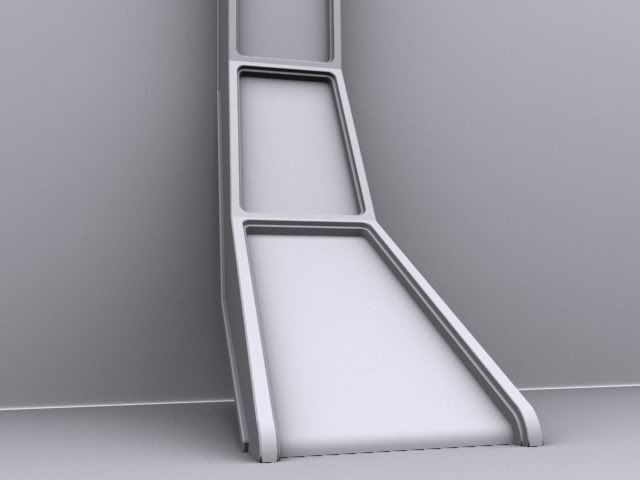
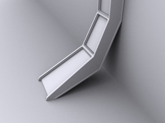
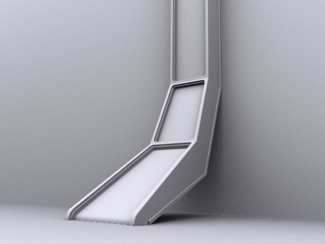
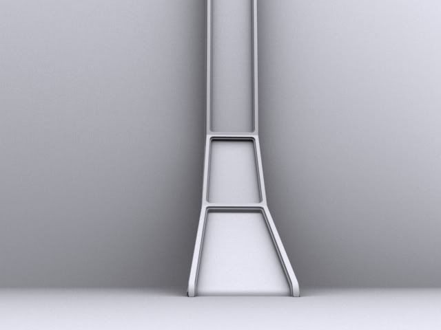
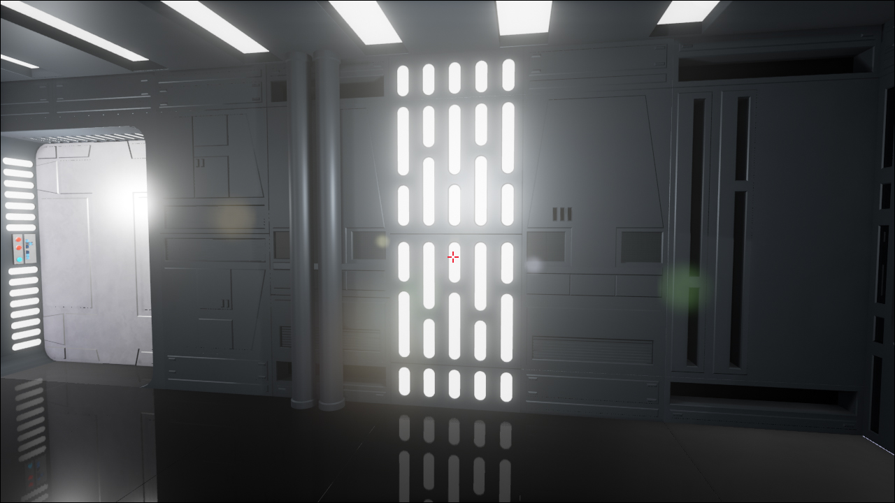
So got some time last night to make a start on this at last. Below are a few renders of my first pass at the bulkhead, the first element of the hanger I'm focusing on. Time spent on this was more on the research than the execution, is a little more complicated than it looks, and there are some discrepancies between the set version of the asset and what you see in the matte painting versions, but I think I've managed to find an acceptable middle ground between the two. More or less done with this now other than for fine detailing (specific vents and the like on the main recessed panels etc), though I'll sleep on it and see if I'm still happy with the proportions tomorrow. Have also yet to add the lighting panels to the side. Will do that once I'm happy with the shape and I call it finalised.

Let me know what you think so far guys.


Bulkhead_Render_01.jpg

Bulkhead_Render_02.jpg

Bulkhead_Render_03.jpg

Bulkhead_Render_04.jpg
107244.jpg
Post edited by TALON_UK on
Tagged:
«13456710

Posts

  • FreakFreak1088 Posts: 4,361Member
    Looks like a good start.
  • TALON_UKTALON_UK2 Posts: 0Member
    Okay, here is a quick update, not had time to do much on this today, but thought I'd quickly bang out a shot or two of how these bulkheads would look in place, obviously this is just a test render rather than anything like near the finished article (still a helluva lot of detailing to go), but I'd like people's opinions on how they look spacing and proportionally when compared with shots from the movie. need some fresh eyes on this before I move into full detailing on this thing.

    Thank you in advance for you comments.

    Hanger_WIP_01.jpg

    Hanger_WIP_02.jpg


    DeathStarII016.jpg

    DeathStarII019.jpg

    DeathStarII025.jpg
  • SeverusSeverus401 Posts: 254Member
    That looks pretty spot on to me...
  • TALON_UKTALON_UK2 Posts: 0Member
    Looking at this again this morning, I reckon I'll make the bulkheads a little deeper and make the lowest section a touch shallower. To bring it more in line with the matte painting versions of em.
  • FreakFreak1088 Posts: 4,361Member
    Yeah, after looking at those screen shoots, I think your right.

    Do you have a little stick man to put in there, so you have an idea of scale. It will help you with the scaling of it all.
  • TALON_UKTALON_UK2 Posts: 0Member
    Not too worried about scale as yet, more the proportions and spacing of the bulkheads, but will certainly look at adding a figure for scale when I start to look at nailing that aspect of the model.

    Have just played around with the bulkheads some more this afternoon, deciding to go with the depth of the set version of the asset, but look to the matte painting for guidance on how far out the foot of the bulkhead should be jutting out, and how shallow that part should be. Looking more into it there is further discrepancy between the set and matte painting versions, including the fact that they appear considerably wider in the painted version, but I've decided not to get anal about it and just settle on an interpretation that works for me, otherwise we could be here all day faffing with this single aspect of the overall model. So I'm going to consider this done, and look at adding the finer detail and lights on the sides.


    Here are the latest two renders, let me know what you reckon to the new proportions guys.

    Cheers.

    Hanger_WIP_03.jpg

    Hanger_WIP_04.jpg


    (Oh, and how do you update the initial posts attachment image? Don't seem to be able to do it for some reason)
  • FreakFreak1088 Posts: 4,361Member
    Looks fine to me.

    Do you mean the imainge for the thread?
    If so you have to update it in the first post of the thread.
  • mylexmylex1015 Posts: 346Member
    This looks really great, looking forward to see more
  • TALON_UKTALON_UK2 Posts: 0Member
    Thanks for the kind comments.

    Yeah, with that initial post image I can't seem to get to the attachment management screen when I attempt to edit. I'm guessing it is only available through the 'Go Advanced' tab, but for some reason I can't access that when I go to edit a previous thread entry. Nevermind.

    Anyhow, here is the latest batch of shots from this, just got a little more time on it tonight and have added the side light panels to the bulkheads, and having decided on how high these things are, have applied the top section to them too. Check 'em out and let us know what you think.


    Hanger_WIP_05.jpg

    Hanger_WIP_06.jpg

    Hanger_WIP_07.jpg

    Hanger_WIP_08.jpg
  • ChrisGFXChrisGFX362 GermanyPosts: 607Member
    looks good so far :)

    there is a little error ... the "collums" don't reach the ground (see images). If yoou have the BluRay you can see it better there.

    Chris
    94280.jpg94281.jpg
  • L2KL2K0 Posts: 0Member
    yep. they dont touch the ground, and they are a bit wider.
  • FreakFreak1088 Posts: 4,361Member
    Lighting looks good.
  • TALON_UKTALON_UK2 Posts: 0Member
    Heh thanks for that ChrisGFX, well spotted, goes to show just what happens when you're staring at something too much, and are so focused. Your brain turns to scrambled egg and you miss glaring mistakes like that. Funny how after 30 years of watching this movie this detail never registered. Well actually, it kinda half did as I clocked it to a certain degree, but half assed explained it away as something weird about the floor reflection, like some optical illusion or something. Daft when that detail is clearly some inches off the ground. Shows why a fresh pair of eyes is always a good thing when you get too close to something. Anyhow, at least it is easy enough to fix.

    L2K, are you talking about the width of the feet, or the bulkhead on the whole? If it is the whole thing you think needs to be a bit broader, that is a tricky one, as they appear broader than mine in the matte, but the studio set model of the detail is actually a little skinnier than mine, I tried to aim for a happy medium between the two. So for the moment I think I'll be sticking with them as they are. Though knowing me I'll probably change my mind in 24 hrs.

    :argh:

    With regards to the lighting, I've just whacked a skylight in there, which is what I tend to do with renders of untextured models, just gives them a good realistic finish with minimum effort, though they take a while longer to render. Just a temporary measure though. Will have to sort out some proper lighting for this once the mesh is complete and I put a roof on the thing.


    Thanks for the feedback guys, much appreciated.
  • TALON_UKTALON_UK2 Posts: 0Member
    And here we have the easy fix, just took a moment to sort this and raise it a few inches off the deck, should be just about right if you take into account that the image above's dark shadowy area includes the reflection of the shadow on the shiny deck plates, so the distance between the bulkhead and the deck should be about half of what it appears in that screenshot. Next up adding the finer details, vents and such which differentiate the various bulkheads, and then at last I can focus on some other part of this hanger.

    :)

    Hanger_WIP_09.jpg

    Hanger_WIP_10.jpg
  • ChrisGFXChrisGFX362 GermanyPosts: 607Member
    much better :thumb:
  • TALON_UKTALON_UK2 Posts: 0Member
    Had to take a break from this for a while to sort out some other work, but had a chance to get back to it today, working on the last details of those bulkheads with these shots below, still no detailing of the rest of the hanger as yet, though scale and general size of the hanger has been adjusted, also a few rough and ready shots at the end just to see how it looks with a black reflective floor. Hopefully the bulkheads are good now and I can move onto some other detail before I get bulkhead crazy fever.

    :argh:


    Hanger_WIP_13.jpg

    Hanger_WIP_12.jpg

    Hanger_WIP_14.jpg

    Hanger_WIP_15.jpg

    Hanger_WIP_16.jpg

    Hanger_WIP_17.jpg
  • evil_genius_180evil_genius_1804256 Posts: 11,034Member
    That's looking great so far. I especially like that last picture. :)
  • FreakFreak1088 Posts: 4,361Member
    The floor really bring it to life.
    Look forward to seeing more.
  • TALON_UKTALON_UK2 Posts: 0Member
    Thanks guys,

    Yeah the reflective floor really does take it to the next level doesn't it? Looking forward now to detailing the other parts of this thing other than those bleedin' bulkheads.

    :lol:
  • evil_genius_180evil_genius_1804256 Posts: 11,034Member
    The reflective floor makes it look more like the film, but I wouldn't necessarily say it takes it to the "next level." You'd need a shuttle, a buttload of stormtroopers, imperial officers, Emperor Palpatine, Darth Vader and some TIE Interceptors flying by outside for the "next level." ;) (of course, the bay being complete would also help. :p)
  • TALON_UKTALON_UK2 Posts: 0Member
    Well that's what I mean, that it is starting to look much more like it's movie counterpart with just that one step. Don't worry there is plenty more work to be done on this yet.

    ;)

    Though I'll tell you what is really annoying me. The fact that I don't seem to be able to update my thread thumbnail. Is that feature only available by going through the 'Go Advanced' tab? For some reason I can't access that when I'm editting a post, only when I'm putting up a new one. Anyone else had this issue? Or could an admin possibly be so kind as to update my thread thumbnail with the image below?
  • evil_genius_180evil_genius_1804256 Posts: 11,034Member
    It can be done. You have to hit "Edit Post" and then "Go Advanced" in edit mode. Though, the image you replace it with has to have the same file name as the original thumbnail image or it won't work.
  • TALON_UKTALON_UK2 Posts: 0Member
    Hmmmm, well like I say, for some reason the advanced tab won't work for me when editing an existing post. Curious.

    EDIT: Just tried to edit the attachment via my iPad and that seems to have sorted it, seems that the function just doesn't like my PC's internet browser or something.
  • evil_genius_180evil_genius_1804256 Posts: 11,034Member
    Yeah, it's probably the browser. I use Firefox on the PC, and I was able to change mine on my current WiP thread. What browser do you use?
  • TALON_UKTALON_UK2 Posts: 0Member
    I'm using IE, yes I know, I should wash my internet hub out with soap and water.

    :p

    I have a copy of Firefox that I use on occasion for testing, so I might just switch to that when browsing this site or something.
  • evil_genius_180evil_genius_1804256 Posts: 11,034Member
    TALON_UK wrote: »
    I'm using IE, yes I know, I should wash my internet hub out with soap and water.

    I don't judge people on their browser. ;) I quit using IE many years ago (I started with the Mozilla browser before there was a Mozilla Firefox. ;)) However, if that's what you like to use, more power to you. I use Firefox most of the time, though I also have Chrome installed in case Firefox has a problem with a site.
  • TALON_UKTALON_UK2 Posts: 0Member
    Just a minor update here, not happy with the bulkhead proportions I've broadened them as much as possible to be more in keeping with the matte paintings of the location, but not so much as to disrupt how these details should look when compared to the studio set details. Definitely done with this area now, have also added subtle chamfers to the vent details on the bulkheads, not that you'll catch them in the shot below, but they're definitely ready for their close up now.

    Talking of the shot below, this has the broadened bulkheads on one side and the ones from before on the other, won't tell you which side is which just to see if you can tell the difference, and see if it makes that much difference to the viewer.
  • evil_genius_180evil_genius_1804256 Posts: 11,034Member
    The difference is noticeable, but only because I went back for a 2nd look after reading your post. ;)
    The right side has the wider bulkheads
  • TALON_UKTALON_UK2 Posts: 0Member
    At last! I'm getting to work on stuff other than those bleedin' bulkheads. Have taken my first pass at the wall sections which will fit in between those assets, still quite basic at the moment, they will need a little chamfering, and of course the panel detailing and such, but the broad strokes are pretty much in there and this gives a good impression of what the overall thing should look like. So before I head off to bed here are a few renders of it all together so far, with and without the reflective floor.
  • evil_genius_180evil_genius_1804256 Posts: 11,034Member
    Isn't it amazing how quickly the work goes with copy and paste details? ;)

    Seriously, it's looking great. :D
Sign In or Register to comment.