Greetings!
Welcome to Scifi-Meshes.com! Click one of these buttons to join in on the fun.
Quick Links
3DAnother Enterprise F


Calamity Si introduced the fact that a competition on the Star Trek Online site to design the next Enterprise wasn't open to people outside of the US. Fair enough, but then he designed a nice Enterprise F, and there was oohing and aahhing and then some silly idiot said "Ooh, why don't we have an Enterprise F thread for other non US citizens."
That was me, and now I'm paying for it because I started to get inspiration for a new trek ship... As if I didn't have enough stuff to work on!!
Still, the generic thread was in the gallery section, and I didn't have a finished product, so here I am. ho hum.
- - - -
Coming up with the concept.
Well, whereas some of the designs on the STO site have essentially used Sovereign parts or tech, in a different configuration, I decided an Enterprise always wants to last at least a generation of ships. I was thinking we needed something which made the Sovereign look outdated.
The main problem is that making a futuristic, say 25th Century trek ship, is that it just isn't an Enterprise. If you look at the silhouette of the Constitution, the Excelsior, Ambassador, Galaxy and Sovereign, whilst the proportions are different, it's the same ship. It's a saucer, a central body behind it and two nacelles reaching back on pylons. Even the totally warped JJ-prise still held true to this tradition.
To that extent, this one doesn't feel to me like an Enterprise, but... I have to be able to let go of the past and embrace change!")
That was me, and now I'm paying for it because I started to get inspiration for a new trek ship... As if I didn't have enough stuff to work on!!
Still, the generic thread was in the gallery section, and I didn't have a finished product, so here I am. ho hum.
- - - -
Coming up with the concept.
Well, whereas some of the designs on the STO site have essentially used Sovereign parts or tech, in a different configuration, I decided an Enterprise always wants to last at least a generation of ships. I was thinking we needed something which made the Sovereign look outdated.
The main problem is that making a futuristic, say 25th Century trek ship, is that it just isn't an Enterprise. If you look at the silhouette of the Constitution, the Excelsior, Ambassador, Galaxy and Sovereign, whilst the proportions are different, it's the same ship. It's a saucer, a central body behind it and two nacelles reaching back on pylons. Even the totally warped JJ-prise still held true to this tradition.
To that extent, this one doesn't feel to me like an Enterprise, but... I have to be able to let go of the past and embrace change!
Post edited by Dannage on
Tagged:
Additional credits
- Icons from Font-Awesome
- Additional icons by Mickael Bonfill
- Banner background from Toptal Subtle Patterns
© Scifi-Meshes.com 2001-2024
Posts
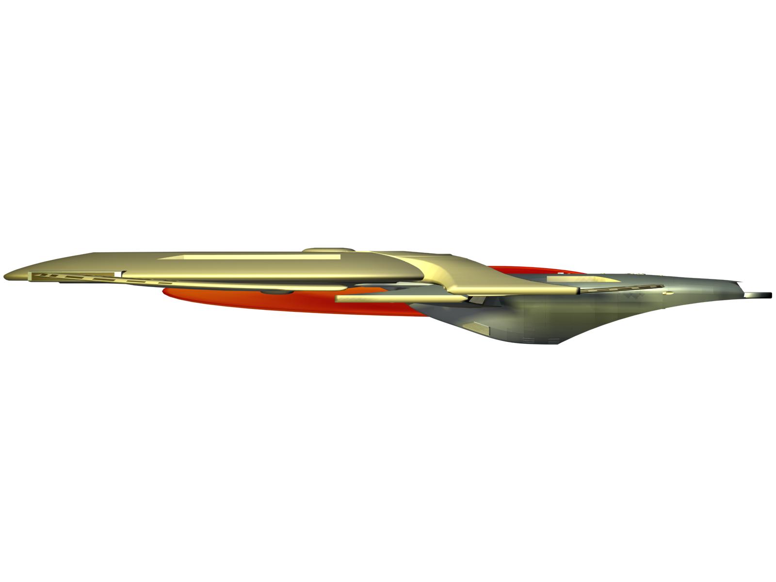
This is the approach that I normally take with my trek designs. I always ditch detail and go for a general shape. If I can get an outline that is pleasing on the eye, that's something I can push forward. Then onto another post it (top left) and I try and expand the design a little further.
So the premise here, is that we have a design which looks a little symmetrical. There is no 'neck' between star drive and command section. At one point I was considering basically making the two halves of the ship essentially be clones of each other.
I dropped that fairly quickly though, since half way down the ship you'd have to flip upside down.
Middle picture is a slightly more formed outline of both top and bottom which ends up looking like this when split out and mirrored.
Colb - Now you mention it I can see that from a top perspective. I have to admit, I do like the Andromeda, but I think her side and front profiles will be sufficiently different enough so that in 3D she will look different. We'll have to wait and see!
One of the reasons behind my thinking with some of the lines was pulling trek back to TNG era. As I always do when trying to find a 'successor' shape, I did similar sketches to what I had done in my initial one here, for all the enterprises. No distracting detail, just the outline very roughly, so you youlc look at the dynamics and how each design moved. The Sovereign class seemed to me to be all about speed. The design itself sang out "I am a really fast ship" but the Galaxy class, more like a whale (even though according to the ol technical manual, it's designed on a bird!) What I wanted to do was not to make a ship that said "I kick ass" it was needing to be a ship returning trek to it's less combative roots, and saying "I am a graceful ballerina" ... sort of thing. So, less militaristic, more explorery... We'll see how she looks when I build her.
And if Cassio is watching, I'll probably send her to you to texture.
But it certainly is a nice design.
But I'd worry about the design first. Lets see more
Actually, it might be better to call it the "Jefferies conundrum," as Greg Jein was the lead modeler of the TNG era. Matt Jefferies created the original design of Enterprise for the original series.
I'm still in two minds at this stage, whether I will have the second 'ring' bit on the back, but we'll see.
I also wanted to get some shots of the two sections separated. The underside just a stretched half sphere at the moment. Wouldn't put too much stock in what you see there.
But the basics now give us an idea of what the two sections will look like.
As you can see, I have put warp nacelles on both sections. The ones on the 'habitation' section are smaller and on her own I'm sure she'll do much less speed, but it seemed to me a bit daft to give the traditional 'lifeboat' saucer section impulse only. That means a saucer section will never really leave whatever star system she's separated in. Giving an albeit slower warp capability to the drive section, say Warp 5 or 6, at least means she gets to travel back to federation space, even if the 'battle' section is destroyed.
Edit - Forgot orthos.
They are not the sleekest nacelles out there, but then I'm not trying to convey speed, more grace, so the design ought to have nice gentle rolling sweeping lines.
That said, since I'm not that hot on modelling, let alone smooth, organic beautiful shapes, I may just get her as far as a medium quality model and then give her to expert modellers to rebulid properly, if anyone will want the job.
And with just the top section.
Secondly, on the topic of the Ent-J... I regret to inform you that she never existed in the prime universe. The only reason that the J looked like that was because it was in an alternate timeline which Archer then prevented. So in all honesty, the -J would not look like that, so really there's no need to think about making the -F a linear succesion the the -J. When I saw this design, I probably got the largest smile on my face in a while. You have avoided the lineage to the -J entirely. Bravo.
Furthermore, I honestly look forward to how this design progresses, and how the detail comes along when you get there. Excellent job so far. You've truly captured the essence of the relative term 'Futuristic' with this ship.
Lizzy, in truth, they were for aesthetic purposes to create a smoother line across the front, ideally an unbroken arc. I would say in true star trek tradition I'll come up with some form of heisenberg compensator to ensure that they serve some function. Probably a high energy set of sensor arrays of some form, trading a pallette for them.
I do like the departure from the general Fed design, and I see the evolution from Voyager and later Arrowhead shaped hulls.
Have you given any thoughts to the deflector yet?
I've nothing against nacelles, they just should match the rest. With that, it's like having the Enterprise-E using nacelles from the Ent-A...
It just doesn't match up well.
Didn't hear about those other two designs, can you give me a link?
That only works for Samuel Jackson. :flippy:
Did some more work the other week before rebuilding the nacelles
Changed the Nacelles, the pylons and the body... And the saucer... uh...