Greetings!
Welcome to Scifi-Meshes.com! Click one of these buttons to join in on the fun.
Quick Links
3DMithra Class (Bridge)
So here's the bridge to my Mithra class starship; a ship I've been developing over the past year for Star Trek: Bridge Commander. I've come to the conclusion, however, that while the ship herself may never make it as a mod, I'm more likely to complete her as a highly-detailed CGI project instead. In light of this, I've begun developing the bridge and will likely soon be posting up the ship herself at some point or another...
So on with the bridge. Clearly I've gotten some inspirations from the "JJ-verse", as well as from the "Generations" galaxy bridge and Defiant bridge. The Mithra is an early-25th-century design, and so I tried to implement some streamlined elements into the bridge...
Enough with my rambling though. Have some pics:
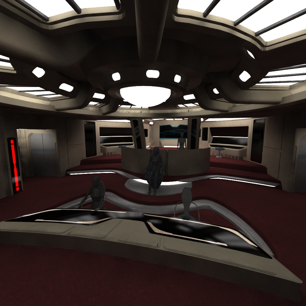
Post edited by Aeries on
Tagged:
Additional credits
- Icons from Font-Awesome
- Additional icons by Mickael Bonfill
- Banner background from Toptal Subtle Patterns
© Scifi-Meshes.com 2001-2024
Posts
But I'm missing Conn and OPS. Or are they BEHIND the captains chair? Then where's Tactics?
Nice work though.
By the way, hows your omega station coming?
@Melak: I haven't looked at the Omega Station in a little while... for whatever reason, I'm having trouble conceiving the primary shape... nothing really seems 'right' to me. Later on this upcoming month I'm going to get back on that one though; I have a few ideas for that sensor/comm arm. BUT, I haven't had too much time to work on both of these projects at once as I'm moving into a bigger place this week! [YAY!!
@Aresius: Conn and Ops are actually at the fore of the bridge now, where they were on the Galaxy Class bridges. I've moved the consoles on either side of the viewscreen to the back as engineering and science stations, while the console just behind the captains' chair is intended as both primary and secondary tactical. I'm thinking of re-working the layout a little with the port and starboard walls, to allow additional room for inset consoles... I think I'm also going to reconstruct the pillars and translucent glass pannels... something seems really off with them and it's ticking me off. xP Hehe.
I'll throw up a render for you guys tonight when I have more time, so that I can demonstrate the changes and developments I've mentioned. [yay for posting at work!] it takes a freakin' 30 minutes to an hour to render just one of those shots... grawr. x_x [am not too pleased about that!]
Thanks for the compliments guys! :]
-Aeries
Don't forget to place lights at head's height
Good work. :thumb:
It's pretty obvious what I've done. I'll just post the pics. Keep in mind that the second was rendered long after the first. The only changes noticable is the tactical console that was formerly the helm... I think it looks much better there as tactical. I'll make helm tomorrow. Also for tomorrow I'm going to make chairs for other consoles, make the last consoles for the walls at the aft of the bridge, and detail the ceiling more at the aft section. After all that [shouldn't really take long] I'll proceed with texturing.
Another note, too, is that this is my first time EVER TEXTURING ANYTHING!! IT's also my first time ever having done anything in 2d... I've made the LCARS in a combination of Max and Photoshop... it's supposed to be a mix of Sovereign First Contact LCARS and the USS Relativity's "TCARS".... lemme know whatcha think?
Anyways! Pics for yew boys....
**EDIT**
There is a texture in there that's only a placeholder for the moment, that being the bioneural net on the walls beside the two consoles just behind tactical. I say temporary because I didn't make that graphic and I have no idea where i originally got it from; it's been sitting here on my computer for what seems like forever now. If it's a problem please let me know. But like I said, it's just a place-holder. I'll be making a new set from scratch very soon... assuming I even keep those there and not redesign that area.
It was more unique...
After a CRAP TON of farting around [pardon the pun. xD] I've finally gotten the HUD overlay to kinda/sorta work. Now if only I could figure out if Photoshop has a symmetry modifier like 3ds Max, I might be able to add these other details to it that I've made... girr.
Edit: OH YEAH! I made new consoles for that area, too. xD Forgot to mention it above. :P
That bit on the main viewscreen would look better if it conformed more with the screen so it doesn't look too cluttered.
I'll get working on viewscreen details later on. It's been giving me a headache. On that note I've added the left and right screen basic LCARS HUD layouts. I'm thinking a tactical plot on the right side and a science/engineering overlay on the left? Maybe.
I've re-made the carpet and added an inset for helm & ops. I really like the inset, I think... It just seems to work. :] And before anyone mentions it, yes, I will work on those darn reflections in a bit. Lol. For now I need sleep...
Okay, here you go!
Great job. Keep it up.
Got working on the MSD... needs a proper font and gotta tweak the mapping a bit but it's coming along... Also still gotta tweak the reflectivity more. Darn raytrace reflectivity map thing is so darn... good? Lol.
I LOVE THIS SHIP'S BRIDGE. PERIOD. The standard for anything bigger than a Norway-Class, beginning 2389.
My only nit-pick is an (*Optional*) gullwing-style LCARS auxiliary over-ride console on the Captain's Chair.
One that stays pivoted in the "upright" position, & swings down flat across the Captain's lap or is embedded in the arm-rest somehow.
A few things though: certain objects like the bases of the chairs and the railing supports look super reflective, and it's causing some wierd artifacts (you can see it most on the base of the captain's chair in the first pic).
Second: The Captain's chair is kind of blobby at the moment, especially the backrest. It would look better with a more defined style, like the Enterprise-E:
File:Sovereign class Captain's chair.jpg - Memory Alpha, the Star Trek Wiki
Lastly, your floor is rather bland. The multiple levels and the Voyager-style lighting strips look good, but maybe you could try making the edges a different color, to break things up more visually. The Galaxy bridge is a good example:
File:Galaxy class bridge.jpg - Memory Alpha, the Star Trek Wiki
Hope that helps!
you can imagine a lot of things going on in the background, which you dont get with previous trek bridges.. if that makes sence probably not...
i guess what im saying is it looks like the nerve centre of a starship, not a room for the main cast to sit..
good work
For one, a number of your panels seem to be reflecting the lights/luminous surfaces but not the actual model, which looks really weird. Also you need to do 2 things with your reflections.. Have a Fresnel/IOR value assigned to anything reflective (possibly doing a material mixer thing in Max, with a Fresnel curve blending the reflective/non reflective materials... And introduce Reflection blur/glossiness to the materials, as even the display screens wouldn't be mirror sharp (people put their hands on them all day long!) The 'metal' material especially needs some attention. It's difficult for me to advise you on how to do all that, given it's Max!
Great start on the model though!
Wow, thanks for all those pointers! You're absolutely right too, the reflections are really..... bad. It looks more like plastic than glass/metal. At the moment I have a standard material with, in the maps for this material, Raytrace applied in the Reflection slot set at a level of 4. I REALLY need a new material. xD Lol. Glass/Windows [at the back of the bridge for example] are the same thing, but with an additional Raytrace map applied to Refraction and set at 100, but that doesn't seem to do very much... as you said, only reflections of direct light seem to work. This is the same for the windows, only they'll only allow direct light to shine through as well.
Half of what you said didn't make much sense to me but I'm looking it all up for tutorials that I might be able to adapt to my current situation. Thanks a TON for all your help!