Greetings!
Welcome to Scifi-Meshes.com! Click one of these buttons to join in on the fun.
Quick Links
3DClass II Dock


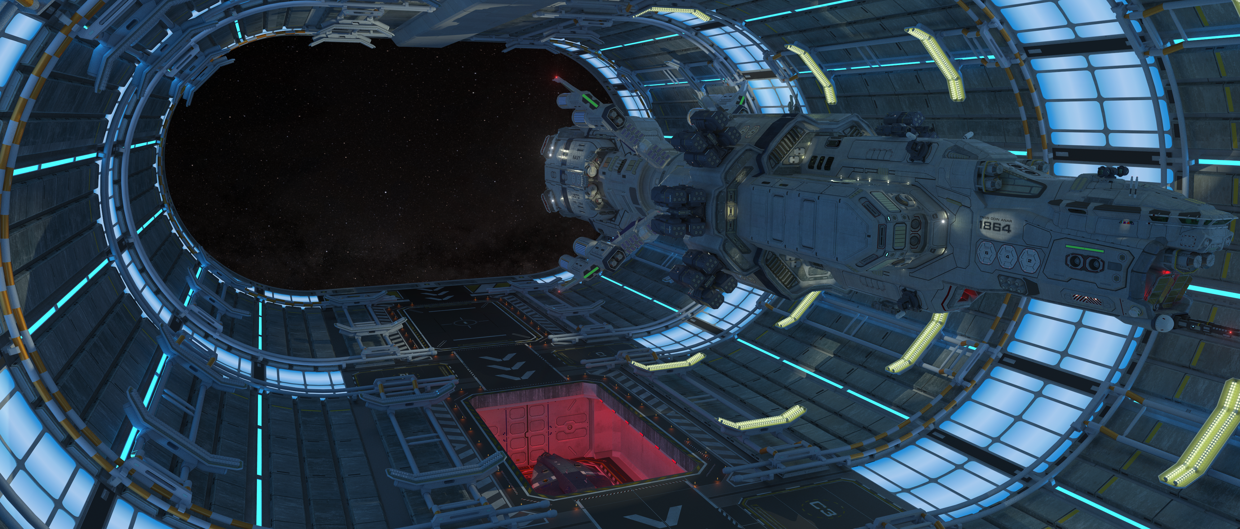
Mesh build is far from done but a good chunk of the core model is complete enough for a render test. I'll do a fictional scene write up when the dock is finished.
Modeled entirely in SketchupPro 2018. The mesh here including the Okuda Class Destroyer in the scene is nearly 20 million polys. There are only two displacement maps, one in dock wall texture that appears between the long "rail" structures and upper Dock overhead and one in the Okuda hull texture. The Test scene was rendered in Thea Studio in 8K with slight post-work done in Gimp 2.0
Modeled entirely in SketchupPro 2018. The mesh here including the Okuda Class Destroyer in the scene is nearly 20 million polys. There are only two displacement maps, one in dock wall texture that appears between the long "rail" structures and upper Dock overhead and one in the Okuda hull texture. The Test scene was rendered in Thea Studio in 8K with slight post-work done in Gimp 2.0
Post edited by Guerrilla on


Tagged:
Additional credits
- Icons from Font-Awesome
- Additional icons by Mickael Bonfill
- Banner background from Toptal Subtle Patterns
© Scifi-Meshes.com 2001-2024
Posts
Join our fancy Discord Server!
Out of curiosity, what was the render time for the image?
Frequent updates at our Discord channel!
Overall I'm going for a realistic lighting setup vs. a pretty one. The one thing I don't do with my art is practice presentation for the sake of aesthetics. In sci-fi I feel strongly there is way too much of that which spoils suspension of disbelief. For example putting a magic light source on a ship in deep space which is common place and nearly standard. I mean space is a dark place. The best IRL lighting setups I've seen in sci in my opinion have been 2010: The Year we Make Contact and The Expanse. Also look at the many images out there of Starfleet vessels inside the spacedock. Those images the ships all blend in as well and in my opinion are some of the best realistically lit scenes in scifi. That being said one thing I've going to play with is to add spotlights in the dock to better illuminate a ship that is "docked" like those spacedock scenes from trek. I'll play with global medium to get the beams to slightly show up a bit though in a vacuum unless there was dust or a gas present that wouldn't be present IRL. But one could say it was some kind of venting from the ship's ECS.
So yes, the ship is blended with the dock background a lot I agree. However, that's what it would really look like. The hull of the Destroyer is also non-reflective and has a sprayed on thermal coating. That's knocking down the contrast quite a bit.
Now along with the main dock lighting which I already know how to fix (I think), the big work lights definitely need help too and definitely look too CG insofar as the structure. Right now I'm not sure how to go about fixing it so idea are welcome. They are not just in how much I need to adjust the projected light but in the texture of the surfaces, especially the tube rails they're mounted on. I may just do away with them and go with something else as they are heavy poly anyway.
This scene is actually meant to sort of show the ship about ready to depart which is why all the running lights are on and the work lights are dimmed and turned off where there are no other ships docked.
It didn't occur to me without Viper's help but I have to agree it would be great if your ship stood out a little more. After all, it's a terrific model. One thing about it is that you have those ("Too CGI looking") lights all around the ship which theoretically should light it up more than they are in your render.
What I want to emphasize is my appreciation for your design ideas. Great ship model. Great Dock idea.
Agreed. However, this is significantly less true of objects in orbit on the bright side of a planet. I personally feel some artists over-darken these. One can easily look up photos of the international space station and see what I mean. The direct light from the sun and reflected light from the planet really light it up.
If you mean those drydock images of Voyager, I agree. Not the TMP ones. Those are too flat, and they have tons of phantom lights.
One way to get some separation in the lighting is to add some ceiling lights in a different color. White probably. That would break up the ship from the background a bit as the top will be a bit different. But totally your call.
Frequent updates at our Discord channel!
No that's drydock..I'm talking about the Spacedock scenes from STIII and IV
How's this guys? Look any better? I added flood lights to the lighting scaffolds, re-modeled the main dock panel lights and re-rendered.
h