Greetings!
Welcome to Scifi-Meshes.com! Click one of these buttons to join in on the fun.
Quick Links
3DDestroyat Class w/ some interiors
 P5ych0p4th476
GermanyPosts: 341Member
P5ych0p4th476
GermanyPosts: 341Member


Hi,
I started learning Blender just about two Months ago (though I have some previous experience in 3ds Max). Since I've allways been a Star Trek fan I mostly do starship, spacestation and shuttle models. Currently I'm working on a Destroyat class starship with some interiors.
I hope you enjoy some of the renders. And if not at least be nice :-P
Post edited by Guerrilla on


Tagged:
Additional credits
- Icons from Font-Awesome
- Additional icons by Mickael Bonfill
- Banner background from Toptal Subtle Patterns
© Scifi-Meshes.com 2001-2024
Posts
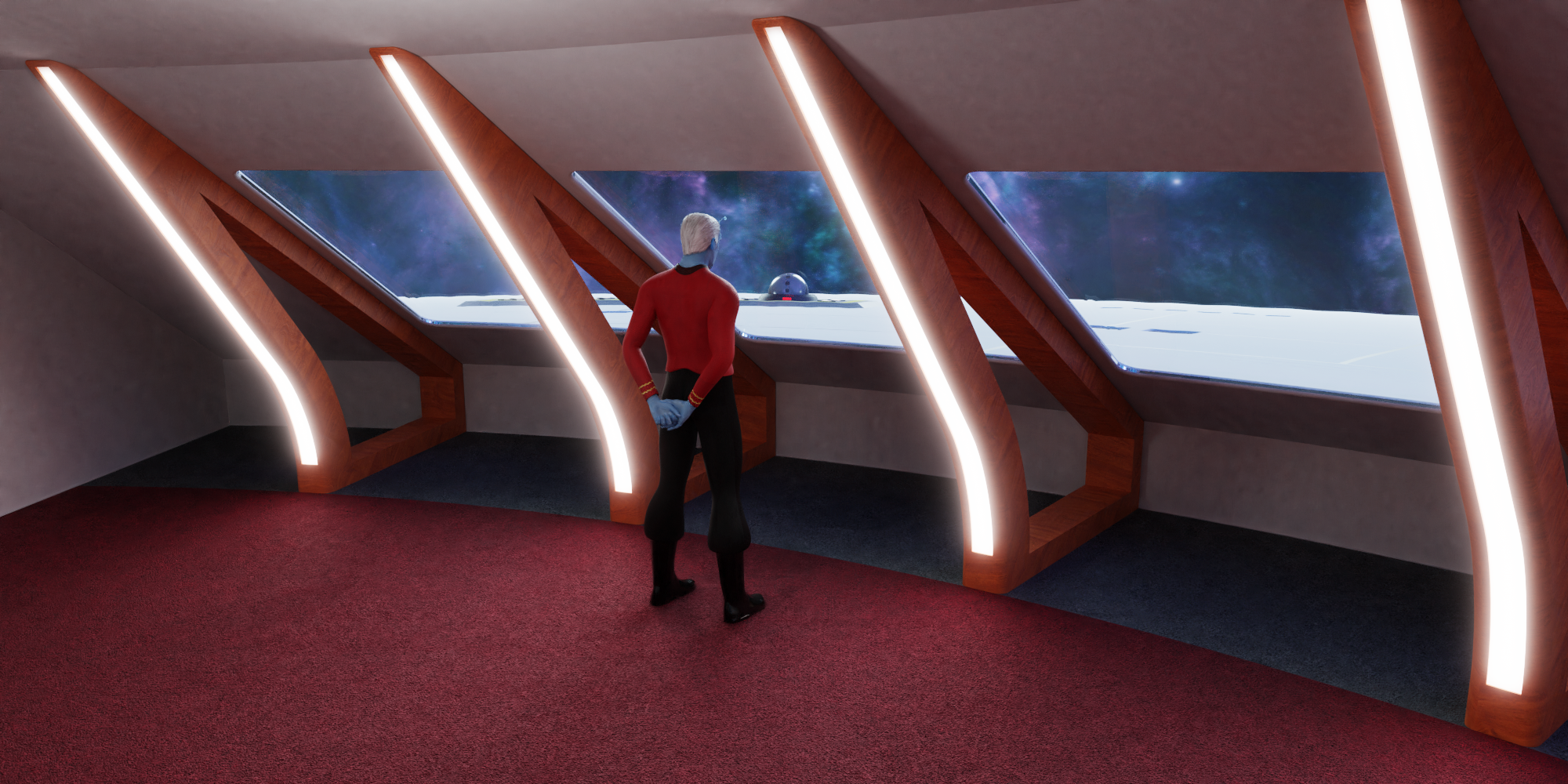
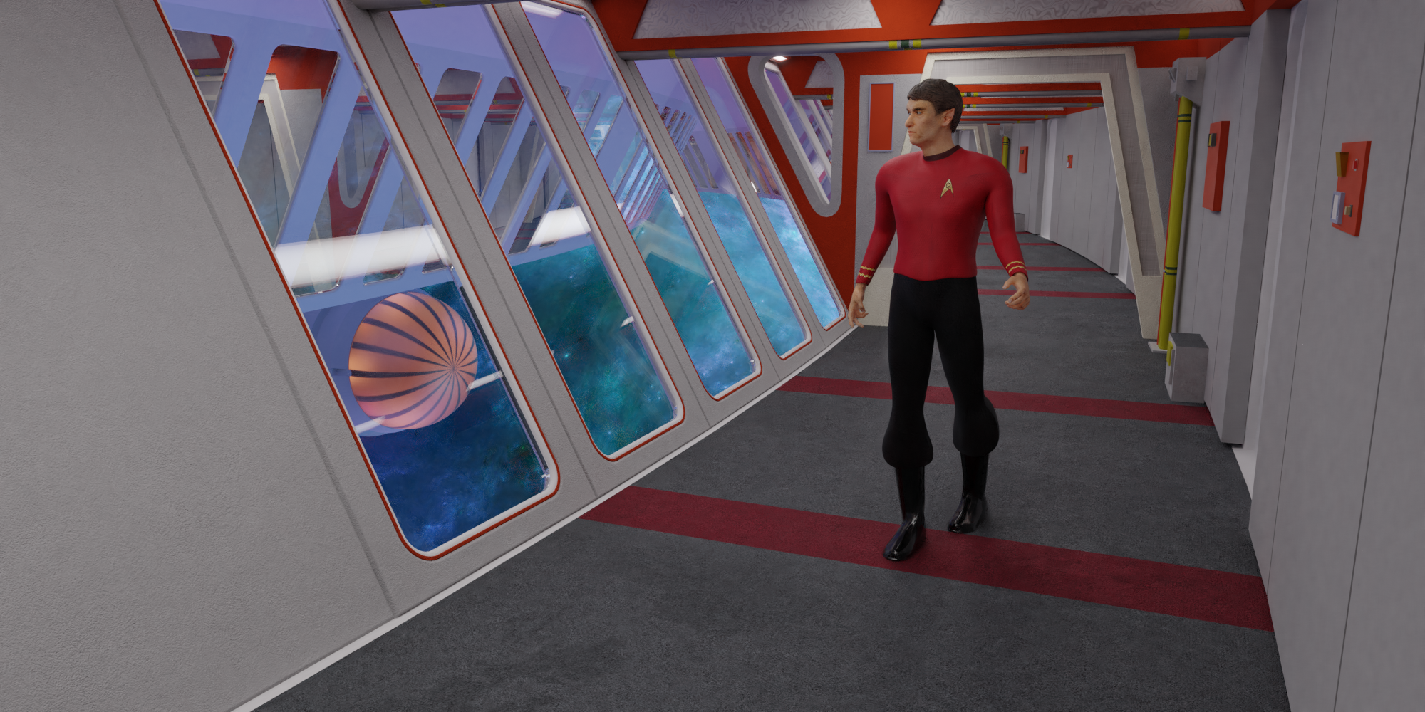
I think my only criticism is that for TOS era, the hull seems paperthin there when even in TNG it was still pretty thick.
I do agree about the thickness of the hull though, it's a little detail that gives rooms a lot more realism. As an example, here's a window from the TOS Enterprise.
Now that you say it, the walls seem a little thin. I might have thought, it looks a little more futuristic that way. But my next ship will have thicker walls, I promise ... now I just have to decide, which one that shall be ... and maybe finish this one first.
I'll also have some fresh renders later, however, the forum won't let me upload them at the moment ... weird.
What is it about your lighting that you're not happy with? You're using Cycles, aren't you?
I feels a little dark to my eyes. Maybe I will be adding some lights to the walls instead of just having them on the ceiling.
And yeah, I‘m using cycles. Not a fan of the videogame-y look you geht with eevee.
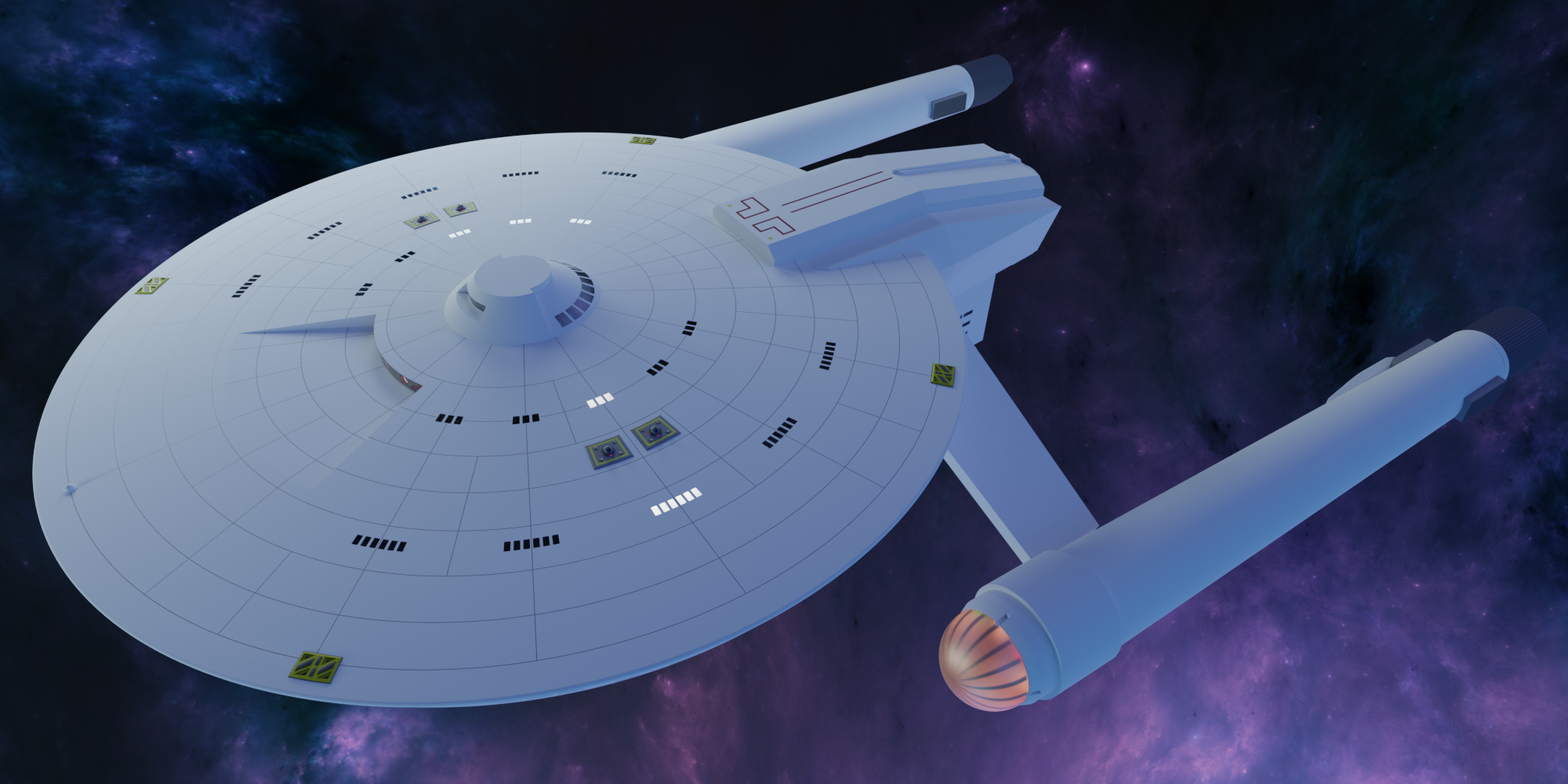
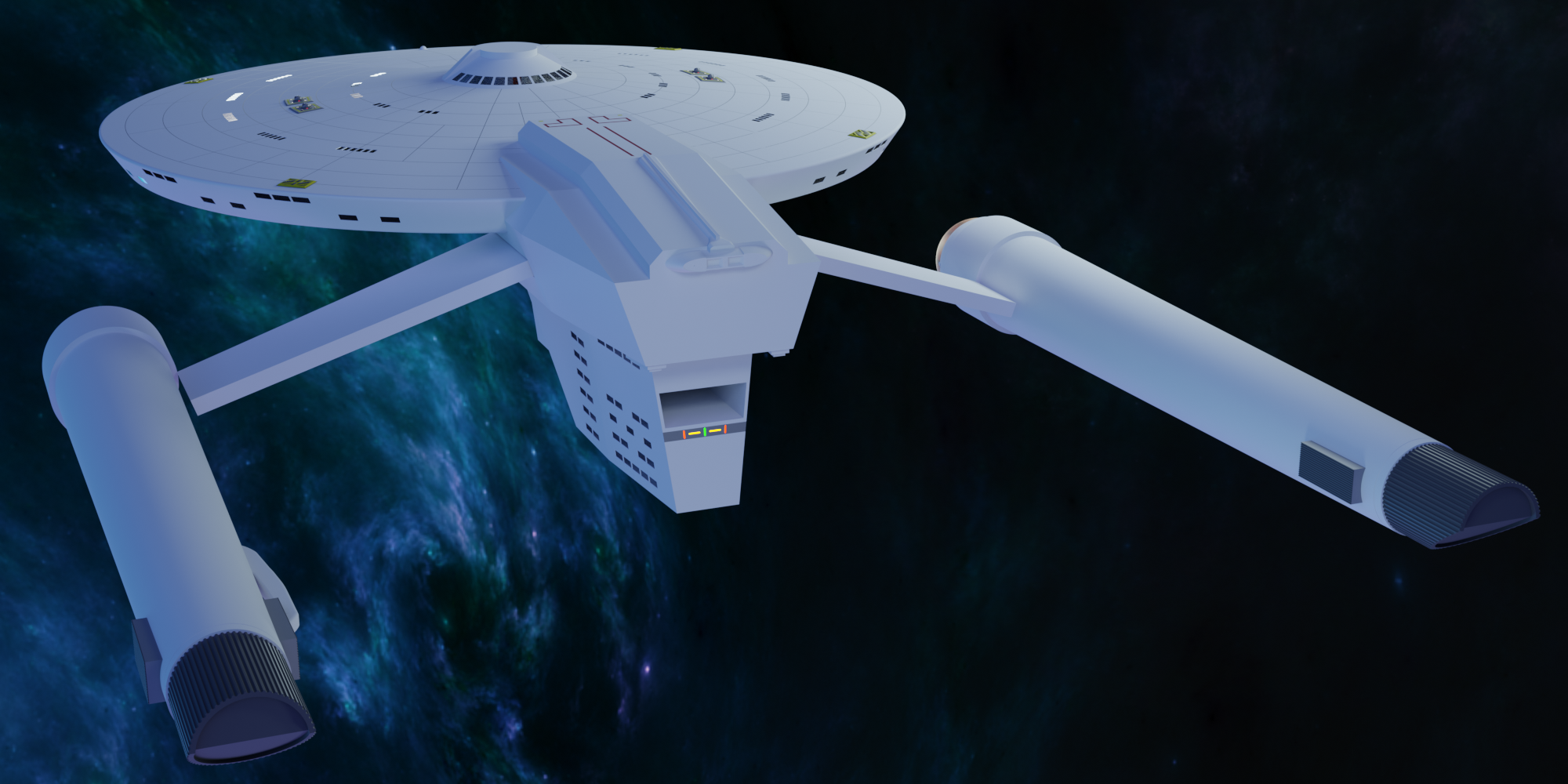
However after I rendered two pictures, I wasn't happy with the phaser turrets and the shape ot the airlock, so I redid both of them. Looks okay now, though I'm still not entirely happy with it.
Also the windows are a little bit too clear for my taste. I might tint them or add some dirt ... oh well ... the work never ends :-D
Sadly my Bar Exam is coming up, so I won't have much time to do much with it for the forseeable future.
Good luck with the bar exam.
Thanks! I'm afraid, I'm going to need that :-D
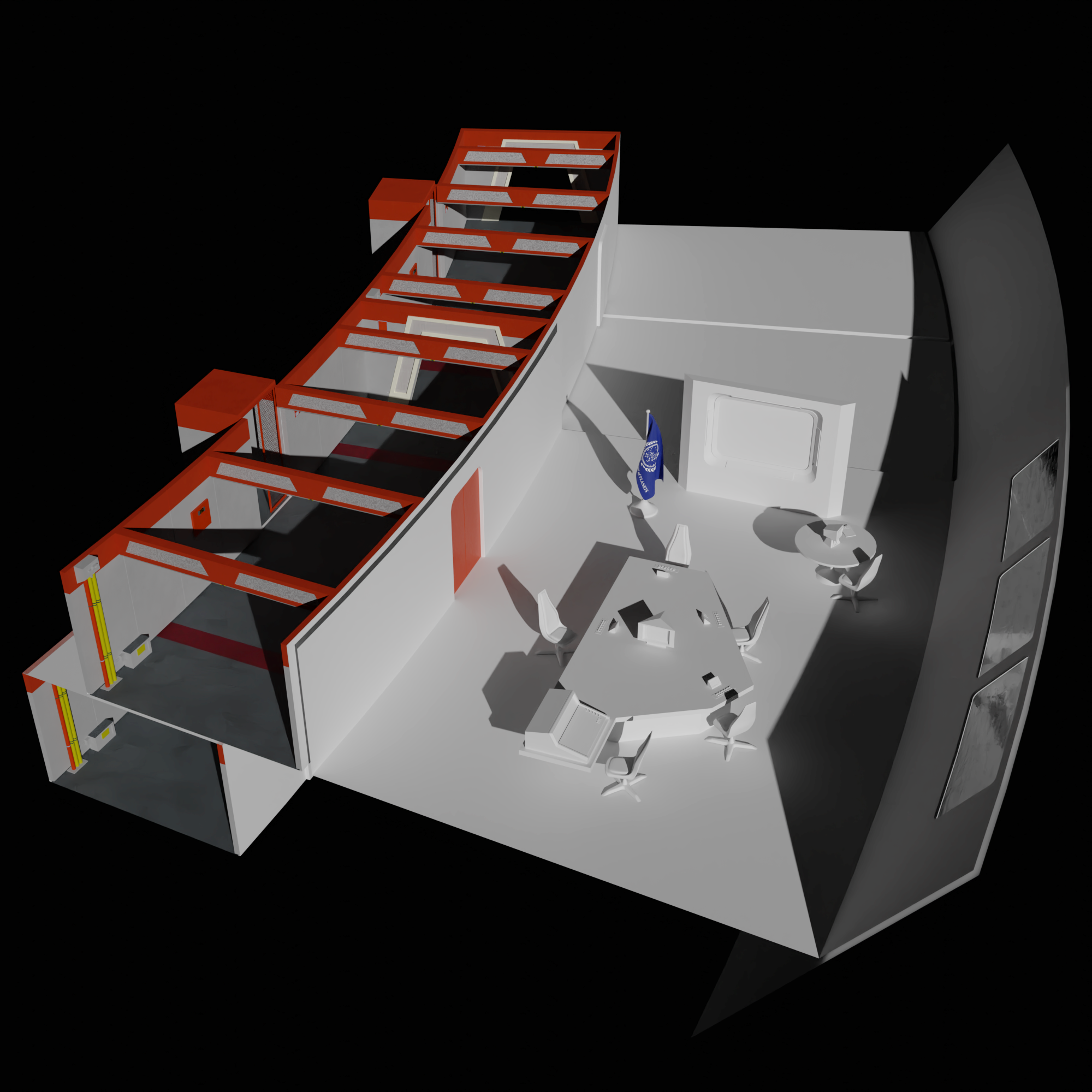
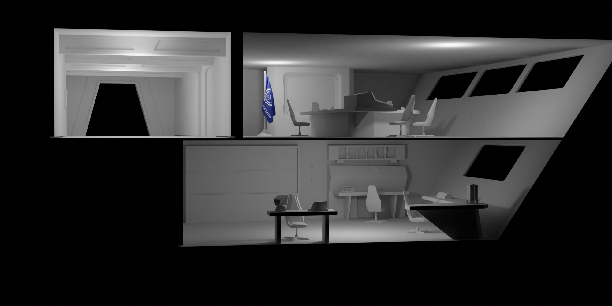
The science lab/medical office is pretty much done. I rendered it in 4K but sadly the denoising kills most of the texture detail. However rendering the samples required for a crisp picture would probably melt my poor little notebook
Then I experimented with an aztecing pattern on the nacelles. I'm still unsure if it is too much or not enoungh. However since it's the firste time I did something like this at all, I'm quite happy with it.
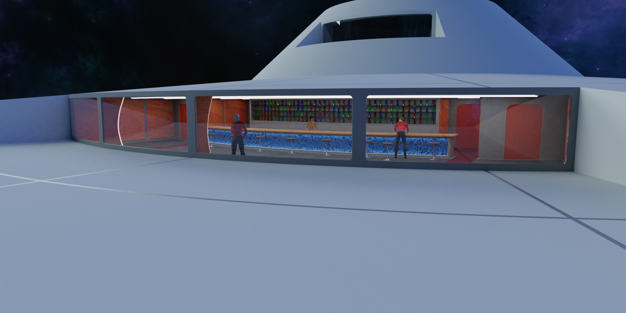
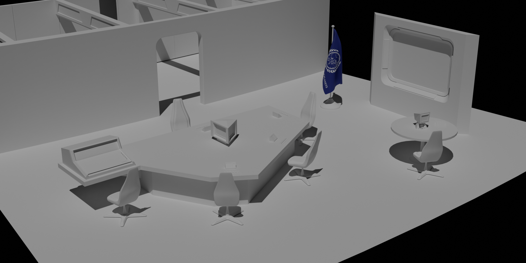
Lastly I started laying out the bridge. It's not quite a classic TOS design, since I allways enjoyed the "Hotel in Space"-Look a little more than the militaristic feel, some bridges have. But I think, it should still fit well within a TOS aesthetic. I just realized after rendering, that the monitor layout looks like a couple of shocked faces looking down on my poor andorian redshirt
The "painting" in the back is just one of the renders form yesterday put through some filters on my phone ... for that little effort, I'm actually quite fond of the result.
PS: since it's a longer text, I hope my english is at least comprehensible. I wrote this after a long day of german basic contract law and while learning spanish on the other monitor
Also some aztecing on the saucer. Though I turned down the bump after that render. That was probably a little too much.
If I may offer a bit of feedback on the ship though, I'd suggest leaving at least a couple of meters below each hardpoint on the hull (phasers, RCS thrusters, hatches, etc.) for the machinery that those components need.
For example, the TMP style phaser turrets supposedly have a big power coupling below them under the hull, so it couldn't fit on top of the bar area. Same with the RCS thrusters, they need space inside the hull for gas tanks and other related machinery, so they couldn't fit with a window located on the saucer rim right where they are.
Of course it isn't needed per se, it is your design; but it's a little touch that, IMO, helps with making it feel more real.
Yeah. I think, that goes to the bigger Problem, that The Hull simply is a little bit too thin. I might be able to set the Bar down a Meter or so without having to redo too much of the Model itsself. With the Thrusters I'm not all that happy anyway. Maybe I lose them or model another solution. Maybe a more traditional RCS Thruster look, like die NX-01 Enterprise had ...
Thanks for the input!
I also did a little more work on the bridge but that'll have to be rendered tomorrow
Aztec definitely takes a lot of work and tweaking to get right.
Thanks! This means a lot coming from you since I learned starship modeling in Blender basically with your Enterprise Tutorial!