Greetings!
Welcome to Scifi-Meshes.com! Click one of these buttons to join in on the fun.
Quick Links
TexturingEnterprise D Shader
 Petrmaus
 385
Posts: 28Member
385
Posts: 28Member


Hi everyone,
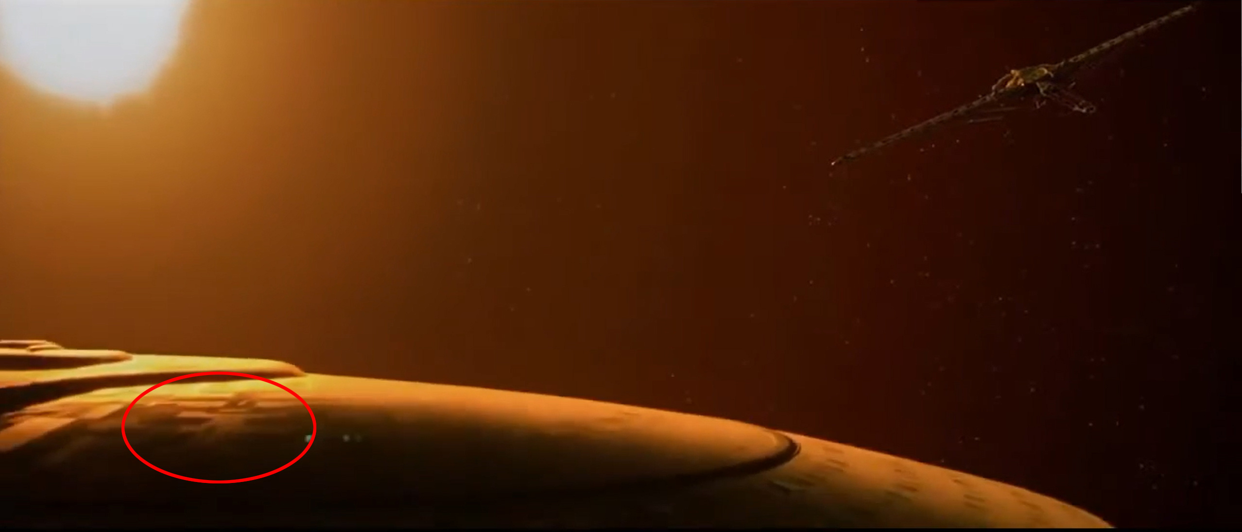
I recently finished modelling my Enterprise D in 3DS Max (2021 version) and I am currently working on the mapping part. I have been trying to achieve the same Aztec effect as shown in Star Trek Generations – for reference, see below print screen of what I want to achieve.
Unfortunately, after several days of trying, I am not able to get even close to my designed outcome. I hope, that some good soul will be so king and help me to set-up my material and share with me their knowledge on how to achieve my goal.
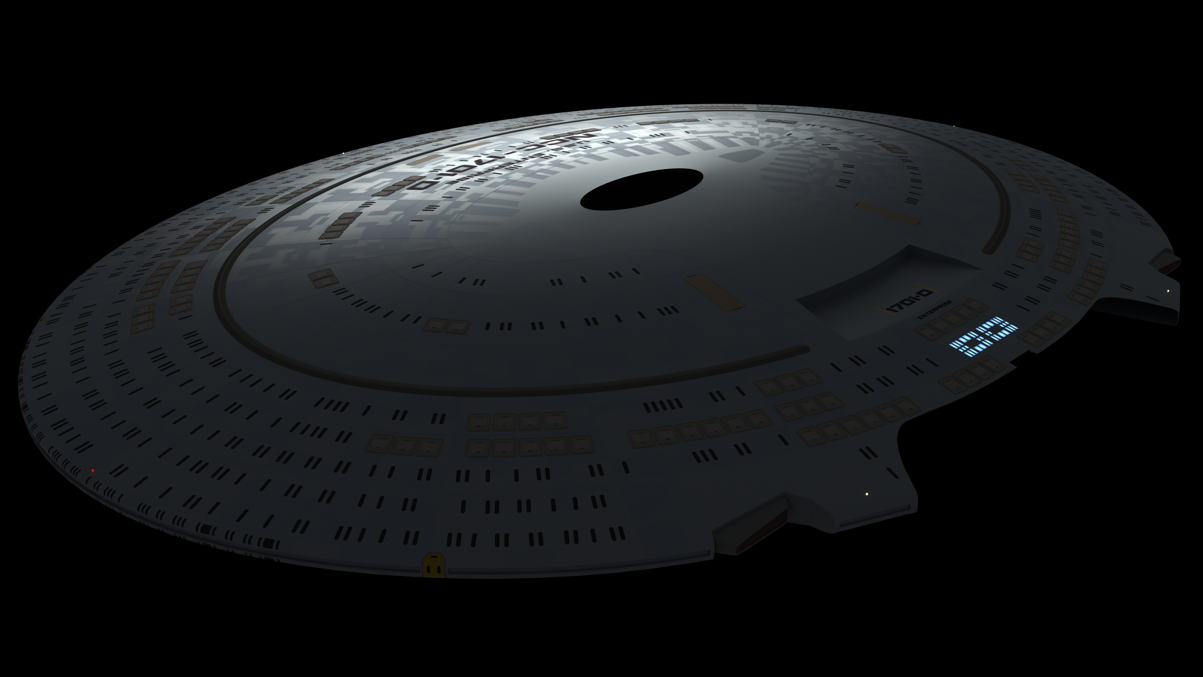
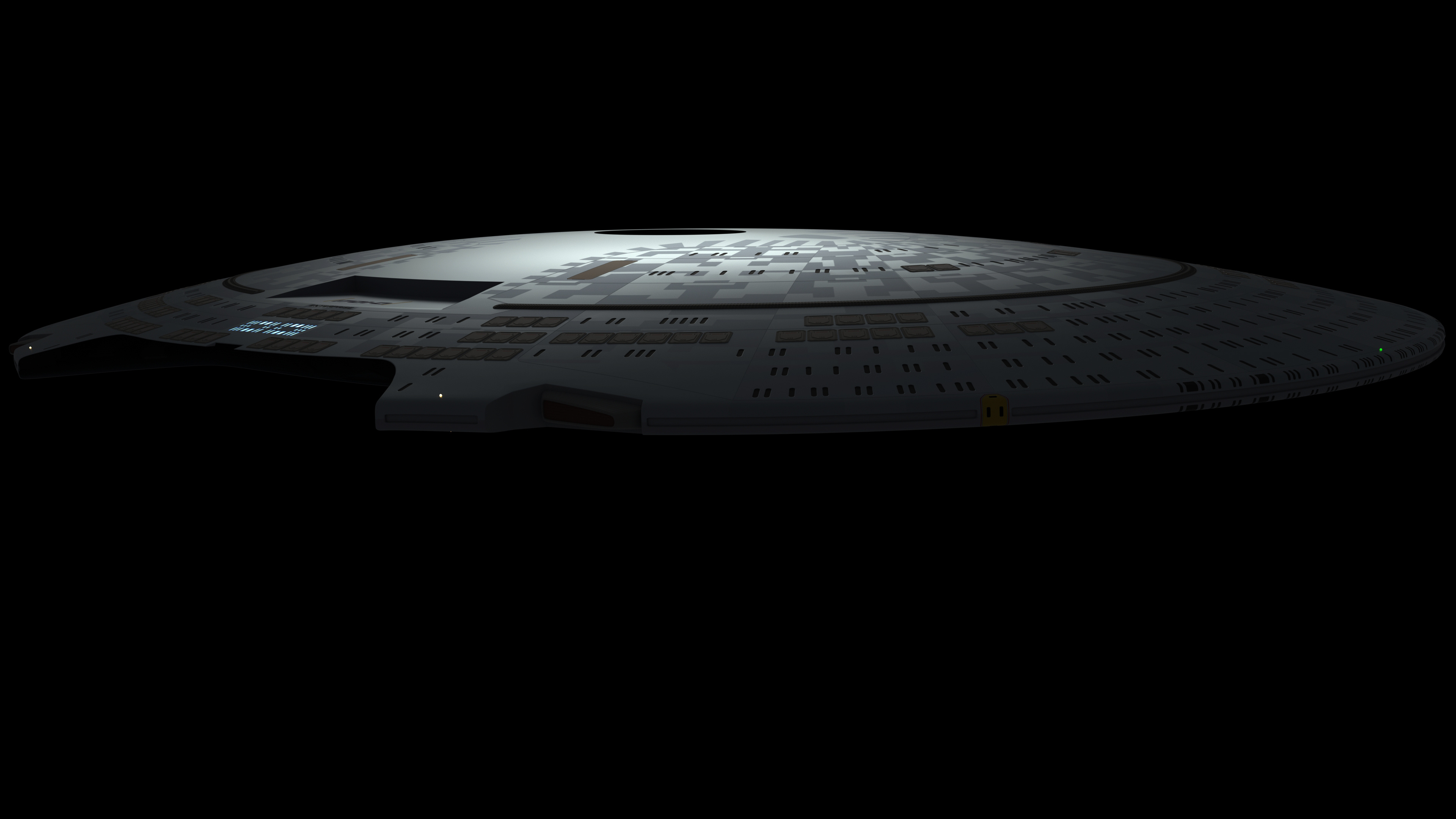
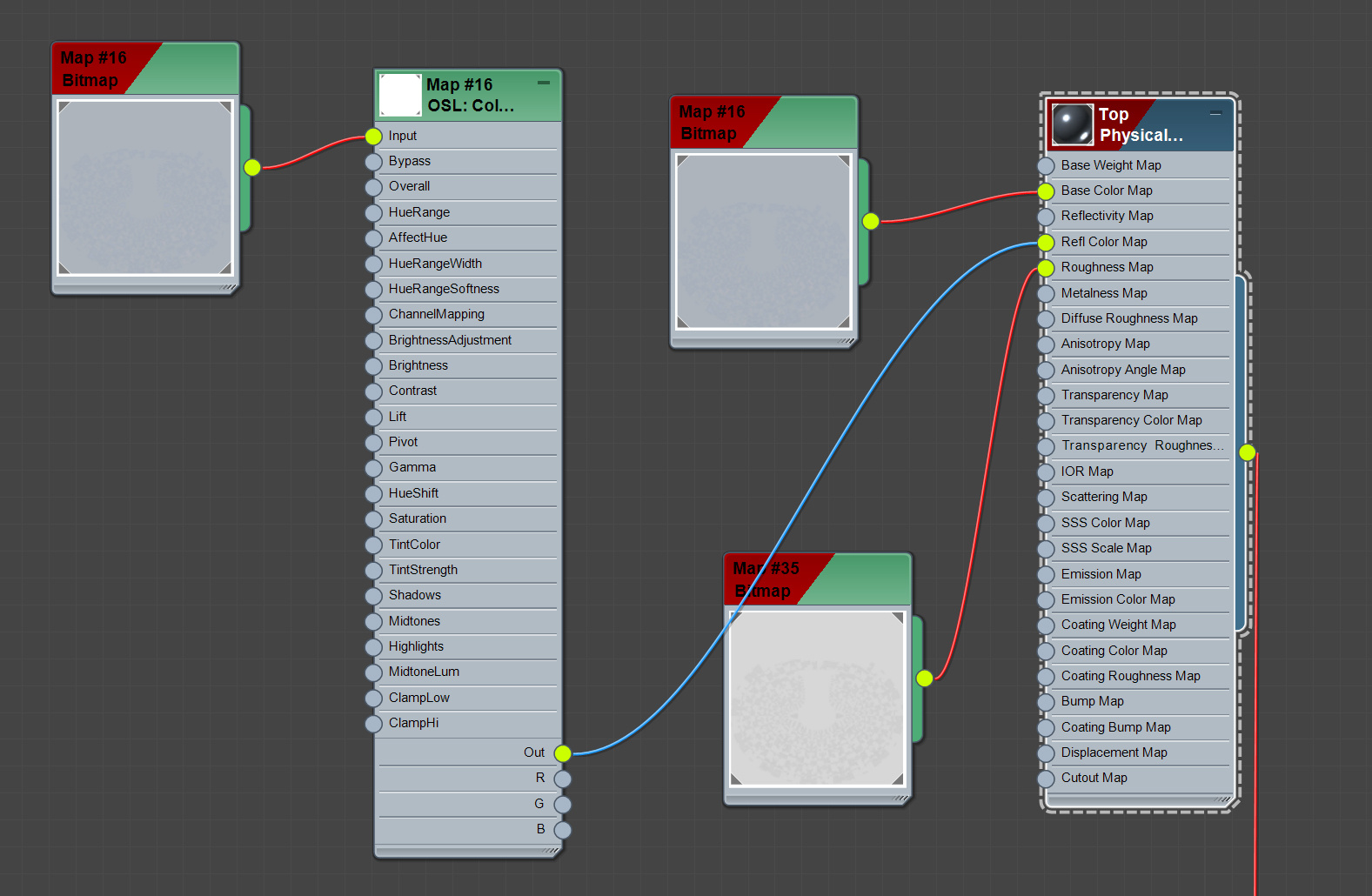
Here are examples of my current mapping work as well as material set-up and maps I am using. Maps are still work in progress; I am using Photoshop to create them.
DIFUSE MAP

GLOSSINESS MAP (ROUGHNESS)

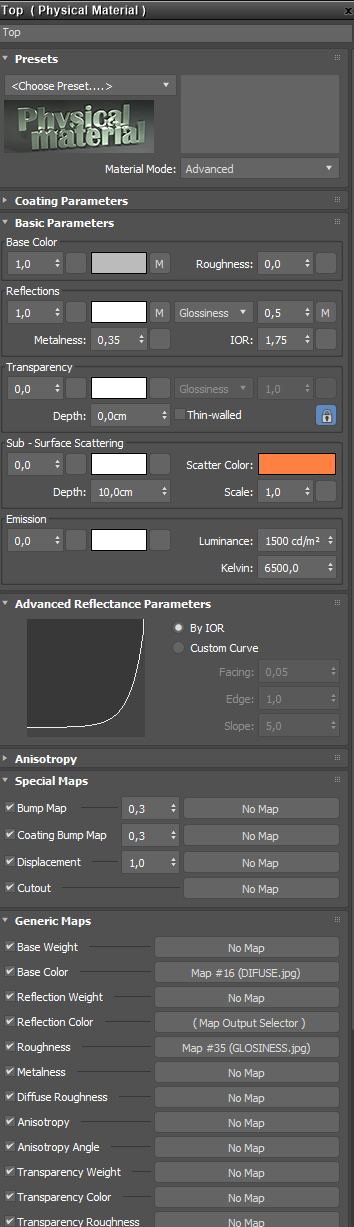
Thank you in advance for your kind help.
I recently finished modelling my Enterprise D in 3DS Max (2021 version) and I am currently working on the mapping part. I have been trying to achieve the same Aztec effect as shown in Star Trek Generations – for reference, see below print screen of what I want to achieve.
Unfortunately, after several days of trying, I am not able to get even close to my designed outcome. I hope, that some good soul will be so king and help me to set-up my material and share with me their knowledge on how to achieve my goal.
Here are examples of my current mapping work as well as material set-up and maps I am using. Maps are still work in progress; I am using Photoshop to create them.
DIFUSE MAP
GLOSSINESS MAP (ROUGHNESS)
Thank you in advance for your kind help.
Post edited by Petrmaus on
Tagged:
Additional credits
- Icons from Font-Awesome
- Additional icons by Mickael Bonfill
- Banner background from Toptal Subtle Patterns
© Scifi-Meshes.com 2001-2024
Posts
Also I don't think you want to be overriding reflection colour as that will take you out of PBR. I'm not 100% sure on how 3DSMax handles these things, @Viper or @PixelMagic will be able to help more on that one. In blender all I use is a base colour map and roughness.
Wow. I was going to ask about your materials workflow. This looks like no fuss, no muss.
I think I saw someone giving a talk at the Blender Conference on pretty much just this topic.
Various Work: U.S.S. Constellation - Matt Jefferies Concept Shuttle
Maybe the problem can be in how I setup my scene, I have one Arnold directional light and one skydome light.
I also noticed that when I added the main bridge, zooming in, I can see that there is a reflection of the main bridge on its base. I am worried that once I “turn on” the lights, this will be too much noticeable. I tried to lower the Specular level as much as possible so it does not influence the Roughness. But still I can see the reflection.
Any further suggestions on how to make it more looking like in the movie are much appreciated and needed 😊
Your base color is too bright, take the value down.
Get the actual colors in there; ie the 'duck egg blue' and 'sky blue' should be closer to what is on the original Enterprise. That was Probert's goal in setting the color scheme. So look at the restored E in the Smithsonian (and I think G Kerr's color write-ups) main color and the color on her front dorsal. It also helps to know how the refit was painted, but the original more-so. If you want to take it to grey, do it as irl- in post.
Do NOT repeat info between maps. 'duck egg blue' should not be the same roughness value all over, etc. You are correct that the sprayed paint will be more homogenous, but with the way these paint jobs tend to be layered, you can be more nuanced.
Lighting- what scale did you build your model at? If it is 4', 6' or 8 ' long, then you want your light scales to mimic the lights that would have been used to film a miniature. If you've built your ship to 'full' scale at ~650m, then your lighting needs to account for that.
I wouldn't worry much about solving the internal lighting just yet, there are a lot of approaches. For this, the most accurate is going to be to create an acrylic shader for window shapes (ior of about 1.58 and keep it a little frosted as if it's been sanded) and put lights inside of or luminous poly/geo behind them with a little offset.
For your next round, scour favorite images and try to do a camera match, then a lighting match. If you can say 'I want THIS', folks can tear off big chunks with you.
@lewisniven would you be so kind and show me how did you create the misty texture in Photoshop that applied over your aztec pattern? I would love to do this as well so the surface of the hull does not look like it just left space dock
If there is a way, how to make the highlights "sparkly", please let me know. In the meantime, I will finish the map and turn on the rest of lights. Then it will be time to start working on the bottom part of the saucer.
Thank you again to both of you.
I used Substance Designer Grunge to get the effect but you can Google grunge textures and find some overlays. Alternatively you could use the render>clouds feature in Photoshop and combine that with some noise.
I'd render 2 or 3 and rotate each one 90 degrees. Then mask them with your Aztec pattern, so you don't get the grunge going over the panel lines cleanly, if that makes sense.
Here's how I did an earlier iteration in Photoshop:
https://forums.scifi-meshes.com/discussion/comment/2023665#Comment_2023665
That's looking really good. So much of the 'look' is down to lighting. I'd say you could probably use a tad more dirt on there, so more contrast in your grunge layer, and the moment the panels looks very 'clean' and I think you want to just break them up a tad.
A good way to cheat, is to find free PBR metal textures and use the roughness map from those as an overlay on your texture, so something like this (which is free but you'll need to make an account):
https://www.poliigon.com/texture/metal-corroded-heavy-001/3219
Then take the roughness map and then stick that over the top of your roughness map and use screen or overlay blend modes and fiddle with the opacity. You don't want it to be too over the top, just enough to break yours up a bit. You can use a curve adjustment layer on it in photoshop too to get some more contrast.
My goal with these projects is to get it to look 'right' as a model (in this case the 6-footer) on a stand, in appropriate lighting. If I can pull that off, then lighting and post-work can push it to its film appearance. In short, the model obviously 'didn't look like that' either. I get the appeal of doing it in camera, or in a single beauty shot, but you may also want to play with render passes after a while, see what you can push there.
@vfxart I absolutely agree with you, I was studying the paint-job on the 6-footer and it is a mess. The white parts, that should be reflective the most are sometimes reflective only in part or not at all.
I will now start working on the bottom part of the saucer and then straight to the Stardrive section
Don't make any assumptions about panel color and reflective amount having a relationship, especially when it comes to the value level of the diffuse color (there is no relationship with dielectrics).
Good that you see that their refl amounts vary.
Things are screwy around reflectivity in pbr materials (and most popular pbr authoring apps are not correct, though they claim to be and are accepted as such, but that's another story). Anyway, more-so with metals (so be happy you aren't dealing with them here) but even with model paint finishes, keep your eyes open for that sort of fun.
@lewisniven Based on your suggestion I made the grunge layer more visible in my glossiness map. I also realized, that the aztec pattern is too much visible, so I washed out the diffuse map a little bit too. Here is the result. Any feedback will be much appreciated.
Various Work: U.S.S. Constellation - Matt Jefferies Concept Shuttle
Various Work: U.S.S. Constellation - Matt Jefferies Concept Shuttle