Greetings!
Welcome to Scifi-Meshes.com! Click one of these buttons to join in on the fun.
Quick Links
Fesarius Closeup


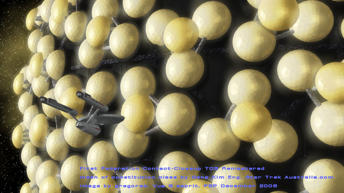
Here's my take on the image released before the remastered episode aired. I finally had to beak down and do more than simply a displacement to get this. I exported a geodesic sphere from Hexagon--haven't yet found out if there's a way to change the geometry--so they have more facets than I wanted--then in Vue 6, "unmoothed" the sphere to retain the facets. Try as I might with material properties, I could not get all the highlights/reflections I wanted.
Yes I am compulsive/obsessive about certain things, hence the new render. I studied the episode stills more closely, and I think I've found the best compromise.--still can't get the orbs to have the right feel, but I think I will give up, for a while.
Tagged:
Additional credits
- Icons from Font-Awesome
- Additional icons by Mickael Bonfill
- Banner background from Toptal Subtle Patterns
© Scifi-Meshes.com 2001-2024
Posts
The way I think you should do the text is to get rid of the banner it's self and just use a simple font in white (perhaps with a slight transparacy). Scale the font size down and place it in the middle at the bottom or in one of the corners.
Keep up the good work!