Greetings!

Welcome to Scifi-Meshes.com! Click one of these buttons to join in on the fun.

3DStarfleet Museum Orbital Annexe

unusualsuspexunusualsuspex331 Norfolk UKPosts: 0Member
edited January 2011 in Work in Progress #1
Wel, I've been renedering for a while with fantastic models made by others and having lurked and occasionally posted here, I decided it was about time to stop messing about and dive in!

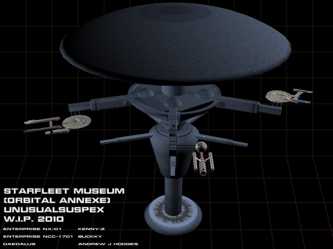
So, MAX at the ready I've started with this, the Starfleet Museum Orbital Annexe. This is the first version which (in modelling terms) is a total nightmare. Unaligned parts, billions of polygons, and wasted elements!

HOWEVER as a first attempt it doesn't look bad and now I can refine the basic concept!

My thanks to Kenny-Z, Buckky and Andrew Hodges for the loan of their models to show scale and textures are placeholders.

Watch this space!
85546.jpg
Post edited by unusualsuspex on
Tagged:
«13

Posts

  • LockeFPLockeFP171 Posts: 0Member
    The holodeck background gives me such a warm giggle! Cool . . .

    I like what you're doing (I think) but it would help so much more if you were making better renders. What do you know about lighting and rendering in general? If you haven't already checked this out, take a gander at MadKoiFish's tutorials. Specifically the lighting section. That will give you tips on how to light your scene so you aren't washing out the detail in your models. Also, try rendering at a higher resolution (1024x768 is great) so that we can get a good idea of what you're trying to show us. And don't try to always get everything in each shot. Make several shots that show off close-up angles of the model. One overall image is great, but it really helps to see what else is going on in the scene.

    Also, uploading to a different site and then linking the image back here does wonders.

    Like so:

    korolevyacht01.jpg

    If you use ImageShack, make sure you post the "direct link" instead of the "forum" one, since that way the image pops up in it's own window without the ImageShack site.
  • unusualsuspexunusualsuspex331 Norfolk UKPosts: 0Member
    These were such basic (and to be honest unprofessional!) first goes that larger images weren't really warranted. Sadly the texture placeholders are also dark which doesn't help I agree!

    As the project progresses there will be more 'intimate' details. For now it was a case of 'here's where it begins!' :lol:

    Thanks for the comments LockeFP and I'll check out the tutorials now! :thumb:

    Museum2-1.jpg

    Museum-1.jpg

    This better?
  • StarshipStarship466 São Paulo - BrasilPosts: 1,977Member
    ItA’s a good start. ;)
    I donA’t know how you built the dome, but I believe it noeeds more segments. The border sshow an weird shadow, itA’s like some sort of smoothing trouble.
  • unusualsuspexunusualsuspex331 Norfolk UKPosts: 0Member
    Thanks Starship!

    In the last day or so, I've refined the main elements of this mesh (with the exception of the arms which I'll be starting work on soon!)

    You're right about the top dome. There was nowhere near enough segments in it! :argh:
  • trekkitrekki951 Posts: 1,405Member
    very god start, i hope it comes more from the station. :)
  • BasillBasill172 Posts: 0Member
    Nice start. Interesting design.
  • BuckaroohawkBuckaroohawk2 Posts: 0Member
    I like the way you mixed elements from the spacedock first seen in "Star Trek III" with the Vanguard Station from the book series (also briefly viewed in the remastered TOS episode "The Ultimate Computer"). The wider middle section also looks a bit like the Nomad Probe / Romulan Cloaking Device from TOS, just turned upside-down. I don't know if you intended that or not, but it's a nice acknowledgement nonetheless. I'm looking forward to seeing how the details on the project develop. Good luck!
  • unusualsuspexunusualsuspex331 Norfolk UKPosts: 0Member
    Ok, the major reconstruction is complete. I now need to work on details which will be a loooooooooong drawn out process as this is the first model I've ever done.

    (BTW the lighting rig here is as described in Madkoifish's tut in the Tutorials Section.)

    Texturing (after the detailing) is also brand new to me so be patient.

    newmuseum4.jpg

    newmuseum3.jpg

    newmuseum2.jpg

    newmuseum5.jpg
  • unusualsuspexunusualsuspex331 Norfolk UKPosts: 0Member
    Sorry, duplicate post! :rolleyes:
  • BasillBasill172 Posts: 0Member
    Yay! Improvements! Nicely thought out. I like the refinements to the structure, though I think I preferred the upper docking arms on the previous version for some reason.
  • HellsgateHellsgate0 Posts: 8Member
    Love this design, but frankly I'm surprised there weren't dozens or hundreds more (of this type,) in visible reach of Starfleet Headquarters during the orbital approach / departure shots during "Star Trek: The Motion Picture" or the one or two visits the Enterprise-D made to Earth during "Star Trek: The Next Generation". Even if they were meant as medical facilities / workers' housing meant for nuclear disaster survivors (during "Star Trek: Enterprise") or just parking stations for civillian freighters, perhaps dispersed in the distant background.
  • unusualsuspexunusualsuspex331 Norfolk UKPosts: 0Member
    Ok as you're all aware, this is my very first model so be gentle! :lol:

    I've added some detail here and there but have tried to be restrained, mainly because of the scale of the station and my (steam-powered) PCs limitations!

    Added shuttle bays below the visiting ships docking ring, dish supports in the main saucer, greebles here and there and one or two other small things. I've also tidied up the modelling a bit as well but I'm still probably way high on the poly count (which is why my machines protesting! LOL)

    I know I want to add top and bottom comms arrays and detail that flat surface on the lower saucer and I may add a few more bits, but I'd like to respectfully ask for some ideas from you guys who have much more modelling experience so feel free!

    Thanks for looking!

    th_View1.jpg

    th_View2.jpg

    th_View3.jpg

    th_View4.jpg
  • unusualsuspexunusualsuspex331 Norfolk UKPosts: 0Member
    Not a major upgrade but lower saucer surface now detailed and comms array placed on top. Lower recess greebled. Docking arms next I think.

    As always, comments and ideas welcomed!

    th_View4aa.jpg

    th_View4a.jpg

    th_View1a.jpg
  • BasillBasill172 Posts: 0Member
    Mighty fine work for a newbie toe dipper. ;)
  • unusualsuspexunusualsuspex331 Norfolk UKPosts: 0Member
    Thanks Basil! The encoragement should prepare me for the texturing!!!! :o
  • AresiusAresius359 Posts: 4,171Member
    Reminds me a bit to the mother-ship from close enounter...

    I love it.
  • unusualsuspexunusualsuspex331 Norfolk UKPosts: 0Member
    Thanks Aresius! And to every body who has commented, I'm learning from you all!

    Quick update, I've tried to subtley apply panels to both saucers which (when it's textured) shouldn't look bad I hope!

    th_DetailedSaucer.jpg

    th_DetailedSaucerLower.jpg
  • SchimpfySchimpfy396 Posts: 1,632Member
    Nice work so far. The detailing is coming along very well and once you apply textures I think you'll be pleasantly surprised.
  • AresiusAresius359 Posts: 4,171Member
    It looks good. They're subtle indeed.
  • NightShadowNightShadow10 Posts: 0Member
    SFM gives its members 32 MB of useable storage for posting pics here. Just thought I'd mention it because, while using off-site image hosts is indeed nice, people can't always view them at work or on government computers!!! Take me, for instance. I'm in the US Army, stationed in Afghanistan, middle of nowhere. I saw the very first pic that you posted and it looks promising. Everything else you've posted since then: I can't see a bloody thing except a red X- very frustrating. I'm just sayin'........
  • unusualsuspexunusualsuspex331 Norfolk UKPosts: 0Member
    Sorry Nightshadow! Never even thought of that! So especially for you....

    The first image is pre saucer detailing, the rest are current mate!
    85716.jpg85717.jpg85718.jpg85719.jpg
  • NightShadowNightShadow10 Posts: 0Member
    Okay. I think I see where you're going with this. I'm seconding the suggestion about your lighting rig: learn how to create a spot-light sphere (a whole butt load of spotlights configured in a sphere). Also, on the pic of the underside of the top "saucer" it looks like you're missing one of those sensor pallette-thingies... count them. I'd suggest making your gridlines/panels a little more prominent- right now they look a little faded. I presume that you're going to eventually create bay doors on the upper level- I freely warn you now: it's not as easy as it looks! Having done it before on my own, it's a lot trickier than you might think.
  • unusualsuspexunusualsuspex331 Norfolk UKPosts: 0Member
    There are no bay doors on the top saucer, just around the ring below the lower docking arms. The top Saucer is admin, quarters and Starfleet Academy facilities; the pentagonal section is the Visitors Main Complex with direct access to the upper viewing gallery and permanent exhibit docking arms; the lower docking arms are for visiting operational vessels (along with another viewing gallery) and the ring below that is access to the shuttle bays.

    With Spacedock not far away, this facility was retired and no longer serves large vessels (internally) just shuttles and auxiliary craft at that lower bay.

    The egg shaped body contains more exhibit space while the lower saucer is engineering.

    As for the sensor pallet, that's one of three that isn't there on purpose as there is an extra one out at the rim. It was just to stop the whole thing being too symmetrical.

    Having used MAX for just over a week, I'm naturally still learning so lighting and texture are next on the list!
  • gmd3dgmd3d250 DublinPosts: 132Member
    this is an exciting design .. its moving very well
    “You become responsible, forever, for what you have tamed.”
  • NightShadowNightShadow10 Posts: 0Member
    Interesting that you've decided to make lighting and texturing next rather than first. Most of the people who get involved with MAX do it in the exact opposite sequence: lighting, texturing and THEN modelling. Generally speaking, I advise people to get familiar with lighting techiques by doing lots and lots of images, becoming proficient in producing pictures (and, if possible, get at least aware of animation techniques) and effects. Then I advise people to create VERY basic shapes and learn how to apply textures, tweak materials and interact with Raytracing and Radiosity and generally understand the different texturing techniques out there. Once those things are done, not necessarily to the level of mastery, but at least to a level of strong competence, I urge people to start learning the most basic of modelling techniques and slowly progress to more advanced work. Once they start the modelling process, they're able to see their WIP pics a lot more clearly because they've learned how to create lighting rigs and they're able to have a more streamlined modelling flow because they have a better understanding of what textures can go where (and what textures can be used in place of modelling in some cases). I guess different people come at it differently. It'll be interesting to see how you progress as time goes on....
  • unusualsuspexunusualsuspex331 Norfolk UKPosts: 0Member
    I'm just thoroughly enjoying learning as I work and proceeding in areas I feel comfortable with which at my ahe is a bonus!

    Small update with a texture test. Put together some (incomplete) upper and lower saucer textures just to see where I was at (and YES the lighting rig is yet to be sorted! :rolleyes:)

    Quite pleased with it so far. Obviously need signage and textures for the rest of the sections but I'm loving it! :thumb:
    85734.jpg85735.jpg
  • LockeFPLockeFP171 Posts: 0Member
    Well, that's a damn good start. However, I would suggest a couple of things: don't use textures to represent surface details. If you can afford to use up some polys making little details you'll have a much nicer mesh created. Also, the larger the textures the better. For a game (like Bridge Commander) I would use a minimum texture size of 1024 on that upper saucer, 2048 if I could get away with it. And I would use segmented textures as well. That is, a single texture mapped onto a large size and then repeated around the saucer. I'll post a better concept of what I'm talking about this evening when I get back from work.
  • AresiusAresius359 Posts: 4,171Member
    I agree, the more details you make by the mesh itself, the better it is. Right now, it looks a bit blurry.
    But nice work on that part right now.
  • unusualsuspexunusualsuspex331 Norfolk UKPosts: 0Member
    I actually raised the res on the textures and it does look better thank you. I'll hopefully get some more done soon but suffering man-flu at the moment (amongst other things!) so progress is slightly hindered.....oh that and my lack of experience! :)
  • AresiusAresius359 Posts: 4,171Member
    Well, then get well soon. :)
Sign In or Register to comment.