Greetings!
Welcome to Scifi-Meshes.com! Click one of these buttons to join in on the fun.
Quick Links
3DTMP Era Trek Ship
 Fennius186
Posts: 82Member
Fennius186
Posts: 82Member


Hello! So I actually used to be a member here many moons ago, but it seems my old account no longer exists. I dropped out of this hobby for...about 7 years now, but have decided to get back into it. And since trek ships have a nicely set design configuration, its a good project to get started on.
The idea for this, as yet unanamed ship, is something along the lines of a halfway point between the Excelsior and the Connie, or possibly a connie replacement using bits of Excelsior aesthetics.
I started with a saucer, as you do, and a basic bridge and sensor dome. I had a bit of trouble deciding on a neck, originally I was going to go for a wide excelsior esque one but it didn't look right. Then a thin connie one, then I had the idea of two seperate angled necks (which almost transitioned into an oversized Oberth look), but none of these quite looked right. Eventually I settled on this hybrid design, which looks interesting to me, still has a bit of bulk to it but isn't too thick, and I can buy as a halfway point to the thick Excelsior style.
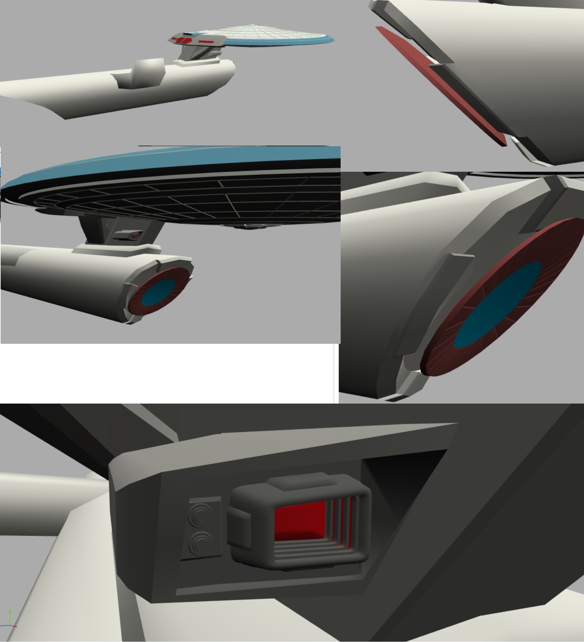
The engines were originally going to be big ones at the side but my attempts at that always looked too late period (more like the sovereign). Eventually I settled on a more direct Connie/Excelsior hybrid. Two central, Connie-esque ones with a large impulse crystal above it, two thin side ones like original excelsior but spaced a bit more out, and a single excelsior esque fin in the middle.
The hull another thing it took me a while to decide on, but I really quite like what I ended up with, it reminds me of the Excalibur from ST:O.
For the forward torpedo launchers, there was an obvious spot on the neck, so I split the Connie style in half.
The deflector went through a couple of variations, I went for an exposed one as a bit of a throwback. It was originally going to be copper on the back and glowing on the front, but while fiddling around with it I coloured the front bumpy bits copper as well and liked the result. In hindsight its a bit voyager-esque, but hey the idea for this ship is Federation engineers playing around so there you go.


The idea for this, as yet unanamed ship, is something along the lines of a halfway point between the Excelsior and the Connie, or possibly a connie replacement using bits of Excelsior aesthetics.
I started with a saucer, as you do, and a basic bridge and sensor dome. I had a bit of trouble deciding on a neck, originally I was going to go for a wide excelsior esque one but it didn't look right. Then a thin connie one, then I had the idea of two seperate angled necks (which almost transitioned into an oversized Oberth look), but none of these quite looked right. Eventually I settled on this hybrid design, which looks interesting to me, still has a bit of bulk to it but isn't too thick, and I can buy as a halfway point to the thick Excelsior style.
The engines were originally going to be big ones at the side but my attempts at that always looked too late period (more like the sovereign). Eventually I settled on a more direct Connie/Excelsior hybrid. Two central, Connie-esque ones with a large impulse crystal above it, two thin side ones like original excelsior but spaced a bit more out, and a single excelsior esque fin in the middle.
The hull another thing it took me a while to decide on, but I really quite like what I ended up with, it reminds me of the Excalibur from ST:O.
For the forward torpedo launchers, there was an obvious spot on the neck, so I split the Connie style in half.
The deflector went through a couple of variations, I went for an exposed one as a bit of a throwback. It was originally going to be copper on the back and glowing on the front, but while fiddling around with it I coloured the front bumpy bits copper as well and liked the result. In hindsight its a bit voyager-esque, but hey the idea for this ship is Federation engineers playing around so there you go.
Post edited by Fennius on
Tagged:
Additional credits
- Icons from Font-Awesome
- Additional icons by Mickael Bonfill
- Banner background from Toptal Subtle Patterns
© Scifi-Meshes.com 2001-2024
Posts
I've actually further tweaked the size since this picture, making the bridge not quite so tall and isntead reducing the size of the secondary hull slightly - as is, the hull is pretty much halfway between the Excelsior and Connie.
The RCS thrusters are actually a bit closer to a TNG era style, but I couldn't get the TMP style ones to look good, so I think this works better.
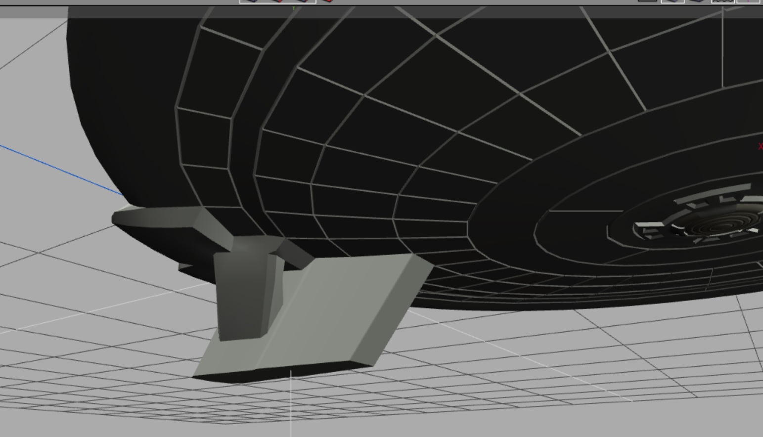
There was no space on the neck for a connie style docking port, but I wanted one on the saucer (and I may put one on the hull too). Didn't work making it flat because the rim is at too big an angle, so I assume the doors open to allow a tube to the actual airlock.
For the shuttle blister, its a bit bigger looking than the Excelsior's, though on the E thats actually the secondary bay.
First attempt at the pylons, I kinda like them, but there's definitely something not right about them.
Opinions are fine, I'm asking for them here.
edit: I am considering Magellan class for a name, though that works better for a pure explorer, and I see this being more of a Connie-esque heavy cruiser
edit: I've also now edited the RCS thrusters to be more era-appropriate (after watching Yesterdays Enterprise and noting that even the Ambassador class had them with yellow borders rather than solid yellow)
I'm debating how to do the nacelles.
Unfortunately I do appear to be reaching the limits of what my surface can cope with before slowing to a crawl, so if needs be I'll migrate it to my actual PC (which I hardly use any more, I prefer working on this machine).
I am....unsure?
(Frankly, the straight engineering section made the ship look much like Star Trek bits stuck to a paper towel tube.)
You could probably pinch the front end of the engineering section down quite a bit as well (in reference to the TMP 1701 deflector surround).
I think another improvement can be made here by matching the forward-leaning angle of the saucer neck to the forward-leaning angle of the front of the engineering section. I would probably make the former match the latter to give it a more agressive look.
I think that one of the things which makes the Excelsior so interesting is that, from the top, the engineering section looks huge, but from the side it largely disappears. This makes the entire ship just as dramatic as the saucer without unbalancing the design by making it bottom-heavy. I hope you have good luck meshing that with the TMP Connie. I wonder if you'll end up with something much like the TNG Ambassador
Yeah I think what happened is I had the primitive version sitting there as a placeholder for so long while I worked on other bits, I just got used to it, so when I finally gave it some shape it didn't look right!
Hmm, I'm less certain about that, though I can give it a try. It may make it flow a bit better, but I do kinda like the big look to it, it gives it something more unique about this ship, rather than just being a connie with excelsior details. (Which I know is what I said I was aiming for!)
Yes, I think you're right there, especially since the rear angles match fairly well. Should make it sleeker too.
It'll lengthen it, but I'm considering shrinking the nacelles a little as I think they're a tad too big.
Huh. I was about to say I hope not as I'm not too fond of the ambassador, but I looked at it and....yeah I've basically made the ambassador in a different era
I could try scooping out more at the back, but I think it might spoil the lines. I was also considering flattening out the top a bit.
That dullness makes it nobody's favorite, but it does provide an excellent example of a well-crafted mash-up of styles. It's inoffensive and dull because it is so well proportioned and has consistent, comfortable aesthetics.
But, you're probably right to resist making one.
The flat top in the engineering section would probably work really well! And then, you could find a unique saucer stem to work with that combination. You might even get that double stem you were contemplating to work by continuing the outer faces of each stem from the sides of the engineering section.
Smoothed the hull, angled the enck a bit more and moved it foreward, slightly repositioned the torp launchers, and I redid the defelctor area with more detail and a slight shrink (also a cleaner mesh).
I much prefer the Propert version, I don't like the engineering hull on the YE one.
The flattopped engineering bit doesn't seem to be working but I till have a few things to try for details and such.
Oh I also put nav lights on the saucer too, but you can barely see them here.
The primitives bit is a concept for an TOS ship that popped into my head while I was looking at reference pictures - basically the kelvin but with two nacelles. Though I might move the deflector to the front of the saucer NX style and either put some other detail on that bit or two deflectors (some versions of the NX refit have that iirc). weirdly though I still don't have a name I like for the big one I instantly came up with a name I liked for this one - Lochland class.
I figured I'd try with the program proper and poke the lighting setup.
Granted the texture I applied went....weird, but hey I wasn't really trying and haven't actually read the manual yet.
(Its also not the full model - I tend to work with it halved to save on polycount, and this was just a test render so meh. But thats why half the bridge is missing
Also, I'm never quite sure how my textures are going to come out. I have no feel for roughness or reflection.
But, your issue is pretty entertaining! It's sort of a cubist's hull texture, complete with extreme shadows.
Is that the engineering section or a peek at the front of a nacelle at the bottom?
Yeah I don't know what happened with that texture but its a really interesting look! Doesn't quite suite a Trek ship, but I could see it being used deliberately in something.
If it proves a pain I'll have a look at other ones, but this is the first I've tried that seems reasonably intuitive. Though i I can't sort the texture problem thet'll be annoying.
Thats the front of the nacelle. its quite a dynamic looking shot and if I was doing it properly there'd be more than just the one light dumped in to test it, so the engineering hull would be at least a little visible.
May have gone overboard on the colours. I also moved the belly phasers foreward, but I might move them halfway back again.
I seem to have officially reached the limit of my surface, so I've migrated to the desktop. Figured I'd try a test render on it, trying once again to slap the textures on.
However I think Kerkythea is indeed too slow because I started that 4 hours ago
So.....Renderman?
No idea whats making the textures do that beyond me not doing anything more complicated than telling it "use texture" :P
As you can see, I didn't notice the shadow the phasers cast until after it had rendered
edit:
GLOW!
I may have overdone the glow
edit again:
Textures working! (better)
However as test renders go, I like it!
How big was the actual image you (didn't) ask? Here.
The light is still a bit grainy when you zoom in, but I love the way the colours mix.
That said, I took a break from it to start on the Lochland.
It was going to be a TOS style one, but I accidentally hull detailed. Literally, I was trying to put a very basic TOS style grid on it and the selection went weird but it gave my this pattern which I really like. but as a result of that I widened the saucer and am making it a bit more Kelviny
I'm in love with hwo the lights behind the deflector look (even if they are a bit christmassy
Edit:
and some more work on the Lochland's deflector. I really love how its turned out. I'm seperating the materials for the rear lights though so I can turn them down a bit while still having a nice bright glow from the front.
The shuttlebay is based very heavily on a fan render of the Kelvin, which I later noticed made up all the details
I'm picturing the Lochland as somewhere in that Kelvin-TOS era, but it is definitely meant to be a Prime Timeline ship even if I'm using some Kelvin details (it is afterall, presumably in the Prime timeline too). Nacelles in particular, while I kinda like the gold cap with sidelights on the kelvin, I would want proper bussards. Though I'm undecided exactly what look I'd go for (I do quite like the multicoloured Axanar ones actually)
also started work on secondary hull detailing.
The shuttlebay is actually missing one more red light near the bottom of the alcove, which I forgot to put in at the time.