Greetings!
Welcome to Scifi-Meshes.com! Click one of these buttons to join in on the fun.
Quick Links
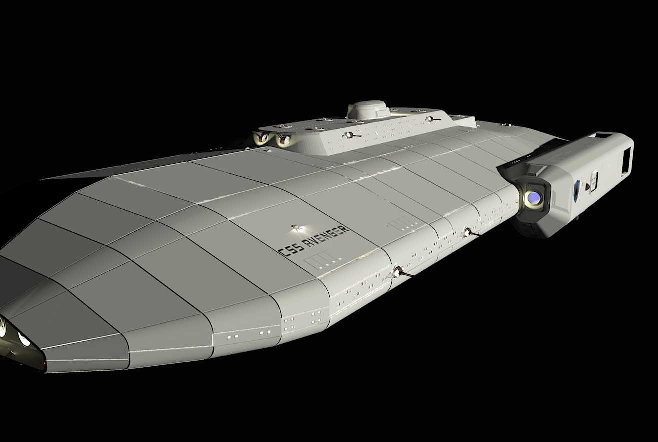
3DCSS Avenger 1st test render


Hey all-
I've been working with Sketchup and Twilight Render, learning as I go. I am in the process of making a capital starship for the cover of a novel I'm writing (third in the series), and am at the point where it's time to submit to suggestions and criticism of the design. Most of the hull features I can explain in-universe, and I'm not a big fan of greebles just for greebles' sake. I can spot a few of the errors that need fixing right away, but even at medium+ render it took 11 hours at this higher resolution, so I just let it go and I'll fix some of the items later.
I already see issues with some of the lights being too bright or too dark, plus light leaks on the hull where my external armor plates were set on top of the 1st hull layer. I think they're coming from where the armor plate groups cut through the 1st layer, and simply running the intersect faces commands should fix that. As a side note, I am running a Core 2 Quad Q9400 at 3 ghz, 6 GB RAM, with a GeForce GTX 260. This is a good system, but renders take forever. Does this seem normal, and are high res or progressive renders going to take all day?
I'm stuck on hull texturing though. I haven't applied any yet, as you can see, and I want a metallic surface that's been painted. I've tried using several different bump maps for texturing, but it always comes away with a stucco feel that just doesn't quite sit right with me. Anything shinier and it looks fake. I plan to use several shades of gray to give the panels some detail, but I don't want to overdo it because in-universe, those are external armor plates that are designed to be easily replaced if damaged and I really imagined them as large singular castings. I think I definitely need to change the color shade on the lifeboat hatches as well.
I think I'm close to a final color scheme for the main battery also. If you look closely at all the AA/Point Defense tubs on the upper gun deck, you'll probably ask what all the red is for. I just colored the AA guns red as a placeholder color to make them stand out while I was installing everything else.
The Avenger has twin fore-to-aft, fly-through hangars on the underside as well, something I'll highlight in another render.
Just for those of you who like to scale, the decks are 9 feet tall, with a 1 1/2 foot mechanical space in between. The glass portion of the windows is 3'8" tall. I built it from the inside out so that I'd have a ship that scaled out rationally. Total length is about 1700 feet.
Comments welcome, as well as any suggestions on hull textures I could try... I've also applied some decals, though you can't see the carbon scoring on the thrust reversers well from this angle.
Thanks for any advice; I've been lurking for a long time and am continually blown away by what you folks put together!
Cheers
Ryan
Post edited by Captainjerky on
Tagged:
Additional credits
- Icons from Font-Awesome
- Additional icons by Mickael Bonfill
- Banner background from Toptal Subtle Patterns
© Scifi-Meshes.com 2001-2024
Posts
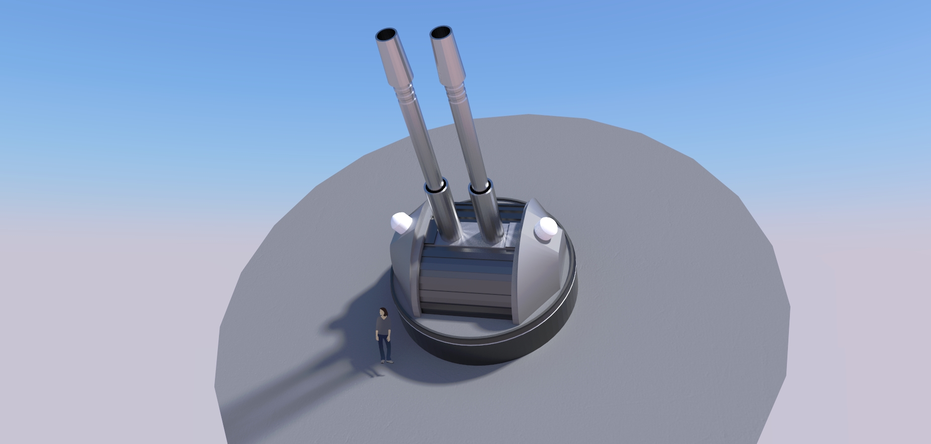
I do see an issue with the turrets, though: the way you've got them mounted will make it hard to aim them. Take a look at the Wikipedia article on gimbal lock, paying special attention to the section on gimbal lock in two dimensions.
Real world tanks and battleships can get away with simple altitude-azumith mounts because their targets stay near the horizontal plane . . . turret design for a fully three-dimensional battle space is a non-trivial challenge.
First, these are ship-to-ship batteries, so their traverse rates don't need to be very high. Also, I don't know if it's easy to see from the second pic I attached to my first post, but the barrels can go from one lock all the way through to the other, around 160 degrees of travel. When I first designed the turrets, it was something I did to make cloning and placing them easier, because all I needed to do was change the elevation of the barrel group, but I realized it was much more practical in the model to also have barrels that could run all the way 'over the top' of the mount and down the other side. With the base rotating, that covered a lot of ground, although I do agree that it's probably not the perfect solution. Phaser strips or something akin to that would be better, but I'd already decided on my tech base.
One thing you should be happy to see, then, is my point defense/AA battery, attached below. It's designed to swivel all over without any mechanical stops to give it problems, modeled on the basic design of the CIWS turrets on modern naval warships.
Please keep asking if you wonder why I have done things a certain way; this project has been sort of consuming! I'm working on the bridge module at the same time as this, as well as trying to finish the novel that this model will be used on the cover of. I could lose entire days working on these things, but then the kids would go hungry and my employer would probably be unhappy with me!
Thanks again!
ps- CSS stands for Confederation of Systems Ship! But I like the Cascading Style Sheet idea as well... Might have to think up some guys who use a computer themed acronym like that!
Quick opinion question for you. I'm attaching my latest render of the hull. I'm running into a limitation of Sketchup and Twilight. I want to do a sort of Aztec-style hull plating, plus I need an actual hull texture as well. I can't do both on top of each other, so I've applied the bump map to the hull and have manually added the different colored panels to the model itself for the Aztec pattern. I need to tone down the bump map a bit; it's a little too noticeable, but does anyone have any opinions on the hull the way it looks right now? Too much, too little, etc?
I am working on the AA guns next, you can see four of the gun tubs in the picture. I tried lighting one of them with a light ring, while the others had spotlights shining just on the gun, but that effect washes out badly if I have sunlight showing on that part of the model. I figure I can always do close-up shots of the gun tubs to show their layout as well.
Thanks for any input...
I've been playing with Photoshop post production, and here's the first pass. I think it seems a bit blown out, but I'm posting it here since, after all, this is the work in progress section. I decided against trying some sort of Aztec'ing pattern on the hull. First off, it just didn't look right to me. Second, the large segments are supposed to be replaceable armor panels that can be swapped out if damaged or penetrated, so it stands to reason there would be a uniform, uncompromised surface.
I should have masked out the gray background, and will use Twilight's Alpha mask feature to do that on the next go-around.
Any thoughts?
I am torn with the hull- I want to have some more detail, but anything I lay down that looks like a grid pattern gets warped or skewed by Sketchup and then Twilight when it's on a curved surface. I am trying to increase the scratch map just enough to get a noticeable surface texture without it looking grainy in closeups. Additionally, I've found it easier to 'dirty up' the hull using photoshop afterwards using layers or difference clouds. I was thinking of trying to vary the color of the large armor plates by a tiny amount to reflect their individual nature...
Any suggestions are very appreciated!