I love the bridge. It's really small, maybe a secondary brigde?
The orange walls of the sickbay strongly remind me on the recreation deck of TMP. I'm not sure if this color works well in a sickbay.
Fantastic work! The only thing I would say is, based on your image file names, that as this is a Miranda-class vessel would they really have 20+ medical beds? We've never seen that many in any sickbay. But despite that I really love what you've done. I really need to set aside some time and learn Blender...Google Sketchup is proving both annoying and limiting.
Note: The bridge above is not for Potemkin herself, but for a possible "ship of the week" in a later episode.
Only the sickbay belongs to the Constitution Refit that's used throughout the series.
BTW: The numbers don't mean what you think they do. http://imageshack.us/photo/my-images/198/twokhd0543.jpg/
The TMP era Constitution class had at least two identical sickbay units, hence "26" for "unit 2, bed 6", similar to how even a small hotel can end up having a room 203.
[edit]
A few more images:
That top-down shot may look weird, but the layout is an amalgamation of real concept drawings.
[/edit]
Wow! I remember seeing some of these on deviantART a while back. I didn't realize this was your work.
Awesome as always. I LOVE those sickbay chairs and the colorful orange take on things. Looks like it's right out of the Phase II (real Hollywood version) set design. So 70's!
Thanks lennier1, that all explains a great deal and makes perfect sense. It's nice to get such an answer as opposed to waffle and misdirection. And I learnt something new about Trek that I didn't before. Bonus.
Cool stuff, dude. I didn't know you were working on Project Potemkin. I like that series. I think they're doing a great job with the limited budget they have. I really like the sickbay a lot.
It's funny, I was looking at the bridge and noting how "compact" it looks and I thought of Potemkin's bridge set. Then, when I saw in the text that it's for that project, it all makes sense.
Looking nice, agree on the color for sick bay, i think a blue would be better suited. blue's been shown to be a calming color and i think that's what you'd need with sick people
Yes, just as Basil said, we decided on the orange tones instead of the original colder blue ones from TMP/TWOK, because they look more 70's. The decision for the warmer tones was partly made to fit in with the other decisions, which gave Potemkin a much less advanced bridge and uniforms that are more a mix of Phase 2 and TMP than anything else.
Speaking of the bridge, she originally started out as a quick sketch, which I liked and in turn used to slap together a quick test render that was then reduced to a more 70's-like version and further reduced to what the budget allowed (pics).
I'm getting a very Phase 2 vibe off the sets. Which I suppose is perfect for it, given your mention that they're meant to be somewhere 80-90% along the way from series 1701 to TMP 1701. I also say keep the orange, it looks nice and really helps with 'dating' the ship's era*. Plus, it helps pull it away from looking too much like the Enterprise's interiors whilst still looking comfortably Constitution.
*as in, making it look mid-to-late seventies designed, not making it look dated.
Speaking of the bridge, she originally started out as a quick sketch, which I liked and in turn used to slap together a quick test render that was then reduced to a more 70's-like version and further reduced to what the budget allowed (pics).
I like the TUC color scheme, but I also like your final version. We've seen from the movies and shows that not every bridge has the same color scheme.
Potemkin's bridge is cool, but it's by no means a professional looking set. However, it's a group of Trekkies making due with what they have, which is mostly a lot of enthusiastic volunteers. Plus, it is still a nice set and it gets the job done. I've been following production of the series since it was in development and I've got a lot of respect for them and what they're doing.
Love your work as always, it's very cool and 70's ish and it's one of my favourite aspects of Trek, that TMP/Phase 2 look is possibly one of the best scifi looks other than, of course, TNG
I'm glad you like what you see.
As much as I like the designs from TNG to Generations there will always be a special place reserved for the TMP era and the still rather unexplored lost era in-between. Then again, Andrew Probert and Rick Sternbach are some of my favorite designers in the franchise, which probably explains a lot.
@tobian: Thanks! Coming from someone whose science fiction interiors look as good as yours, that's quite the compliment.
@Starship: Thanks, Cassio. Most of those images are rather old, but once this big project at work is complete, the sickbay scene will hopefully get me back into action.
I've always rated your interiors, I have several of them in my inspiration folder and yeah I am a huge fan of 70s-ness too, having been brought up with 70s scifi, it also holds a special place in my heart too!:)
The overall diameter of the room is 36ft (18ft radius to where the wall meets the floor in the upper left section above), so from the rest of the dimensions in that diagram (including the ones I extrapolated out), you should be able to get accurate measurements for every part of that set. Note that the new TFF/TUC computer stations fit entirely within the curved walls of the older set (you can get a good sense of that in shots showing the turbolift alcoves). These screenshots should also help:
@Sean: Great! Those measurements should prove quite useful the next time I build a bridge at the normal scale.
In this case, the Miranda bridge up there is that cramped on purpose so it's in line with the cramped live action bridge.
And also thanks for the advice on the sickbay. Now I know what has been bugging me about the corridor.
Hopefully, my job will soon allow me to continue the work on that sickbay set once the current project is completed (second software project in a row that has taken over three months due to its large scale).
I can't really take credit for the lighting. Nowadays things have become a hell of a lot easier thanks to utilities like global illumination and light-emitting materials. A lot more comfortable than when we had to fake that back in the day, but also more heavy on the CPU.
BTW: Sean, would you mind if I used some ideas from your Romulan bridge (the gray one) for something I'd like to build after the sickbay set?
Feel free to take inspiration from anything I've done - that's why I posted it in the first place. ;-)
Regarding the Miranda set, I presume you're referring to the one from TWOK? Believe it or not, it's the exact same set as the Enterprise from the same movie, but with a single centered turbolift alcove flanked by two protruding sections where the original alcoves were. Exact same diameter, etc. (all other parts were the same, save for some additional junky-looking stuff chucked in to make it feel more utilitarian).
Feel free to take inspiration from anything I've done - that's why I posted it in the first place. ;-)
Thanks! I've always wondered what a more detailed version, combined with some elements from other Romulan/Reman interiors would look like. That's part of the reason.
Regarding the Miranda set, I presume you're referring to the one from TWOK? Believe it or not, it's the exact same set as the Enterprise from the same movie, but with a single centered turbolift alcove flanked by two protruding sections where the original alcoves were. Exact same diameter, etc. (all other parts were the same, save for some additional junky-looking stuff chucked in to make it feel more utilitarian).
Actually, I was talking about the TFF-style Miranda bridge I posted earlier. That CG set has a reduced diameter to make it feel similar to the fanfilm project's bridge and the involved budget constraints.
The Romulan bridge is something I have planned for when the sickbay model and a small TOS-era scout bridge (preview below) are completed.
The blue main color is actually another homage to one of Sean's old projects (the Kickstart bridge). With all the interior projects (and educational posts) he has contributed to this community over the years he more than deserves a tribute every now and then.
Tons of work, almost no spare time and then my desktop died on me piece by piece (first the RAM, then the video card and finally the mainboard).
Here's a test render with the new system.
Thanks to all the blurred reflections it still took 98 minutes for s simple 480p image.
I don't even want to think about what the old system would've needed!
Posts
The orange walls of the sickbay strongly remind me on the recreation deck of TMP. I'm not sure if this color works well in a sickbay.
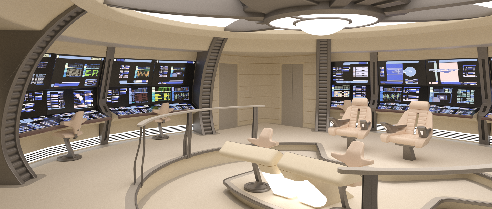
@akb: The bridge is for a different ship, as I mentioned in the initial post. Only the sickbay belongs to the Constitution Refit that's used throughout the series.
BTW: The numbers don't mean what you think they do. http://imageshack.us/photo/my-images/198/twokhd0543.jpg/
The TMP era Constitution class had at least two identical sickbay units, hence "26" for "unit 2, bed 6", similar to how even a small hotel can end up having a room 203.
[edit]
A few more images:
That top-down shot may look weird, but the layout is an amalgamation of real concept drawings.
[/edit]
Awesome as always. I LOVE those sickbay chairs and the colorful orange take on things. Looks like it's right out of the Phase II (real Hollywood version) set design. So 70's!
It's funny, I was looking at the bridge and noting how "compact" it looks and I thought of Potemkin's bridge set. Then, when I saw in the text that it's for that project, it all makes sense.
Yes, just as Basil said, we decided on the orange tones instead of the original colder blue ones from TMP/TWOK, because they look more 70's. The decision for the warmer tones was partly made to fit in with the other decisions, which gave Potemkin a much less advanced bridge and uniforms that are more a mix of Phase 2 and TMP than anything else.
Speaking of the bridge, she originally started out as a quick sketch, which I liked and in turn used to slap together a quick test render that was then reduced to a more 70's-like version and further reduced to what the budget allowed (pics).
*as in, making it look mid-to-late seventies designed, not making it look dated.
I like the TUC color scheme, but I also like your final version. We've seen from the movies and shows that not every bridge has the same color scheme.
Potemkin's bridge is cool, but it's by no means a professional looking set. However, it's a group of Trekkies making due with what they have, which is mostly a lot of enthusiastic volunteers. Plus, it is still a nice set and it gets the job done. I've been following production of the series since it was in development and I've got a lot of respect for them and what they're doing.
The bridge looks great!
I'm glad you like what you see.
As much as I like the designs from TNG to Generations there will always be a special place reserved for the TMP era and the still rather unexplored lost era in-between. Then again, Andrew Probert and Rick Sternbach are some of my favorite designers in the franchise, which probably explains a lot.
@tobian: Thanks! Coming from someone whose science fiction interiors look as good as yours, that's quite the compliment.
@Starship: Thanks, Cassio. Most of those images are rather old, but once this big project at work is complete, the sickbay scene will hopefully get me back into action.
The proportions of the bridge appear to be off - it's stretched too tall relative to the diameter. This blueprint should help:
http://webolutionary.com/startrek/constitution_refit/ph2-xsec.jpg
The overall diameter of the room is 36ft (18ft radius to where the wall meets the floor in the upper left section above), so from the rest of the dimensions in that diagram (including the ones I extrapolated out), you should be able to get accurate measurements for every part of that set. Note that the new TFF/TUC computer stations fit entirely within the curved walls of the older set (you can get a good sense of that in shots showing the turbolift alcoves). These screenshots should also help:
http://webolutionary.com/startrek/enterprise_st5_bridge/index.html
http://webolutionary.com/startrek/enterprise_st6_bridge/index.html
There is also one glaring issue with your corridor set - the non-angled wall should always be on the inside of the curve. See here:
http://webolutionary.com/startrek/corridors_tmp/index.html
http://webolutionary.com/startrek/constitution_refit/sttmpblue1.jpg
Hope that helps; keep up the great work.
@Sean: Great! Those measurements should prove quite useful the next time I build a bridge at the normal scale.
In this case, the Miranda bridge up there is that cramped on purpose so it's in line with the cramped live action bridge.
And also thanks for the advice on the sickbay. Now I know what has been bugging me about the corridor.
Hopefully, my job will soon allow me to continue the work on that sickbay set once the current project is completed (second software project in a row that has taken over three months due to its large scale).
I can't really take credit for the lighting. Nowadays things have become a hell of a lot easier thanks to utilities like global illumination and light-emitting materials. A lot more comfortable than when we had to fake that back in the day, but also more heavy on the CPU.
BTW: Sean, would you mind if I used some ideas from your Romulan bridge (the gray one) for something I'd like to build after the sickbay set?
Regarding the Miranda set, I presume you're referring to the one from TWOK? Believe it or not, it's the exact same set as the Enterprise from the same movie, but with a single centered turbolift alcove flanked by two protruding sections where the original alcoves were. Exact same diameter, etc. (all other parts were the same, save for some additional junky-looking stuff chucked in to make it feel more utilitarian).
Actually, I was talking about the TFF-style Miranda bridge I posted earlier. That CG set has a reduced diameter to make it feel similar to the fanfilm project's bridge and the involved budget constraints.
The Romulan bridge is something I have planned for when the sickbay model and a small TOS-era scout bridge (preview below) are completed.
The blue main color is actually another homage to one of Sean's old projects (the Kickstart bridge). With all the interior projects (and educational posts) he has contributed to this community over the years he more than deserves a tribute every now and then.
Here's a test render with the new system.
Thanks to all the blurred reflections it still took 98 minutes for s simple 480p image.
I don't even want to think about what the old system would've needed!