Greetings!
Welcome to Scifi-Meshes.com! Click one of these buttons to join in on the fun.
Quick Links


Additional credits
- Icons from Font-Awesome
- Additional icons by Mickael Bonfill
- Banner background from Toptal Subtle Patterns
© Scifi-Meshes.com 2001-2024
Posts
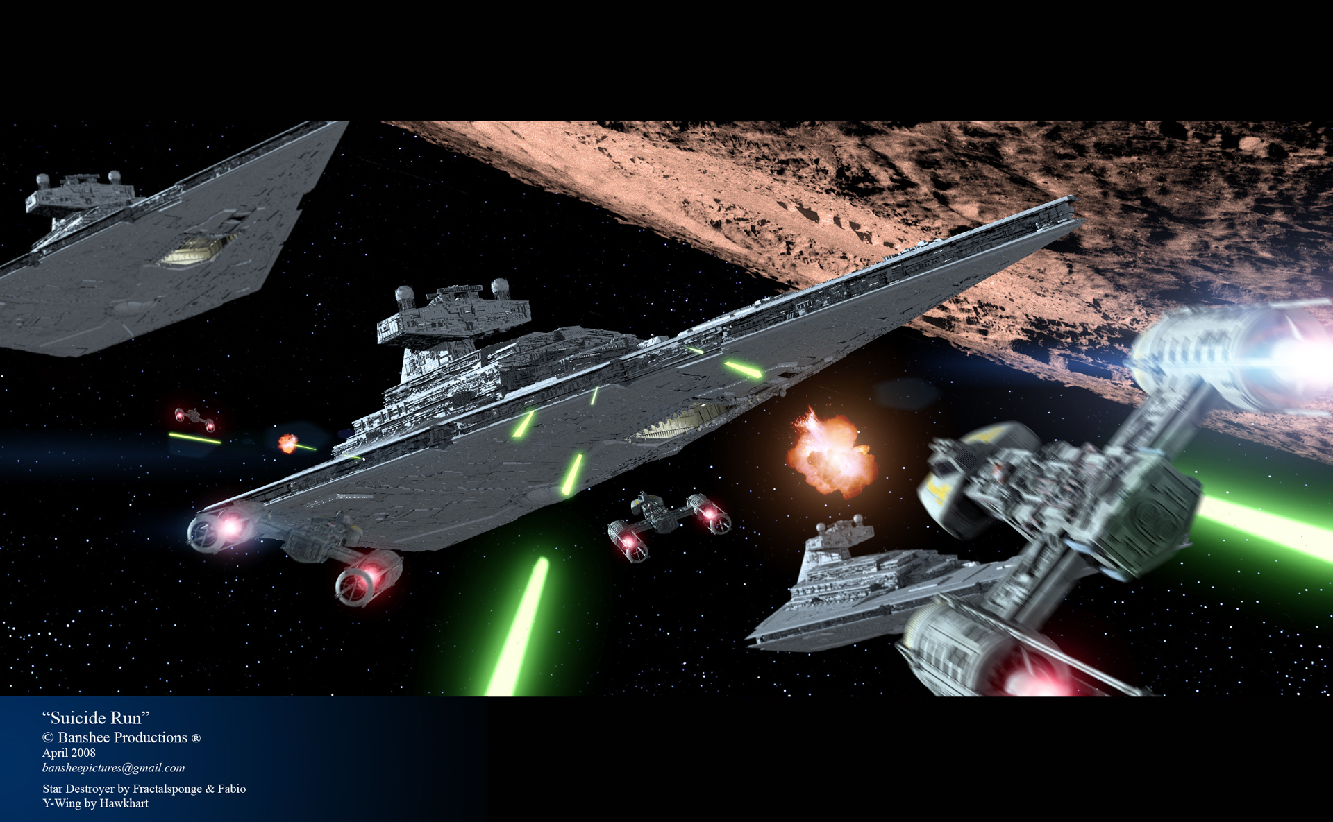
I don't understand why only one Y-Wing has motion blur - now it appears as if the others are standing still. Is that on purpose?
Additionally the plpanet looks odd, although I can't point my finger on the reason. Somehow the surface structure does not match the rest. It appears to be not scaled correctly or to rough and to much contrast. Anyway, it looks very odd.
However I very much like the Explosion ( more!
EDIT: P.S. It's looking really nice on my desktop these days!
I originally had the moon more grayish, but it was blending in too much with the Star Destroyers. I see what you guys are saying though. Guess I should have picked something else, huh?
Interesting note on the starfield, which is the same one I've used in my last few images, it was pieced together from hi-def screen grabs from A New Hope and The Empire Strikes Back.
Thanks again for the comments. Hopefully my next pic will be better.