Greetings!
Welcome to Scifi-Meshes.com! Click one of these buttons to join in on the fun.
Quick Links
3DOn Caernarvon Station


More stuff from Wing Commander! ")
The nebula is not mine, for the life of me, I can't find the source for it.
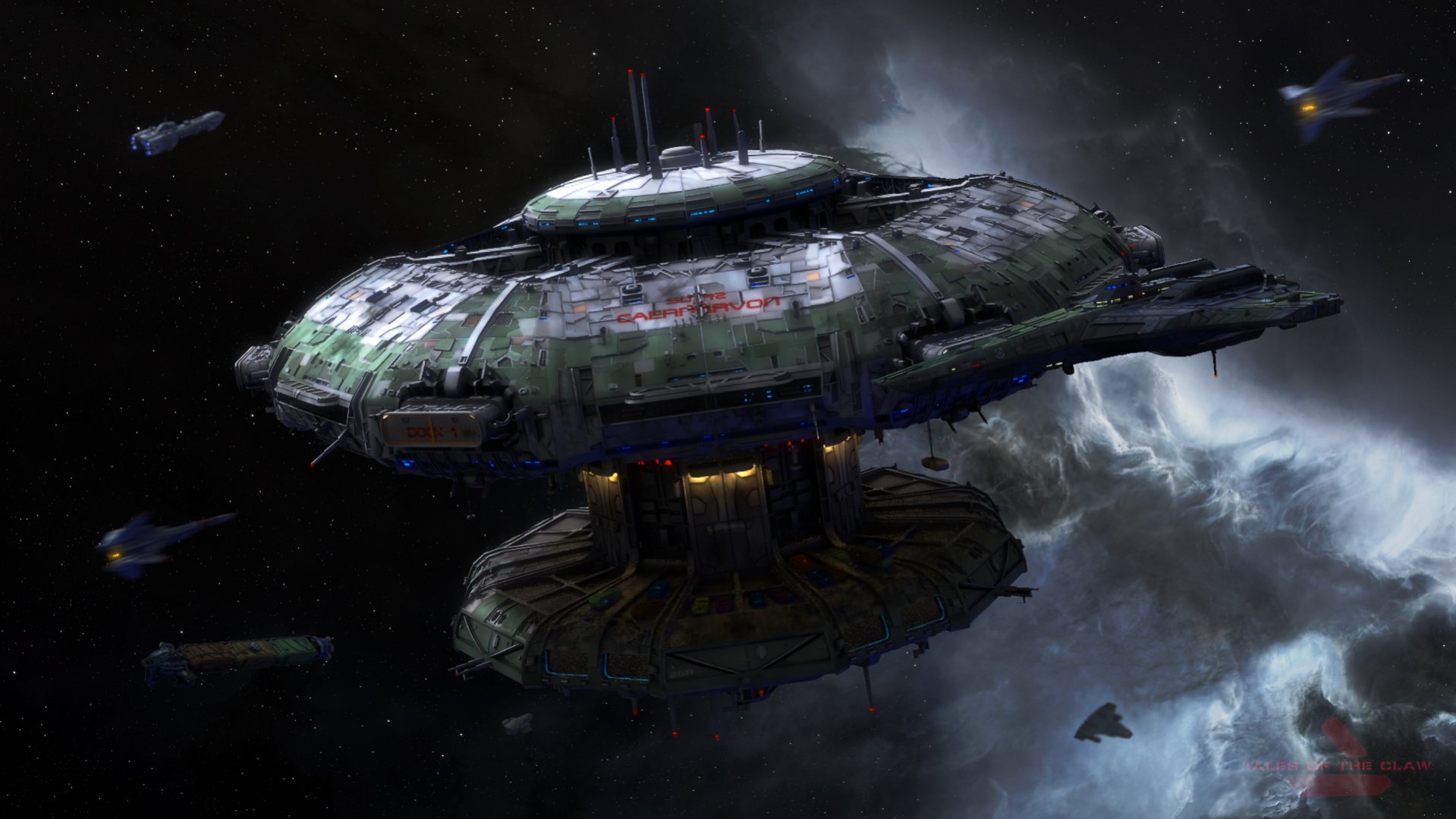
The nebula is not mine, for the life of me, I can't find the source for it.
Post edited by Klavs81 on
Tagged:
Additional credits
- Icons from Font-Awesome
- Additional icons by Mickael Bonfill
- Banner background from Toptal Subtle Patterns
© Scifi-Meshes.com 2001-2024
Posts