Greetings!
Welcome to Scifi-Meshes.com! Click one of these buttons to join in on the fun.
Quick Links
2DSpiral War Cover Artwork


Since I now have, almost, all the elements for the cover ready I am going to start putting it all together.
Elements will/may include:
('3x Splicer 1000s (modeling and textures complete, scene render TBD)
('3x Characters (Line drawing completed by Alex Villareal, I will then digitally paint them in PS)
('1x asteroid based o'neil cylinder academy/colony (modelling in progress, may or may not include)
Background (I am debating using a public domain image, as in the mock up or digitally painting my own)
Text (Completed, my redesign and refine)
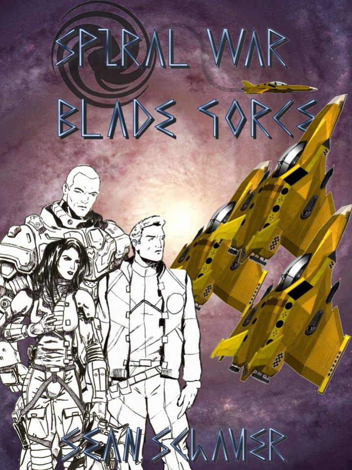
Here are the two current mockups, the sizing and positions of the characters and other elements may change and I appreciate any feedback.
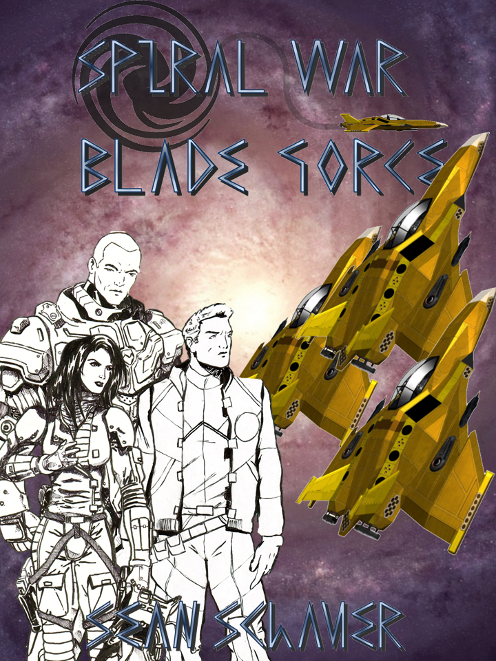
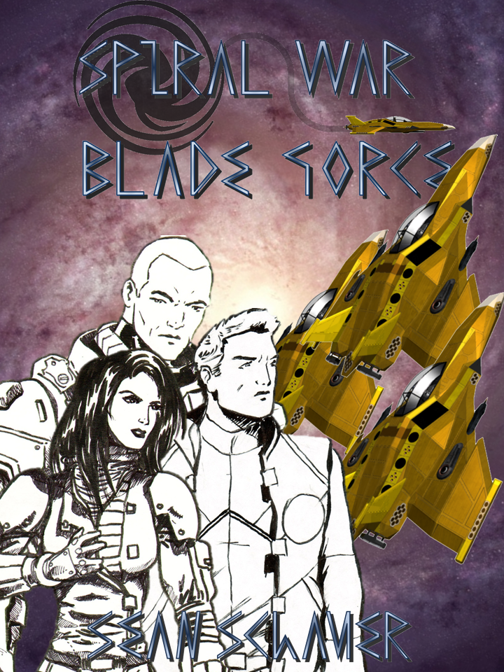
I kind of prefer the characters being larger but then a lot of Alex's work gets obscured/lost, hmmm.
Here are the Characters individually. This will be my first time digitally coloring/painting characters in a long time so I will appreaciate any helpful feedback.
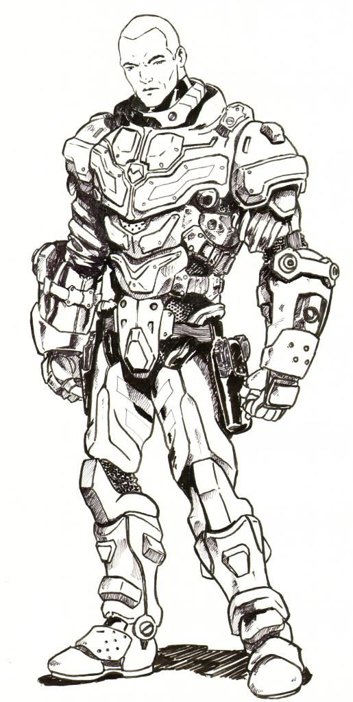
Alex designed Arion's armor, and I like it, though his is bulkier then it would be on other characters.
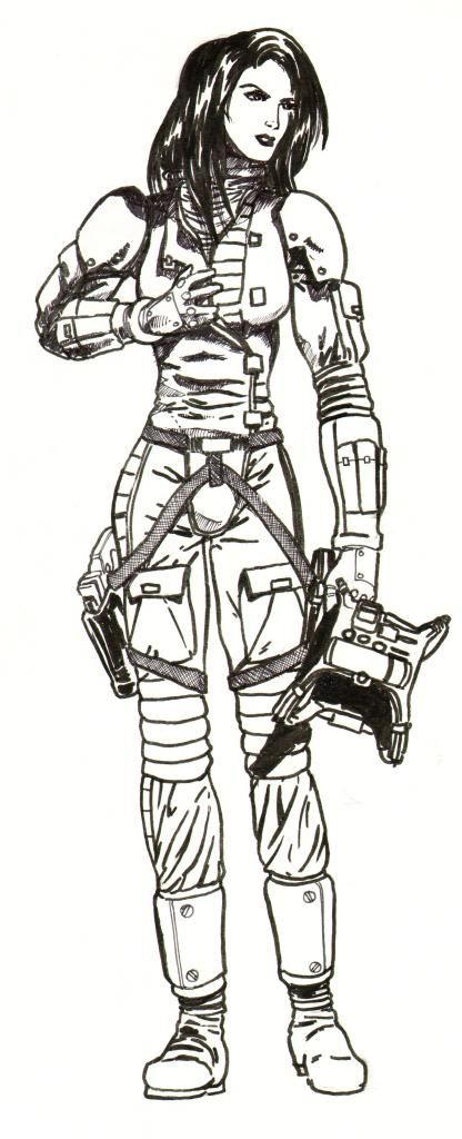
Marda's flight suit is my design and Alex brought it to life fantastically, too bad we couldn't work the helmet in though.
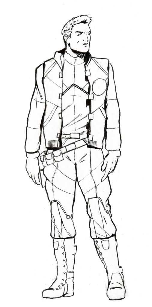
Blazer's duty uniform was a collaboration with Alex working off my description and poor sketches, but I like it alot.
Elements will/may include:
('3x Splicer 1000s (modeling and textures complete, scene render TBD)
('3x Characters (Line drawing completed by Alex Villareal, I will then digitally paint them in PS)
('1x asteroid based o'neil cylinder academy/colony (modelling in progress, may or may not include)
Background (I am debating using a public domain image, as in the mock up or digitally painting my own)
Text (Completed, my redesign and refine)
Here are the two current mockups, the sizing and positions of the characters and other elements may change and I appreciate any feedback.


I kind of prefer the characters being larger but then a lot of Alex's work gets obscured/lost, hmmm.
Here are the Characters individually. This will be my first time digitally coloring/painting characters in a long time so I will appreaciate any helpful feedback.

Alex designed Arion's armor, and I like it, though his is bulkier then it would be on other characters.

Marda's flight suit is my design and Alex brought it to life fantastically, too bad we couldn't work the helmet in though.

Blazer's duty uniform was a collaboration with Alex working off my description and poor sketches, but I like it alot.
Post edited by Knight26 on
Tagged:
Additional credits
- Icons from Font-Awesome
- Additional icons by Mickael Bonfill
- Banner background from Toptal Subtle Patterns
© Scifi-Meshes.com 2001-2024
Posts
slicer 1000 (this is the type isn't it??) fighters would give enough space to add in another type of craft without cluttering the cover.
seen your character illustrations now they are coloured, very cool.
FYI the mustard yellow scheme is because the characters are cadets in this book.
@EG: Thanks, I am still learning as I go a bit here so I don't expect pro quality results, so long as they look good you know?
@SF: I may consider putting something in the background, right now I am thinking the academy itself with maybe an enemy sip near it. As for any other craft, maybe the back cover can get a few, but I don't want to crowd a clutter up the front cover, if it's too busy it may detract people.
Forgot to point out a couple of other things...
With the yellow of your craft and the yellow of the armor/flight suits the cover may lean toward being almost obnoxious. What if you were to keep them as smaller silhouettes more in the background? I think it would balance it out more, especially if the ships were above the title. I, too, would suggest a different font. Something like Bank Gothic maybe? Anywho, just some ideas for ya.
Anyway here is the first pass on Blazer's shadowing. I like how the body is coming out, but the face can definitely use some work, especially the highlighting.
Thoughts?
I experimented a bit with textures on the clothes, skin and hair then toned down the original line art, trying to make it look more like a painting, not entirely sold on it. It also really highlights the the areas that the paint did not cover, but I can easily correct that. I will have to watch some more tutorials on where to go next.
However, theres a lot of colour clashing going on with that yellow/orange. And the text is a bit difficult to read at the buttom since theres little contrast between those bright values.
Perhaps changing the colour of the clothes or the craft? From what Im gathering, the characters are to be the main focus, so you'll want our eyes to automatically go to them, then flow to whats going on in the background.
The background is all my creation now, I followed a tutorial on how to draw a spiral galaxy.
I also resized and repositioned the title, subtitle, and my name, and the characters.
Finally I darkened the fighter/trainers, I still plan to render them again later to create their final image.
Thoughts?
FYI:
Characters: hand drawn and inked by Alex Vilareal, colored in photoshop by myself
Text: Created in MS Visio
Splicer-1000 Dagger Fighter/Trainers: Modelled and rendered in AutoCAD
Galaxy Background: Photoshop
Image Composition: MS Powerpoint
The darkening of the fighters, really does less their focus/attraction of attention and makes the characters really pop and stand out. Im really worrisome about all that yellow lol but I could just be picky >.<
Also, becare with that mass of white in the middle. It actually kinda of works since, it draws your eyes to the character faces, but you dont want it to blend in too much if that makes sense.
Overall looking good Knight, and Im totally totally loving those character drawings.
nice work on the character art.
Maybe something like: Over half the fighters looked like they were old fleet relics and did not wear the mustard yellow of the dedicated trainers. As Blazer walked by one such craft, he saw that the academy sigil was only hastily plastered over the old squadron insignia.
Of course that brings up a new sticking point, the fighters have no markings, I will have to correct that, and come up with an academy logo as well.
Any votes on new colors for the fighters? Also I am debating making the text more bold in appearance and maybe changing the color of it as well, any thoughts?
I then composited them into the cover art to confirm size, position and color, thoughts?
There is also a change to one character, who can spot it first?
new fighter colour scheme is cool and a great improvement on the previous one. good choice to alter the angle of the galaxy, though one that looks more like hubble photographs of a galaxy could be better. text still hard to read, and an enemy fighter could be dropped in behind the leftward end of the title. overral nice.
As for the background, I can make adjustments to it as well, but want everything in this to be unique and something I created and not use even any public doman imagery, so no hubble pictures.
@SF, quit begging for an enemy fighter, if I decide to do so I will. I also still have a back cover to do.
maybe make the galaxy more like this in brightness/hue/intensity. http://i.dailymail.co.uk/i/pix/2011/07/18/article-2016050-0D0EA9E100000578-960_964x580.jpg
you can always experiment by dropping images like this in, just to give you a guide.