Greetings!
Welcome to Scifi-Meshes.com! Click one of these buttons to join in on the fun.
Quick Links
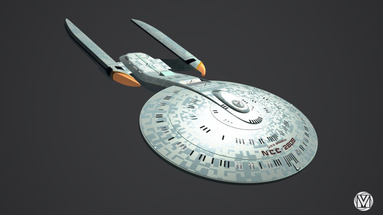
3DU.S.S. BRASILIA
Hi to all again.
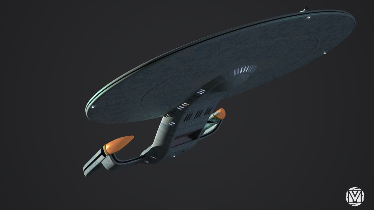
This was more of an modeling experiment rather than design (but Im really happy with results of the form/shape). Majority of the modeling was done more loosely. Decks for instance are not spaced evenly nor precisely. And many of the details are still missing, like deflector antenna (whit which Im stuck).
Ship info:
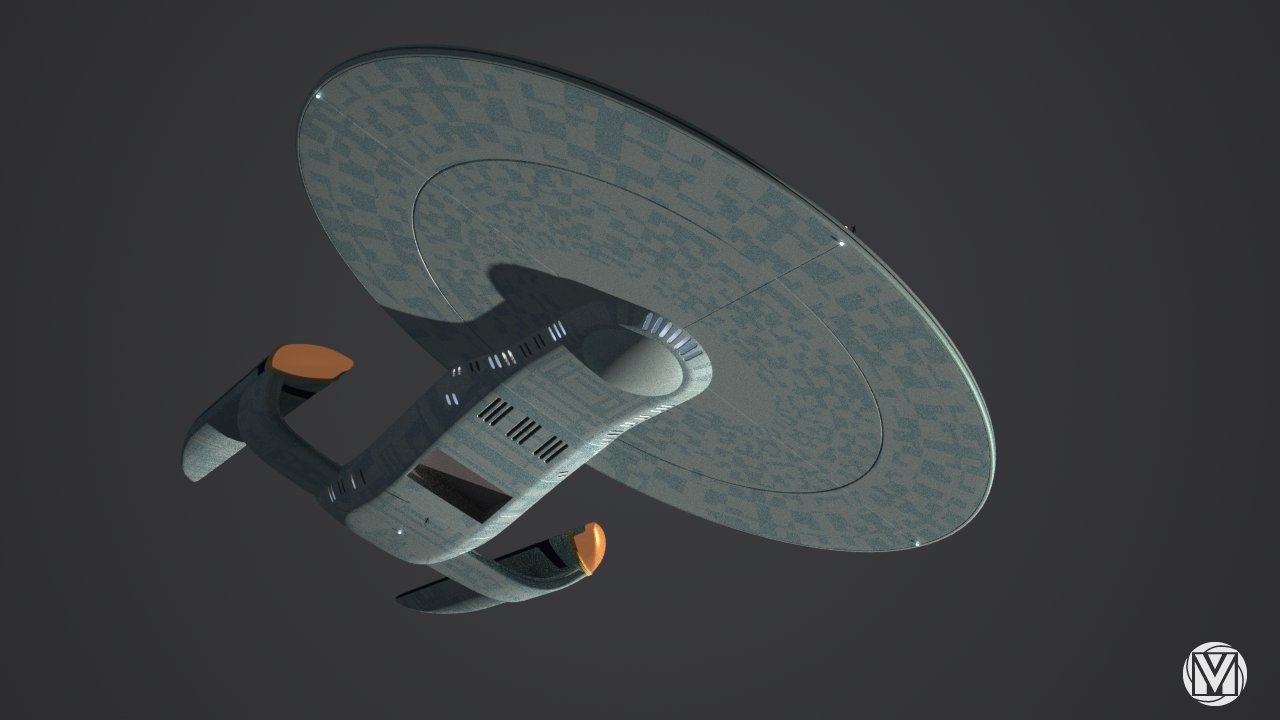
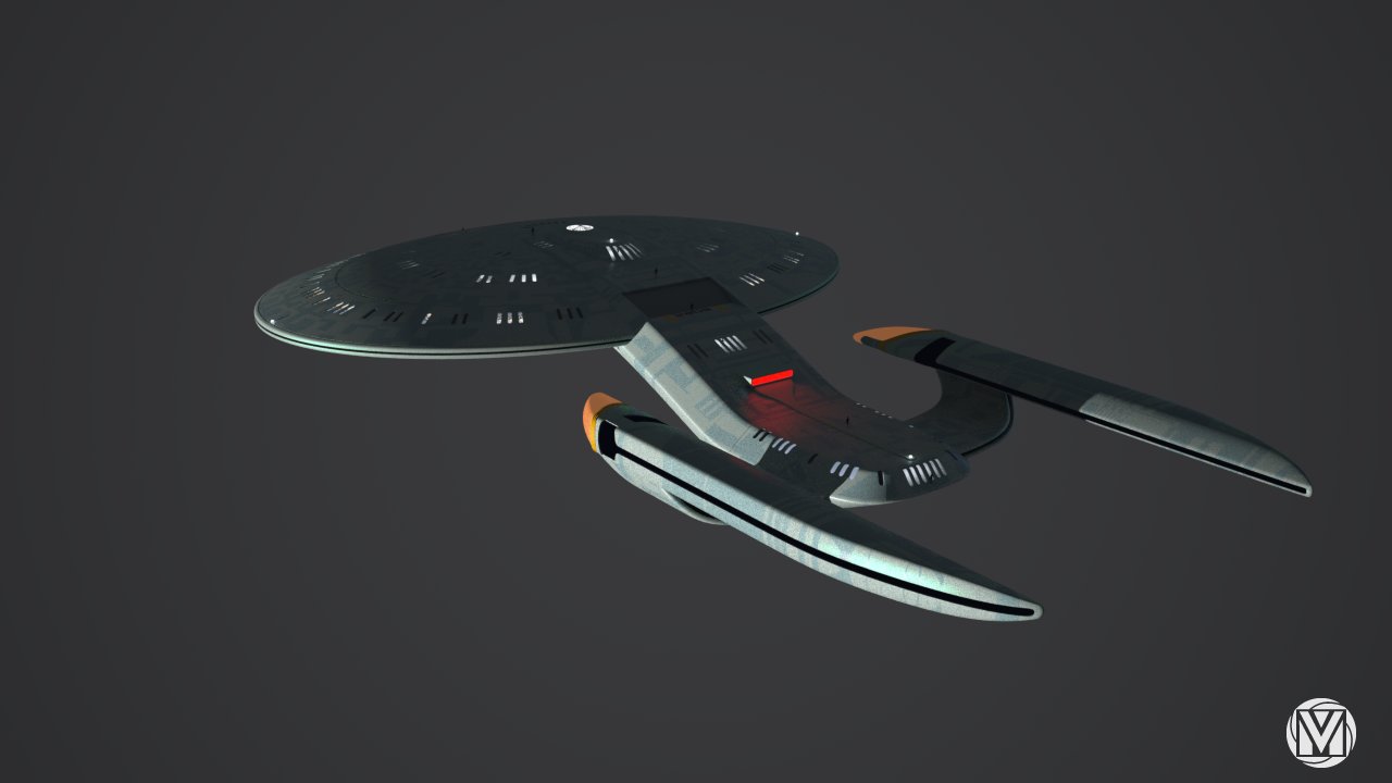
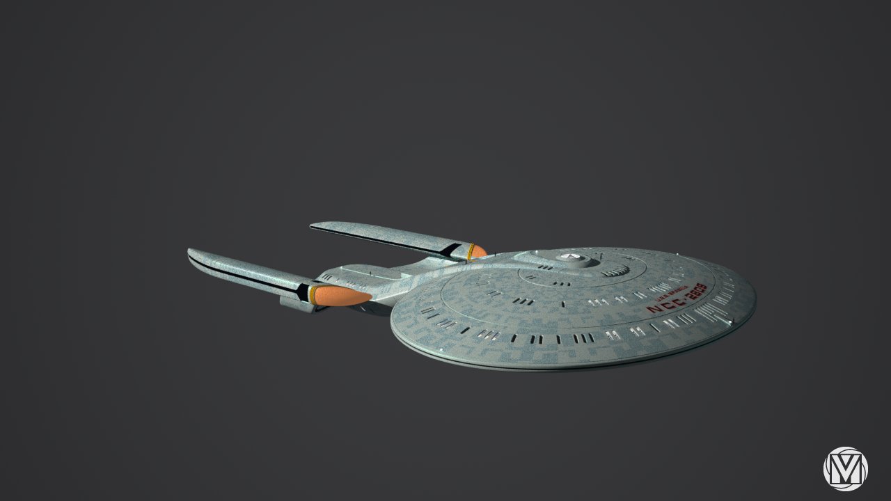
U.S.S. BRASILIA class (Im not from Brasil but this was nice name that came to me") ), is a small ship. About 186 m long ,126 m wide and 30 m in height. It also have one large shuttle bay.
), is a small ship. About 186 m long ,126 m wide and 30 m in height. It also have one large shuttle bay.
Brasilia0053.jpg Brasilia0054.jpg Brasilia0055.jpg Brasilia0056.jpg Brasilia0057.jpg Brasilia0058.jpg Brasilia0059.jpg Brasilia0060.jpg Brasilia0061.jpg Brasilia0062.jpg
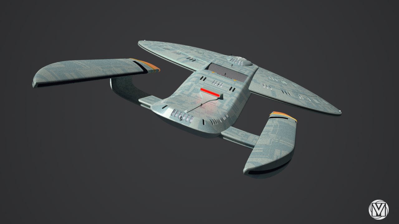
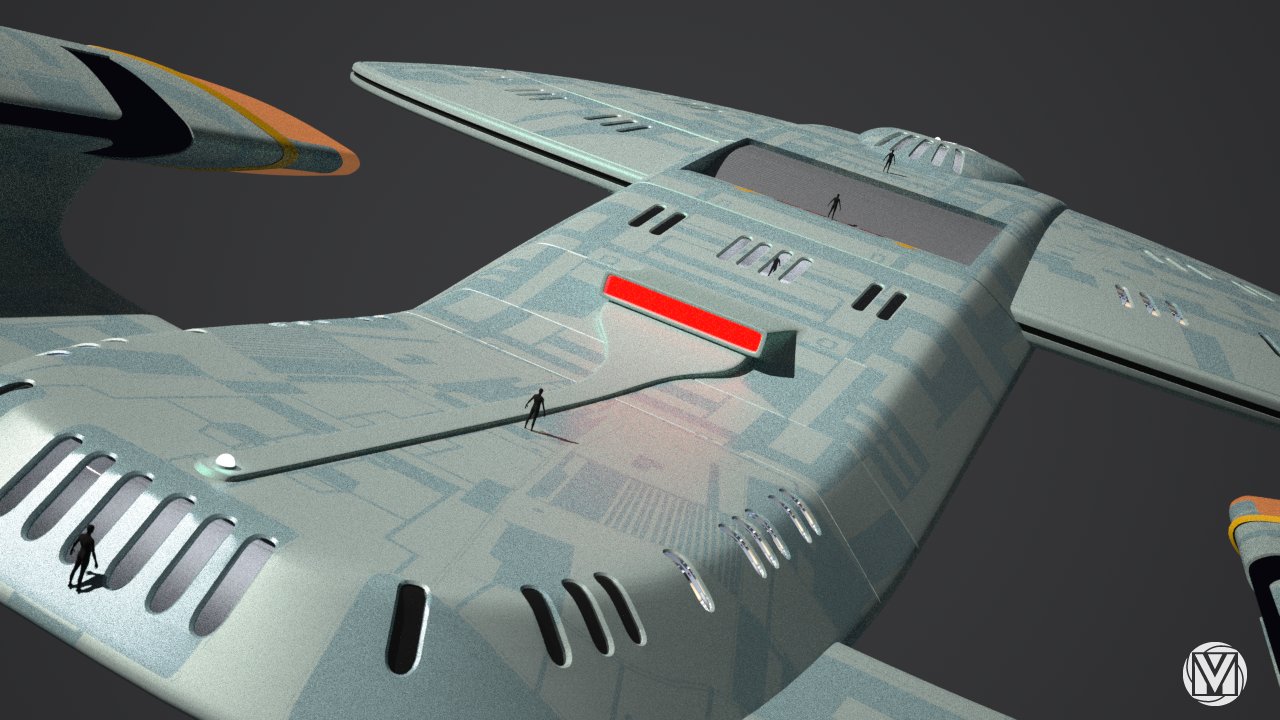
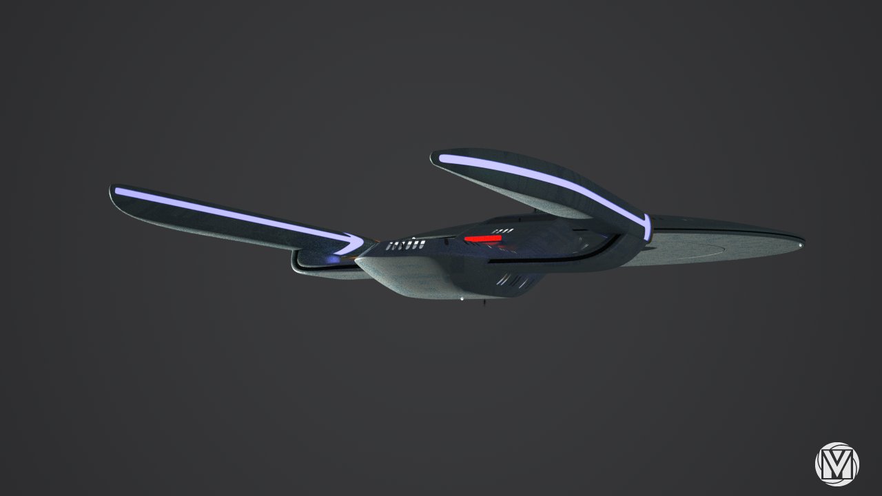
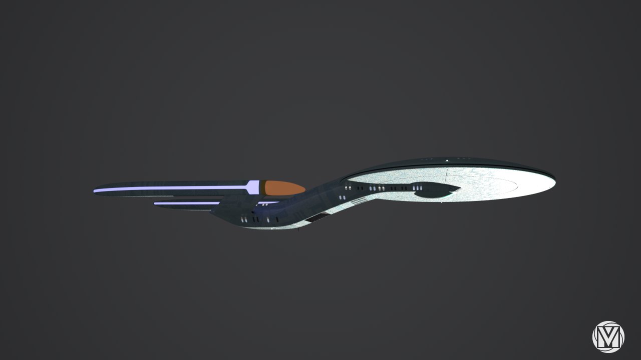
This was more of an modeling experiment rather than design (but Im really happy with results of the form/shape). Majority of the modeling was done more loosely. Decks for instance are not spaced evenly nor precisely. And many of the details are still missing, like deflector antenna (whit which Im stuck).
Ship info:
U.S.S. BRASILIA class (Im not from Brasil but this was nice name that came to me
Brasilia0053.jpg Brasilia0054.jpg Brasilia0055.jpg Brasilia0056.jpg Brasilia0057.jpg Brasilia0058.jpg Brasilia0059.jpg Brasilia0060.jpg Brasilia0061.jpg Brasilia0062.jpg
Post edited by vmblast on
Tagged:
Additional credits
- Icons from Font-Awesome
- Additional icons by Mickael Bonfill
- Banner background from Toptal Subtle Patterns
© Scifi-Meshes.com 2001-2024
Posts
Brasilia0063.jpg Brasilia0064.jpg Brasilia0065.jpg Brasilia0067.jpg
And few old ones with better view of some details.
Brasilia0018.jpg Brasilia0033.jpg Brasilia0035.jpg Brasilia0050.jpg
Thank you very much and I appreciate that you've noticed Andy's influence. I hoped that I've picked up few tips and tricks from him while working on the F (still in progress -he's working schedule is pretty hectic)
I certainly hope so with all my hart. The last 20 years studio just smashed all that ST and particularly Federation stands for. This would pull it back to the more simple, benign and softer features -something that is really embodiment of the Federation (and what was ruined during this whole period -including JJ's).
USS Kubitscheck sounds like a good name for a sister of her.
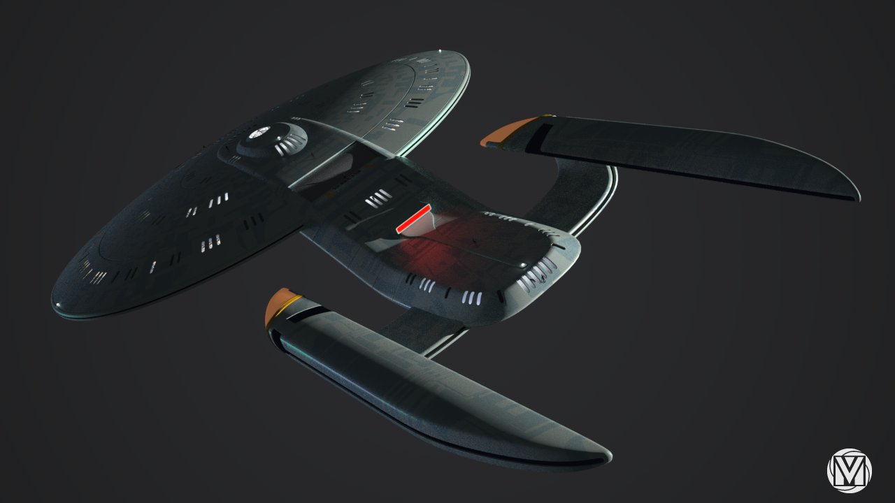
The ship is to much interesting, and I see you follow AndyAâ steps. :thumb: I just donAât like that much of the naceles,especially the bussards. I think it could be redone and improved, but to do it or not to do it, is your decision of course.
for the nacelles you could try chopping the sharp edge off - leaves there general triangular ness but gives you a better looking edge - the ends well jsut less pointy
Maybe adding escape pods and other details from latter designs will make it look less anachronistic.
Yes it is
As much as some politician is a good and honest guy, he is still politician and as far as I'm concerned I would never name any ship by them (I have really low opinion about politicians in general). Tho this guy would be far better choice for sister ship
Thank you
Yes the saucer is standard -my initial design comes from practicality. Since ship is really small, there is no room for any unnecessary spaces or curves. So in a way, it is really an oval with rounded box attached to it
From this point I could only say thank you for that notion, since I would really like that last 20 years could have been erased. Also as I mentioned in one of the replies, I wanted to pull -back- the design to the more simple, benign and softer features, something that is really embodiment of the Federation (as Gene Roddenberry imagined)
It was just experiment concerning some techniques. Since Im working on the 1701-F, I really wanted to test some of them, so I know what to do when we get to the detailing part
Thank you about kind words. Tho the F is really different class and its a huge ship in compare to this one. Also I wish that we have finished F (or at least gotten far into detailing), because Im sure that you would see it in different light. When you have just a raw -chopped- shape, it always looks awful
The -pointy- sharper look of the entire nacelles is there to give contra-balance design of the overall oval and softer look of entire ship and also to give you subconscious picture and feeling of the speed and agility. Also I am pretty happy about how they turned out. Tho, you are right there are some of the details that I could tweak a bit on them
The deflector is not there lol
Thank you
The espace pods from later era (those triangular ones) are just too impractical. I actually think that pods (rectangles) from TNG era are far more practical for its function. Since escape pod has only one function (to preserve life), every design stunt is completely unnecessary. Distribution of space in rectangle-like is far more efficient than in triangle-like.
However, Ive still not made any decisions about escape pods at this moment.
I understand your point. IAâm with you about politicians. Is hard to know how honest a politician REALLY is. Even Kubitscheck, but I think the name sounds good, by the same way you choose BrasA-lia.
Thank you
Yeh that was me. I am working with Andrew Probert (not Setrnbach) on the new Enterprise F model. The soul successor to the famous D and we are trying to pull back to the classy, elegant, curvy and soft design features for the the 25th century. Unfortunately for that project, Andy is really busy guy and I hope that he'll have more time for the F in the near future.
There will be some more of his design directions that Im working on (beside the F). I'll try to upload some wip model soon
D'Oh! For some reason I always get those two confused. Anyway, if you other stuff is only half as good as this, you can be sure to have a lot of fans here.
Thnx again
I just wanted to add that I didnt want to emphasize that because of Andy but because of Sternbach. I really, really dont like his design work on spaceships. In my opinion (these epithets are just too soft) he has just too boxy, wood-log-type design, with too much unnecessary details. However I think he did wonderful job designing federation weapons and pads (grandfather of apples iPad