Greetings!

Welcome to Scifi-Meshes.com! Click one of these buttons to join in on the fun.

2DStar Trek: The Motion Picture Poster Artwork

Jonny BoyJonny Boy1 Posts: 0Member
edited September 2013 in Finished Work #1
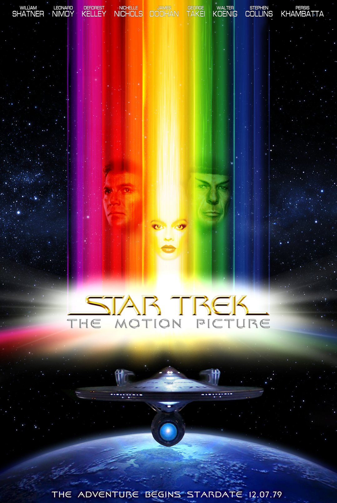
Hi all! It's been a while since I last posted my own work on the boards. Due to an injury which kept me off of work for a while, I have had several weeks to catch up on the amazing work being posted here. So today I thought I'd throw something up here that I've been working on.

I got inspired by the release of the Complete Score for Star Trek: The Motion Picture earlier this year to take a crack at sort of recreating that classic poster art for the movie. Admittedly not a great movie (though it did have great ideas), the artwork for this poster has always been a favorite of mine, and I thought it would be fun to try my hand at a modernized version. This is pretty much the finished product. I'm back to work now and won't have time again, so I'm abandoning it here lol. Hope you guys like it!


tmp_poster_art.jpg
98821.jpg
Post edited by Jonny Boy on
JES
Tagged:

Posts

  • evil_genius_180evil_genius_1804256 Posts: 11,034Member
    Not a great movie?! It's an underrated masterpiece. ;) That movie is Gene Roddenberry's vision of what Star Trek should be. Unfortunately, his vision and the studio's vision were two different things, that's why he was canned and replaced with Harve Bennett for the next 4 films. (they used the convenient excuse that he spent too much money making it) But, there are people with different opinions on the film, so I digress. ;)

    Great work on the poster, it looks accurate. :D
  • homerpalooza67homerpalooza67228 Posts: 1,891Member
    Personally, i found the whole movie boring - and im a major trek fan.
    It had great potential, and there were some fantastic shots, and the rebuilt enterprise was just gorgeous, inside and out, but i just couldnt make myself like it. :p
    the visual f/x were fantastic, however

    ETA: great poster, but you left out spock's one-finger salute :D
  • BolianAdmiralBolianAdmiral1115 Torrance, CaliforniaPosts: 2,567Member
    I have to agree, that TMP is the worst of the classic Trek films (not including the abortion that was JJ-Trek). It was nothing more than a Trek version of 2001... just a bunch of special effects set to hours of music. And like 2001, I have never been able to make it through TMP without falling solidly asleep once they enter V'Ger. It was just a boring and dull film. It would have made a great episode or novel, but as a movie... no. Star Trek: The Slow-Motion Picture. :p

    As for the poster... that is a beautiful bit of art there... very well done!
  • NanoGatorNanoGator1 Posts: 0Member
    We have one of hte original posters at work. I've looked at it a lot... mainly during meetings. :D One detail from it I think you should consider here is that all the lights on the ship have a streaky effect as well.
  • Jonny BoyJonny Boy1 Posts: 0Member
    Thanks for all the kind words, everyone! Evil, I didn't mean to start yet another TMP debate ;) I like many things about the film, and love a few, such as the score by Jerry Goldsmith. And the Enterprise, oh, the Enterprise... but I digress lol. I think that the film's ambition and originality are outweighed by the limitations of time, technology, and money. I think the film was trying too hard to be 2001-Meets-Star Trek, instead of "Star Trek Goes To The Big Screen". The director's cut makes up for a lot of the issues, but still can't overcome the sometimes awkward, sometimes wooden performances, and the pacing issues. Oddly enough, I think that if The Motion Picture had been made by Harve Bennett or someone else, I think it would have turned out more like J.J. Abrams Trek, and that wouldn't have been bad ;)

    NanoGator, I actually almost did that, but I just couldn't figure how to do it and make it look good. I played with some things, but I just wasn't happy with how it actually looked and how it affected the overall balance of the whole thing, so I went with just a clear beauty shot :)
  • saulteniansaultenian331 Posts: 0Member
    Love it...I commissioned Tobias for the bottom image...looks fantastic.
  • Jonny BoyJonny Boy1 Posts: 0Member
    Necro post? Lol, I couldn't help tinkering today, and I never felt completely satisfied with the last version. I suppose since this is a scratch-built re-make, I won't ever be completely happy with it. But I think I can live with this one lol. Enjoy!

    yoU0AVrs.jpg
  • saulteniansaultenian331 Posts: 0Member
    Wonderful. Glad that you used the Tobias Richter image (I commissioned it from him).
    The only thing that is a bit odd is Kirk looks too sad....
  • Jonny BoyJonny Boy1 Posts: 0Member
    Ok, I lied lol, here is the final final version, plus an iTunes album art version, for good measure.

    rc4rvni.jpg F9s3CLY.jpg
  • Jonny BoyJonny Boy1 Posts: 0Member
    Wonderful. Glad that you used the Tobias Richter image (I commissioned it from him).
    The only thing that is a bit odd is Kirk looks too sad....
    Thanks! Glad you like it, though I think you may be confused about something. The Enterprise-Over-Earth part of the pic is from an HD screencap of TMP, with a little touch-up and some extra love from me. I'd love to see Tobias's version, though. I'm sure its spectacular.
  • NanoGatorNanoGator1 Posts: 0Member
    Very nice!
  • RandalRRandalR0 Posts: 0Member
    I think that is so cool.

    Thanks for sharing.Takes me back fer a moment..... :D
  • saulteniansaultenian331 Posts: 0Member
    Here is the image that I commissioned from Tobias...

    KirksBride_1920x1200.jpg

    Enjoy!
    103267.jpg
Sign In or Register to comment.