Greetings!

Welcome to Scifi-Meshes.com! Click one of these buttons to join in on the fun.

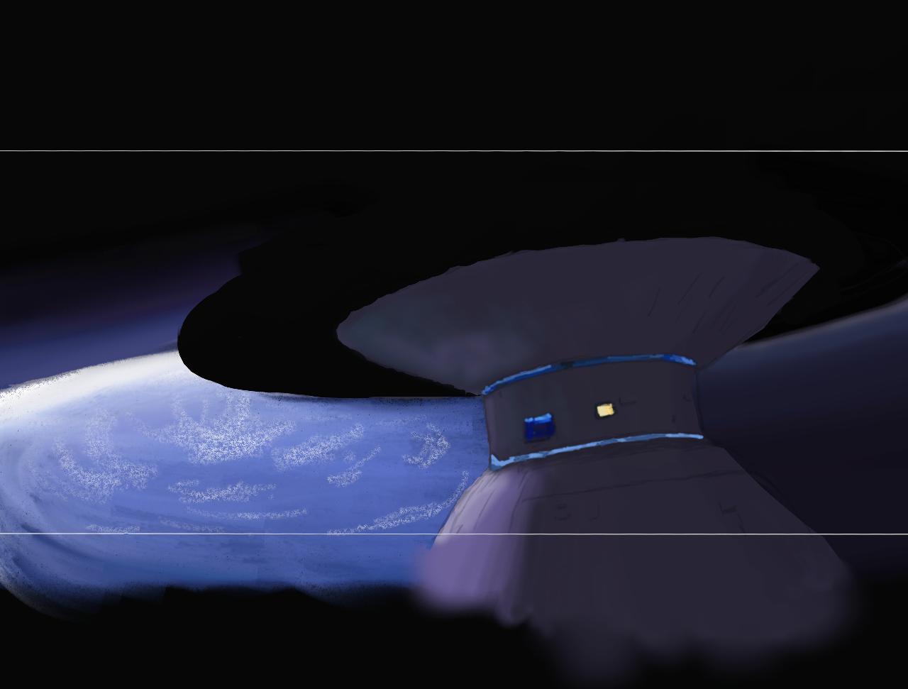
2D2d Stealing the Enterprise.. Artrage and Wacom tablet

Flibble42Flibble42331 Posts: 0Member
edited August 2010 in Work in Progress #1
Well it's been 17 years since i did anything creative and i can tell. Anything i had known has gone.
Anyway, this is my first effort with my new (for christmas) tablet, it's still a work in progress.
The one thing i have to keep reminding myself is "Don't try to make it photorealistic"

Hope you guys like it, any tips on using Artrage are welcome :)
83614.jpg
Post edited by Flibble42 on
Tagged:

Posts

  • IRMLIRML253 Posts: 1,993Member
    no tips from me, I've never been any good at painting, but I do love seeing people do it so I'll watch this one
  • somacruz145somacruz1450 Posts: 0Member
    Well I'm no expert in this but I think you should try to do as much as you can at first and then ask about specific stuff such as shadows, glows, textures etc.
    The image looks solid so far so just keep on it !
  • Flibble42Flibble42331 Posts: 0Member
    Latest update.. We have a moon.. and a bit more shading :P
    83627.jpg
  • Bmused55Bmused55177 Posts: 487Member
    That's looking perfect as is. You are the artist, you can add your own touches. The biggest mistake you can make is try to pander to everyones needs. Do it how you feel is right :)
    If folk want it to look like a screen grab, let them go get one from the film.
  • RekkertRekkert4069 Buenos Aires, ArgentinaPosts: 2,307Member
    Can't give you any advice, but it's looking great to me, keep going!
    For all my finished Trek fan art, please visit my portfolio
  • Looks really good, I'd tighten up the shapes of the station, make them less painterly, add some detail on the lighter side just to pick out some shapes and give the impression of more detail in the dark. The overall shading and tone is really good the shapes pop quite well, even if it wasn't a Star Trek scene I could tell what's the station and foreground and what's the planet/moon and background and image recognition is half the battle the rest is how far do you want to take the details, it's a solid start overall.
  • Flibble42Flibble42331 Posts: 0Member
    Thanks for the feedback. I really do want this to be my work, not a screen capture. I am just having problems with hand eye coordination on the Bamboo tablet, thats why some of the curves are very shakey. Yes i plan to add some surface detail, i just have to figure out how to do it in Artrage..

    So some tidy up and trying to rearrange layers...
    83671.jpg
  • Dr-TimelordDr-Timelord0 Posts: 0Member
    This is pretty good so far, cant wait to see surface details and then the enterprise
  • TovetteTovette5 Posts: 13Member
    It's a good start so far. It looks in some places you're attempting to add tiny details far too early in the development of the painting. At this stage you should be mostly concerned with form and lighting and color. In this sense, what I am saying is to basically paint the station with nothing on it. RENDER the form first; don't worry about anything else. It all comes later in stages.

    Lighting wise you've got the start of something good going- you have a nice ambient light on the bulk of the station and a nice hot spot where the sun is shining but I can see two big flaws in the lighting- your core shadow, the thick, black band where the least amount of light hits a curved surface is too far away from the key light (the sun light). The fall off of the key light should gradient into the core shadow and then ambient light. Make it a subtle core shadow though, because in space light is actually coming from all over the place.

    The second thing I see isn't so much a flaw as it is a shadow that's missing that will really help pop the form of your station- the cast shadow. Given the direction of the light on the moon there should be a nice crisp cast shadow from the upper disc raking across the bottom dome. Have the cast shadow (which is always crisp in space) cut right through the high light of the station that you have below. The sudden contrast of dark right against light will really help sell the shape.

    Also add a tinge of soft lemon yellow on the sunny side of the station- the sun is yellow after all, and the slight warm tones will help separate the station from the earth below since they are both using cool colors. :)

    The noise brush you are using for the clouds is far to crisp for clouds. Your best bet is looking up pictures of earth from orbit. Reference in anything is an artist's best friend.

    Remember, don't worry about details until later. You want to start with a big brush and work your way down. :) The composition is very good and has a strong Trek vibe to it.

    Keep up the good work :D
  • Flibble42Flibble42331 Posts: 0Member
    Because i am still trying to get my head around Artrage, i made sure to put the glows (Light strips and hanger bays) on a different layer, i was just having a go at the nice neon blue effect, they are by no means the finished article. I also put the guide lines on a seperate layer, they may not be part of the final image.

    Good points about the lighting, the reference image is a screen grab, which is not realistic in it's self. Not sure if i should try to make it more real worldly or stick with the inacurate feel of the movie.

    As for the clouds, my original idea was to do the image in chalks but the smudging didn't work as i liked so i switched to the airbrush tool, i did however like the chalk effect so i kept it.

    Thanks for the pointers..
    83677.jpg
  • CoolhandCoolhand287 Mountain LairPosts: 1,296Member
    good move with the layers, dont be scared to use as many as you want, you can always start collapsing them together if the files get big and slow... The more you get the hang of it and the confidence grows, the less layers you'll find yourself using. i used to use separate layers for colours, and highlights, shadows and it'd let me remix the image to keep a nice contrast level and offer more control, i dont tend to do that now but i found it useful. For example i'd use different blending modes, multiply for shadow layers, screen for highlights.. a bit like mixing 3d render elements. Its also very useful for transparent things like windows, canopies as i can paint reflections on a different layer, change how transparent they are etc, without affecting the room, or the cockpit behind the glass.
  • FlankerFlanker0 Posts: 0Member
    Good job and indeed and "practice makes perfect" as they say. Just use as many layers as you like, save reguraly and experiment and you'll get some nice results.

    I am posting a link (which I found useful tutorial wise) when working on planets and backgrounds. Perhaps they can help you to ;) http://www.solarvoyager.com/tutorials.asp again good luck and will be following this. (they are mainly for photoshop and 3dsmax but perhaps you artrage has similar effects)
  • Dr-TimelordDr-Timelord0 Posts: 0Member
    How is this coming along? Any news or updates?
Sign In or Register to comment.