Greetings!

Welcome to Scifi-Meshes.com! Click one of these buttons to join in on the fun.

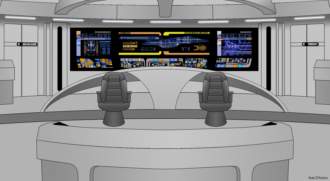
2DTrek Bridge Interior

84253842530 Posts: 0Member
edited June 2010 in Work in Progress #1
This is the main bridge from a Trek-based flash series I've been working on. I'm satisfied with my characters but I think my backdrops need work. I checked out one of the ENT Season 5 threads and was quite impressed with the scenes I saw there, but couldn't quite put my finger on what makes my scenes feel so plain in comparison.

My backdrops are drawn in Photoshop using the Brush and Gradient tools. I've considered using AnimeStudio to draw the backdrops to get cleaner lines, but I feel more comfortable in Photoshop. (I use AS for the characters, see avatar for example.) I just wish the lines in my backdrops were smoother. If anyone could give me any tips on what I could do to improve the look of my backdrops, I would be most appreciative.
59963.png
Post edited by 84253 on
Tagged:

Posts

  • B.J.B.J.1 Posts: 0Member
    I think I can sum it up in one word: DEPTH. Your backgrounds are technically right, but they lack any depth to the scene. I'm no expert on how to do this right, but adding in some gradients/shadows/lighting to the walls, floor and other objects would help immensely. I see that you already have some gradients, but it's still quite flat. Also, I've seen some comics that either blur or simplify the background when it's not the focus of the scene, and many times the background doesn't use any edge lines.

    What you have is a good start though, you just need to build on it.
  • EndeavourEndeavour331 Posts: 0Member
    Some color to the background would be nice, as well.
  • miss deemiss dee0 Posts: 0Member
    Look at the Dark Mirror picts for the depth, love the LCARS. Needs abit more colour / color
  • 84253842530 Posts: 0Member
    Thanks for the feedback, guys! Depth and color are now on my to-do list.

    @miss dee: I searched for Dark Mirror and found this thread. Is that what you're referring to? If so, I'm afraid I can't pick out what gives his images more depth than mine. Could it simply be the use of varied colors? I was hoping he may have images of interiors as well, but I could only find accessories and ships. Granted, I did not actually check every single page of the 96.

    If anyone else has feedback, or perhaps knows of some similar images, please let me know. I'm new to this and appreciate any knowledge that can be shared. :)
  • Dark SaberDark Saber1 Posts: 0Member
    Here is what they are talking about.
    Here is an example of a couple of bridge designs from my thread.

    I like the start that you have here. Keep up the good work.

    USSARESBRIDGE.jpg

    ISSARESBRIDGE.jpg
  • AresiusAresius359 Posts: 4,171Member
    hm, interresting mix of an Intrepid with a Galaxy bridge...

    Aa said, it needs depth and colour. And I suggest also more variety.
  • 84253842530 Posts: 0Member
    @Dark Saber: Thanks for the examples. Your pictures are very nice! The extra color and the higher contrasting gradients make it look much better. I hope those techniques can improve my backgrounds as well.

    @Aresius: I was never a fan of the Intrepid bridge's guard rails. I figured it was time for an adjustment. ;)

    Thanks to everyone for the feedback! I'll post the revised version once I modify it.
  • HellsgateHellsgate0 Posts: 8Member
    84253: I love your bridge design, though I'd reduce the width by half by making it a cross between the Intrepid-Class (with two side stations that face forward,) The Defiant-Class (Captain's Chair with it's own auxiliary LCARS touch-screens,) I love the Tactical station right behind the Captain's chair where Worf stood on the ENT-D. And the Helm/Flight-Con. station in the front should be like the Prometheus, sunken slightly. Otherwise, I like it. Is it a "Main Bridge" or a "Battle Bridge" design?
  • AresiusAresius359 Posts: 4,171Member
    For the first time, I second....
    :eek:
  • HellsgateHellsgate0 Posts: 8Member
    The Command chairs should be squeezed in closer to each other, just my $0.02. There should be three, not two chairs. Captain, Chief Medical Officer, & the last of the three reserved for an "Ambassador" / "Mission Specialist" / or the ship's "Chief Counselor". The X.O. should be a Tactical BEHIND the C.O. / C.M.O.
  • AresiusAresius359 Posts: 4,171Member
    Well, you can also live with 2 chairs, there's no rule of 3..
  • miss deemiss dee0 Posts: 0Member
    the head shrink can sit on the XO's lap
  • 84253842530 Posts: 0Member
    The tactical officer has traditionally been the head of security, under the operations division. This remains the case in ST:Mariner.
    The CO relies on advice from the XO and/or Councellor, and we've seen them sit together for this reason in TNG+VOY. Miss Dee suggested the Counsellor sit on the XO's lap, but in Mariner the Counsellor and the XO are the same person so we don't need to resort to lap sharing.
    I don't recall seeing a CMO stationed on the bridge; the CMO is only a supporting character in this series anyway.

    Thanks for all the suggestions so far. I did go with the sunken Conn station and I'm pushing things closer together so I can fit all the main characters in a single 16:9 shot. I'm nearing completion of my second version and I think you'll all notice the improvement in my coloring technique! I hope to have the next image done soon so I can get some additional feedback.
  • HellsgateHellsgate0 Posts: 8Member
    Can't wait to see what you've dreamt-up. Oh, & leave the M.S.D. area at the back blank so you can use this as a "Battle / Main Bridge" 'Mk. II' variant for all the newest non-canon vessels here at SFM.
  • 84253842530 Posts: 0Member
    Here is the second version. The contrast in the gradients is far more noticeable, the carpet is Ent-E blue instead of Voy grey, I've pushed the command chairs closer together and moved the side stations w/ LCARS into full view, removing the doors. I sunk the Conn down, and it should be obvious I used Dark Saber's art as a reference for the hoods at both the Conn and side stations. I also added some detail below the MSD.

    I'm planning to place some sort of LCARS consoles in between the two command chairs. I'm sure there is still plenty of room for improvement so let me know what you think. Thanks so much for your comments thus far; this second version is far better than my first! Once I'm finished, I'll blank out the MSD area per Hellgate's suggestion so anyone can use this bridge for any vessel they wish.
    60214.jpg
    v-2.jpg 261.3K
  • B.J.B.J.1 Posts: 0Member
    MUCH better! One more thing I'd add are some shadows on the floor around the chairs & other objects. It doesn't have to be very dark, just some indication that the objects aren't floating in front of the rest of the picture.
  • Dark SaberDark Saber1 Posts: 0Member
    BINGO!!!!! You got it. This looks a 1000% better. Keep up the great work.
  • AresiusAresius359 Posts: 4,171Member
    Great work.
    But I suggest to change the console look of the two side consoles. They look to similar to the front one.
  • BolianAdmiralBolianAdmiral1115 Torrance, CaliforniaPosts: 2,567Member
    I really like the floorplan of the first pass... you did a great job melding the 1701-D and VOY design ethics together. The second pic is better by leaps and bounds, regarding depth and color, though.
  • HellsgateHellsgate0 Posts: 8Member
    Sweet, can't wait to see the MSD "blanked out" (final?) version. [email protected]
  • [Deleted User][Deleted User]2 Posts: 3Member
    Hmmm...angle on the rear stations seem odd. Compared to the angle of the "pit and centre chairs, it seems like their leaning too far forward. I'd make them taller, and much more straight. Just my 2 cents

    BTW: have you seen this pic of the Ent E bridge? might be good refrence :)
  • 84253842530 Posts: 0Member
    After a very long break from this project, I've finally picked it back up. I plan to completely rework the displays to use some sort of holo-imaging, and I will be updating that color scheme to something much more sexy.

    Lately I've just been rigging characters, and I threw this in as the background to test my work (blinking eyes, lip sync, etc). Here is a sample of what I've got right now:
    http://www.youtube.com/watch?v=Tvpq2pkoyxQ

    I used Photoshop to draw the bridge. Having objects on different layers is a good idea for moving characters behind them, but when I zoom in the background gets pretty blurry. The characters are all vector images, so they don't blur. I will redraw the whole bridge as vector (which will be a pain), unless I find a way to convert the PSD with some sort of vector tracing app. I don't have any Adobe products, so I don't know if Illustrator has this ability.
  • HellsgateHellsgate0 Posts: 8Member
    Shouldn't the C.O. & X.O. seats have their own independent LCARS consoles with verbal pick-up's, otherwise how is the science officer (in the youtube clip) going to enter Acting-Captains' Starlog entries while she's officer of the deck?
  • 84253842530 Posts: 0Member
    Yes; there will be a console for the CO & XO. I've also been reworking the rear wall a bit. We're going to feature holographic interfaces, which will make a lot of things (like the "pool table" in main engineering) a lot more fun. I believe I am nearly done redrawing the bridge as vector. I will post the updated version here when I am satisfied and ready to see if you are, as well.

    I'll also remember to link to a high resolution image with a blank rear wall as previously suggested.
  • 84253842530 Posts: 0Member
    This is probably the final version.

    I've completed the new holographic displays. I combined elements of the displays from JJ Trek with the displays in STO. There are still traditional consoles in front of the characters, which we cannot see from this angle. I created a Red Alert version which makes the environment feel a bit darker. The "Red Alert" graphics are similar to those from the Shatner movies.

    Per request I've also attached a 2x1080p super high resolution version with no displays.
    82067.jpg82068.jpg82069.jpg
  • HellsgateHellsgate0 Posts: 8Member
    Hmmm...just a nitpick...shouldn't the tactical banister station behind the Captain / X.O. be a little bit higher?
  • AresiusAresius359 Posts: 4,171Member
    For one, I agree with him.
    It should be slightly higher so they have a better overview and, in cas of intruders, have a clear field-of-fire.
  • 84253842530 Posts: 0Member
    The current height allows the tactical officer to still be above others, as everyone else is seated. You do make a very good point regarding the clear field of fire. I've tested it with multiple steps up to the banister, but keeping it simple ensures everyone is still in frame when moving the CONN's hood to fake lower camera angles. (This isn't 3D, so I can't actually get a low camera angle without redrawing many elements.)

    How do you like everything else? ;)
Sign In or Register to comment.