Home › psCargile › Best Of...

Greetings!
Welcome to Scifi-Meshes.com! Click one of these buttons to join in on the fun.
Badges


psCargile
About
- Username
- psCargile
- Joined
- Visits
- 472
- Last Active
- Roles
- Member
- Points
- 417
- Posts
- 620
- Badges
- 8
-
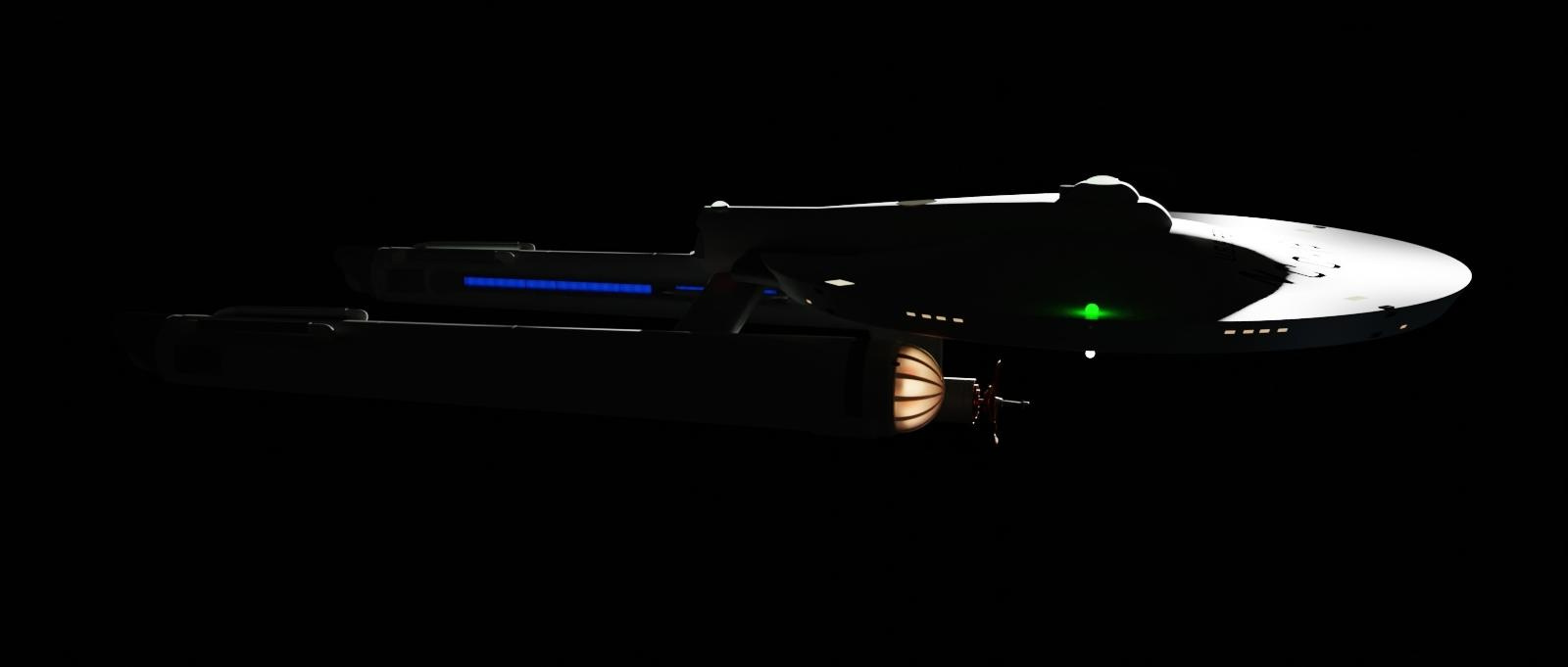
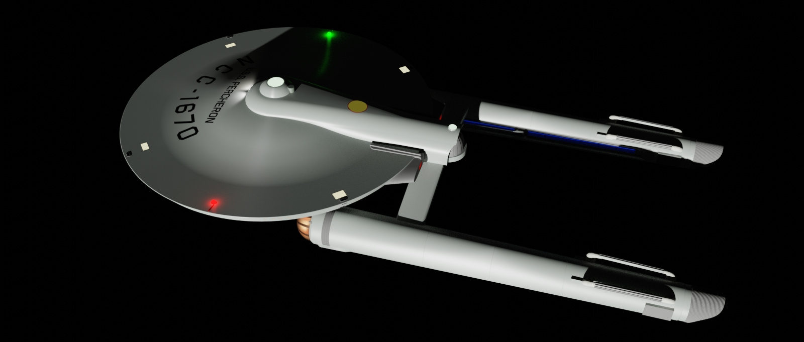
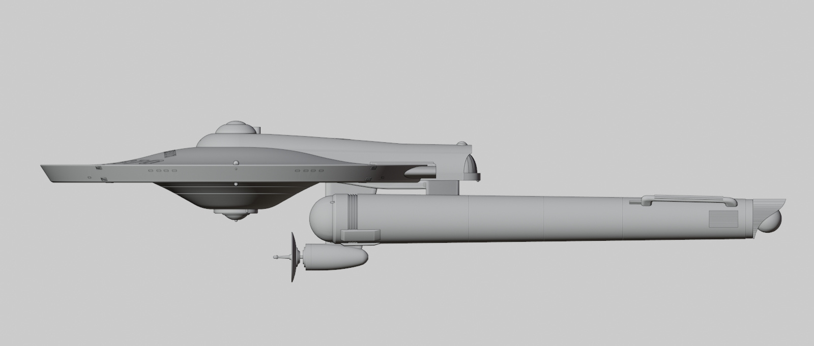
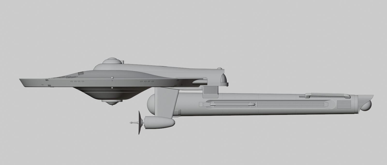
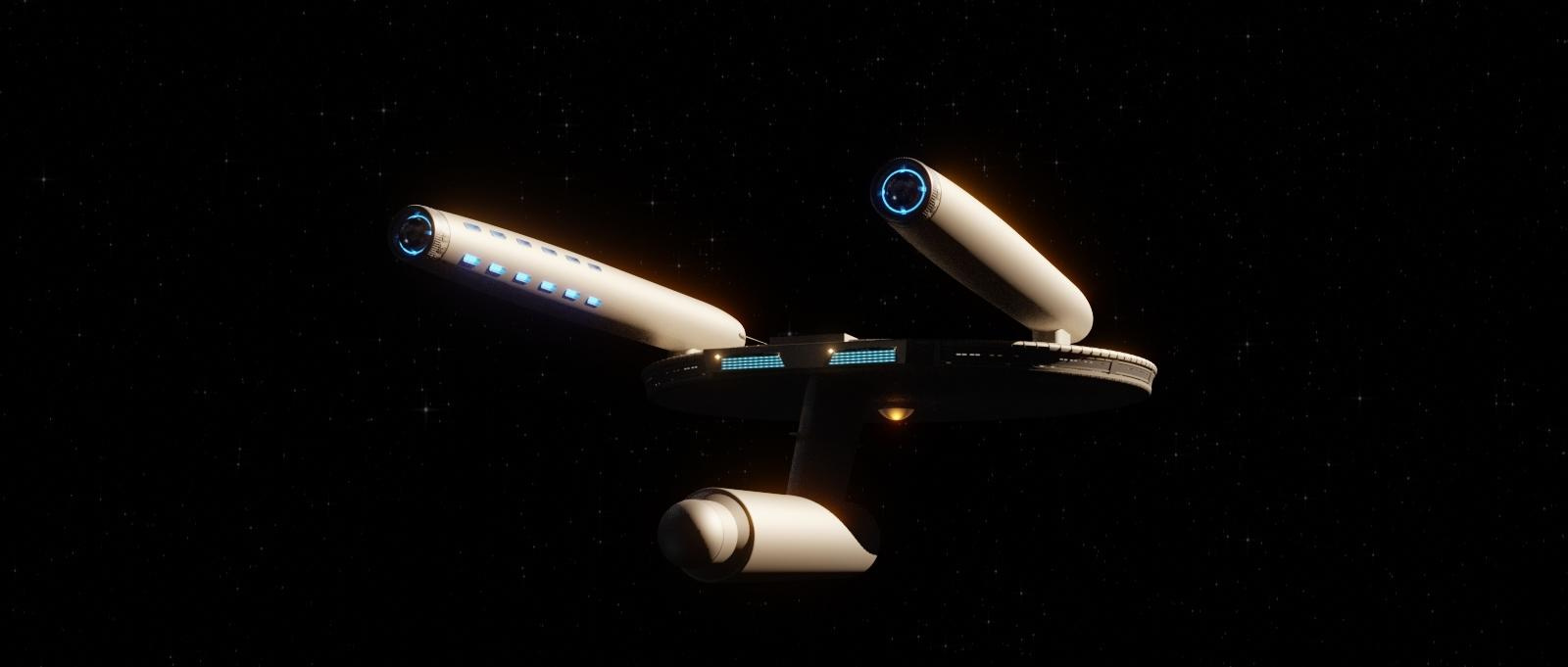
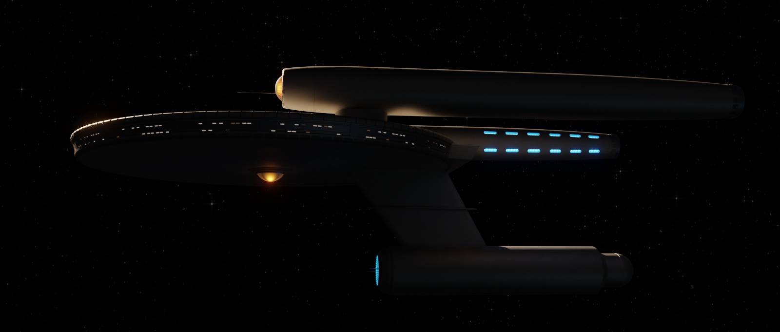
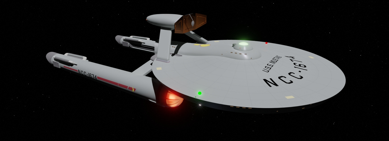
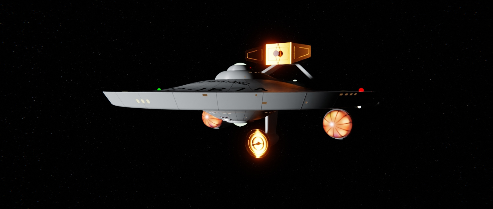
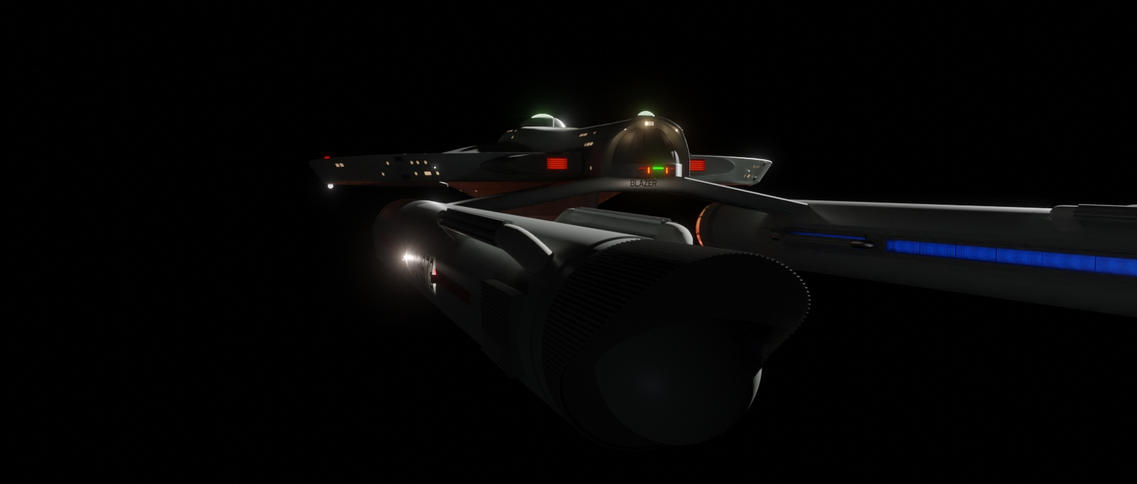
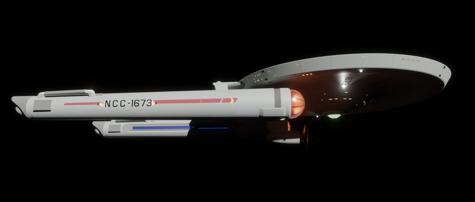
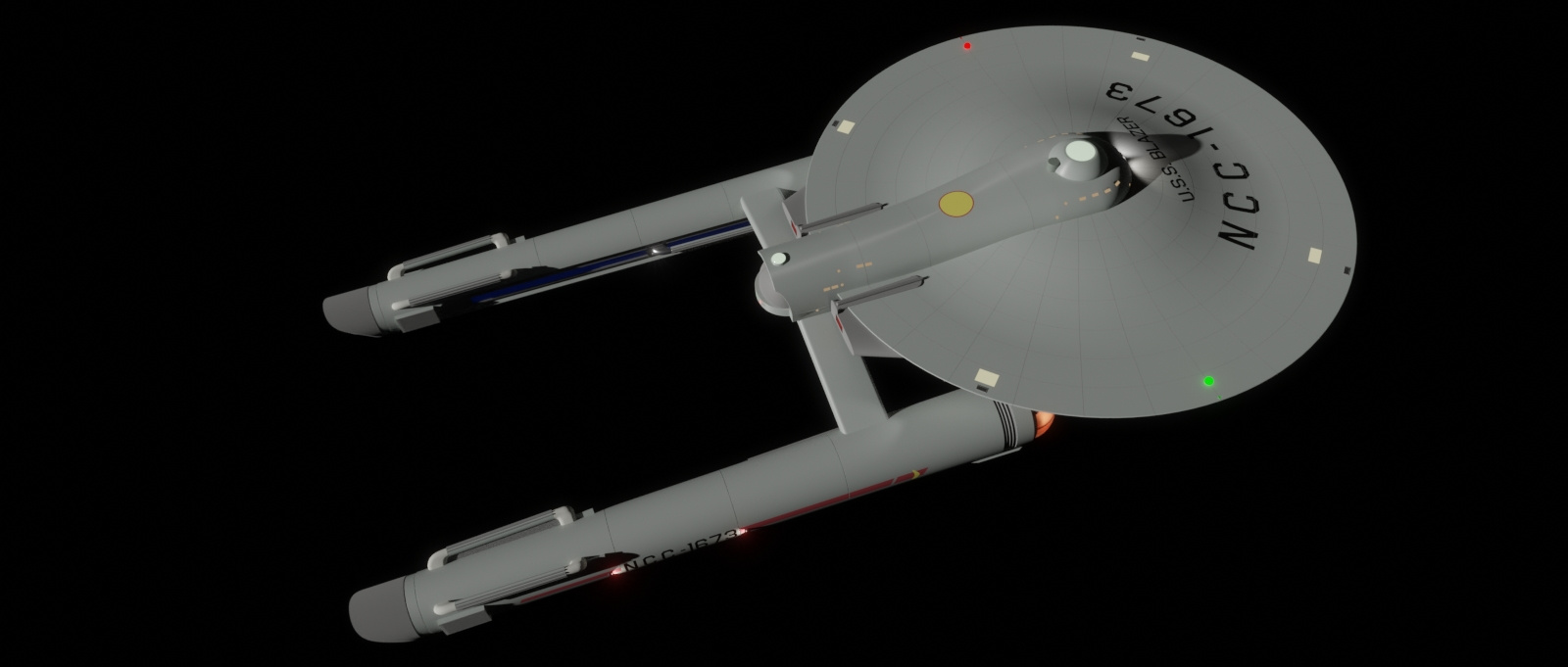
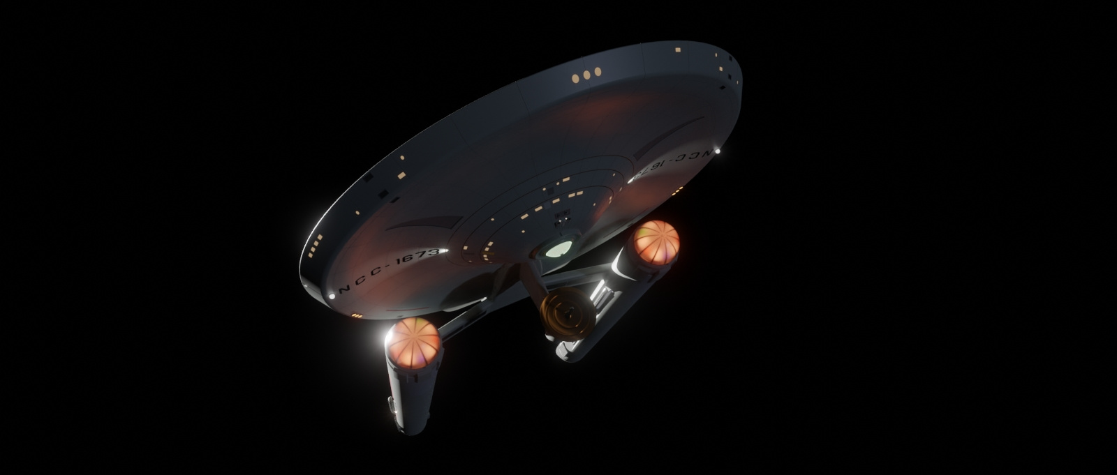
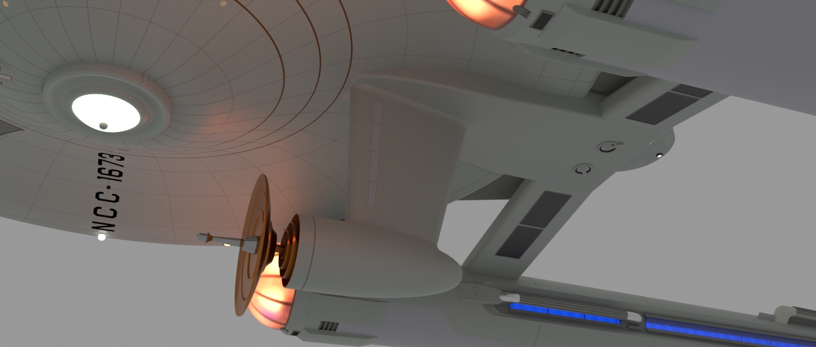
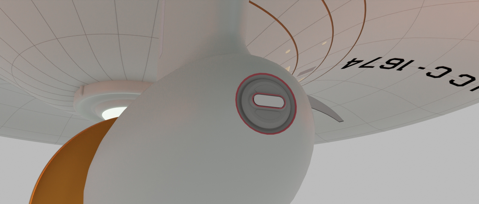
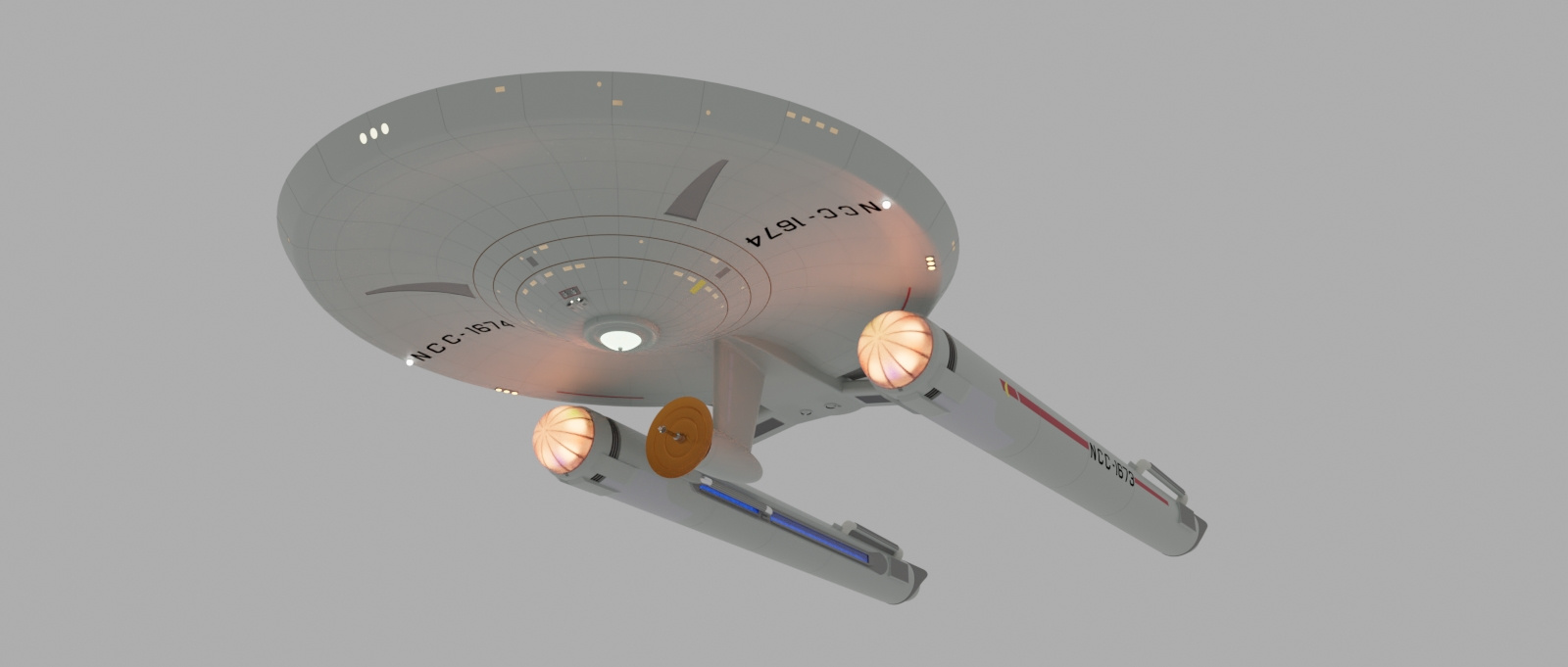
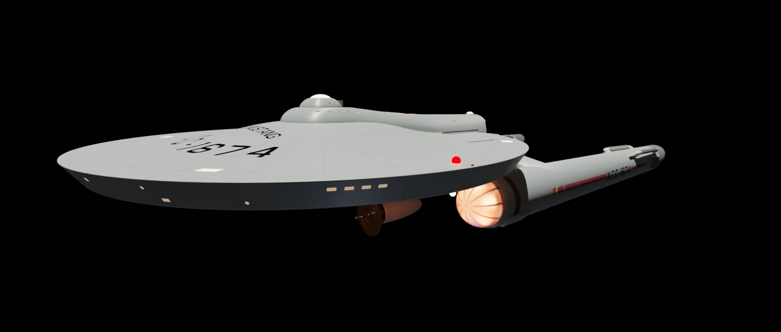
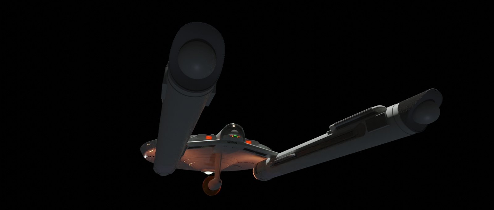
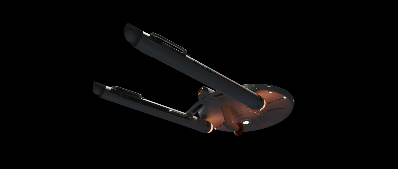
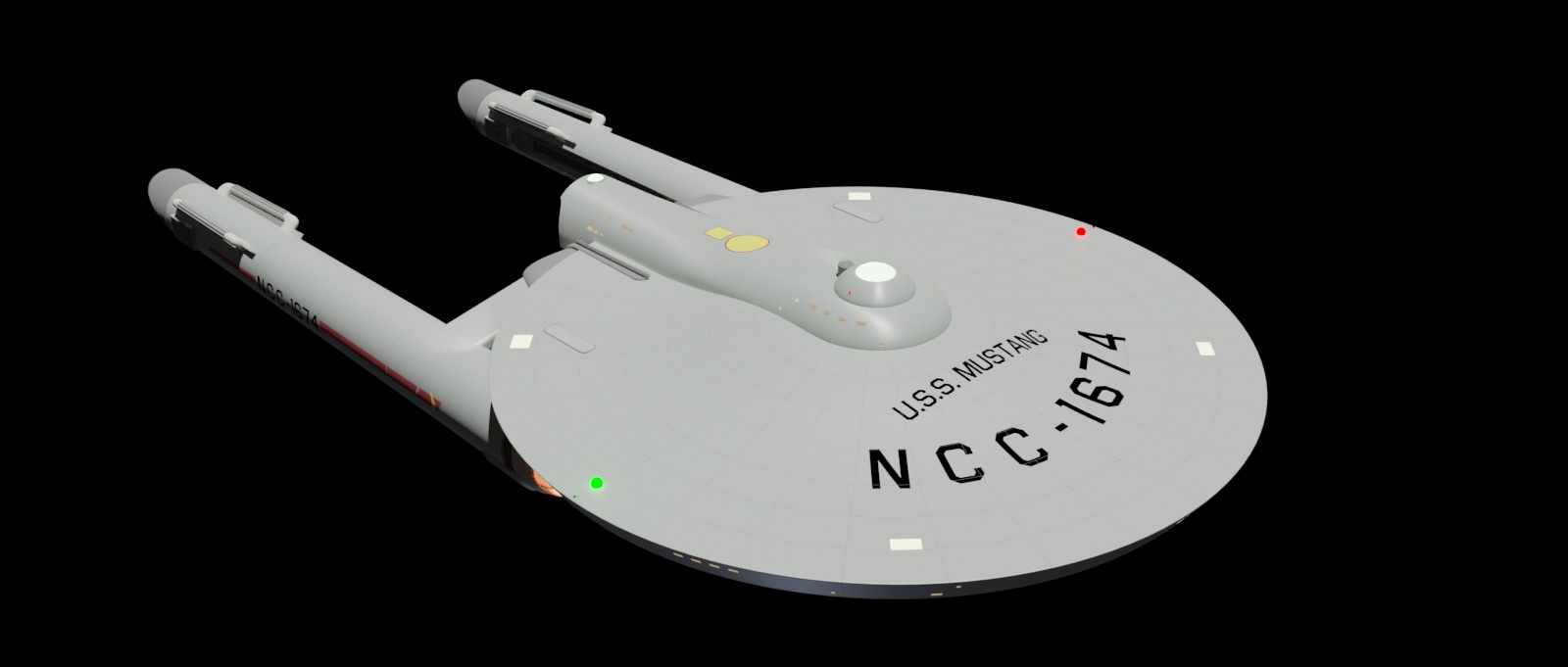
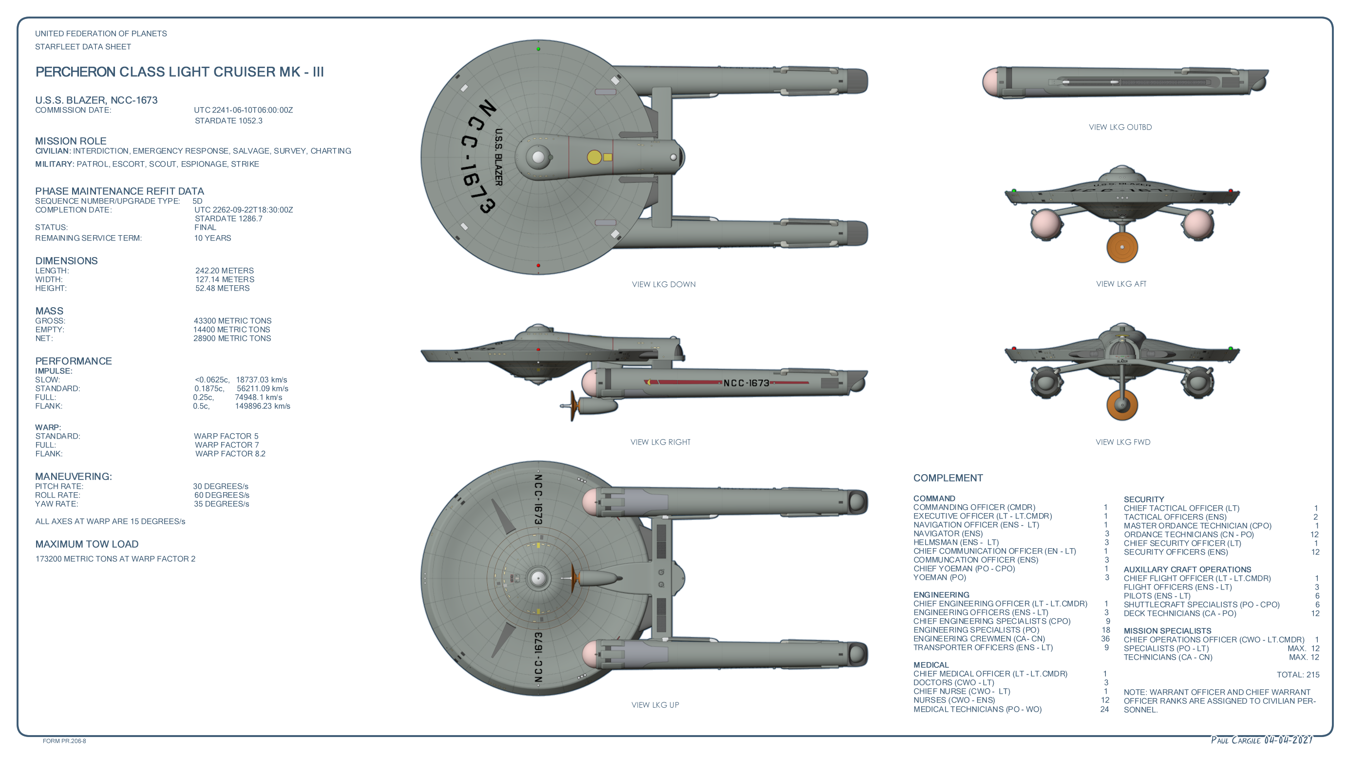
Percheron class (tos era)
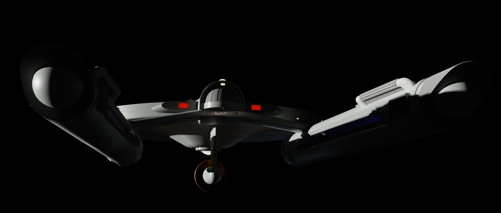
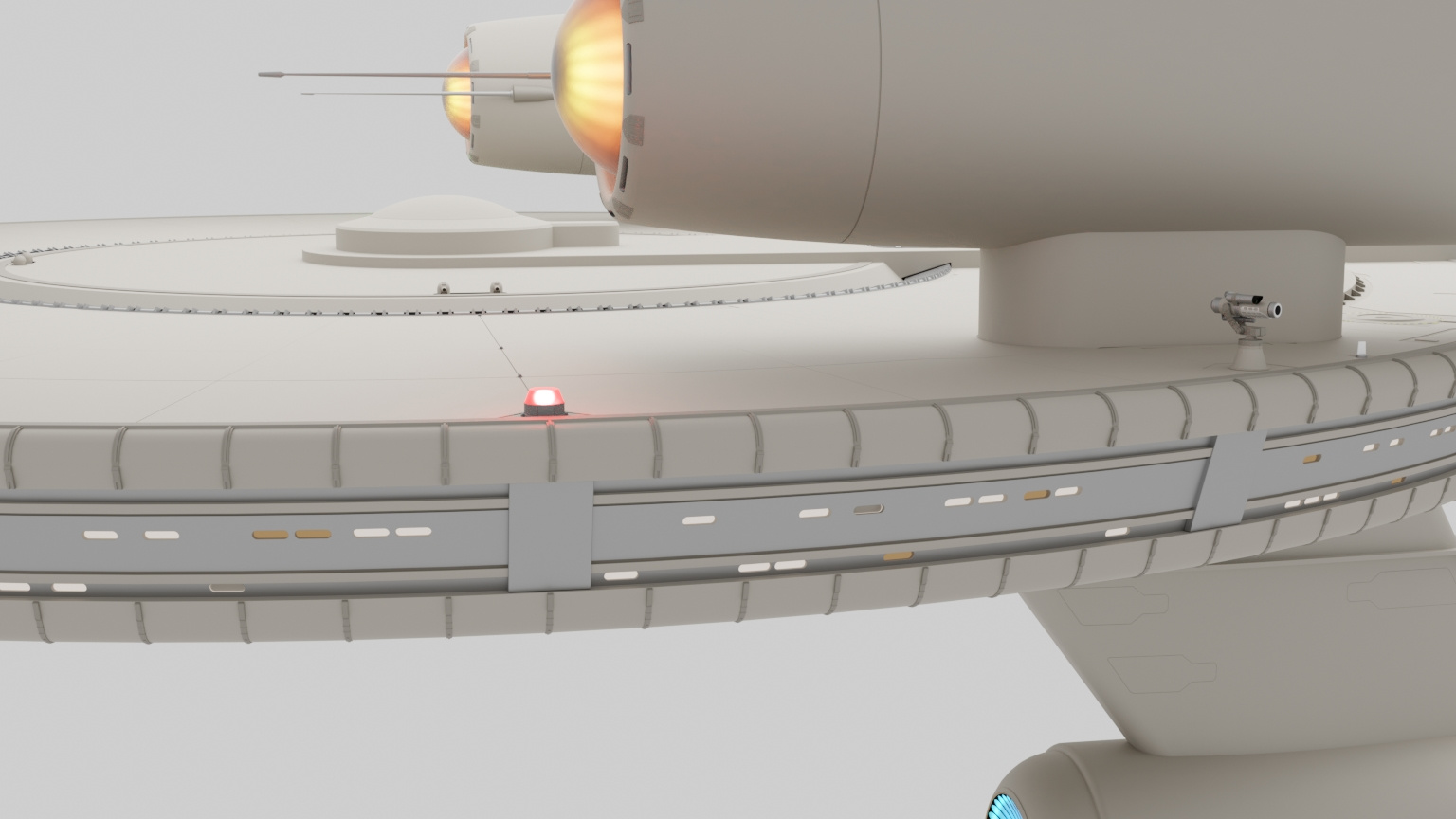
I was looking at my 22 year old MSPaint image of Constitution class predecessors and "kitbashes" and figured I make a model based on the design with the shuttlebay on the saucer. I downloaded some of the Alan Sinclair blueprints and called up scifieric's YouTube channel for guidance. My goal isn't to make an exact replica of the 11 foot studio model, but make it a smidgen more realistic without straying from the Jefferies' aesthetic.
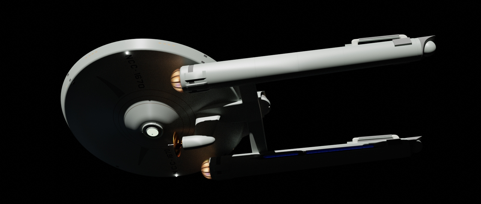
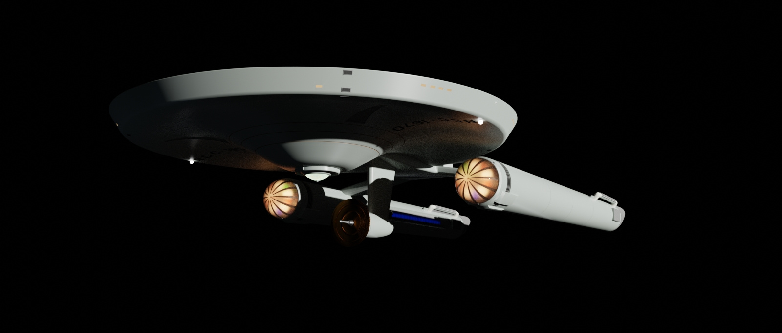
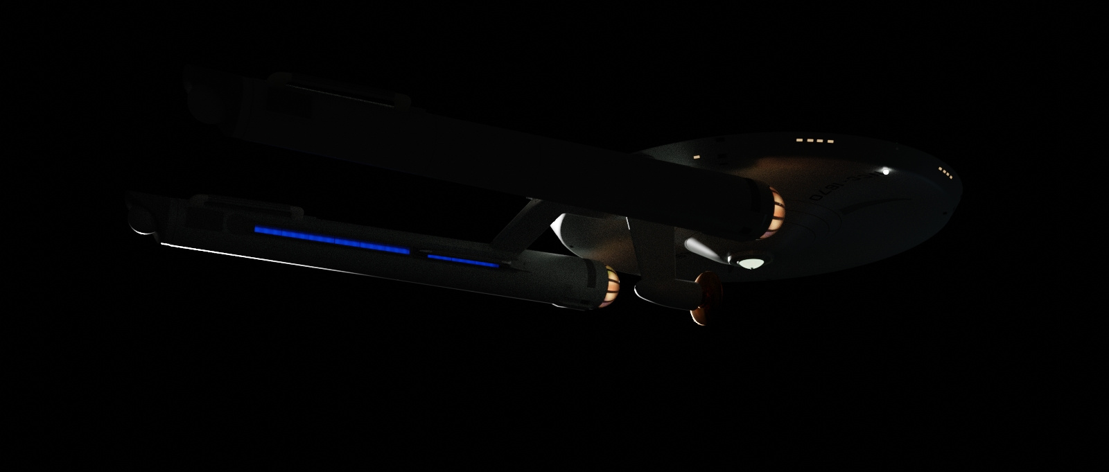
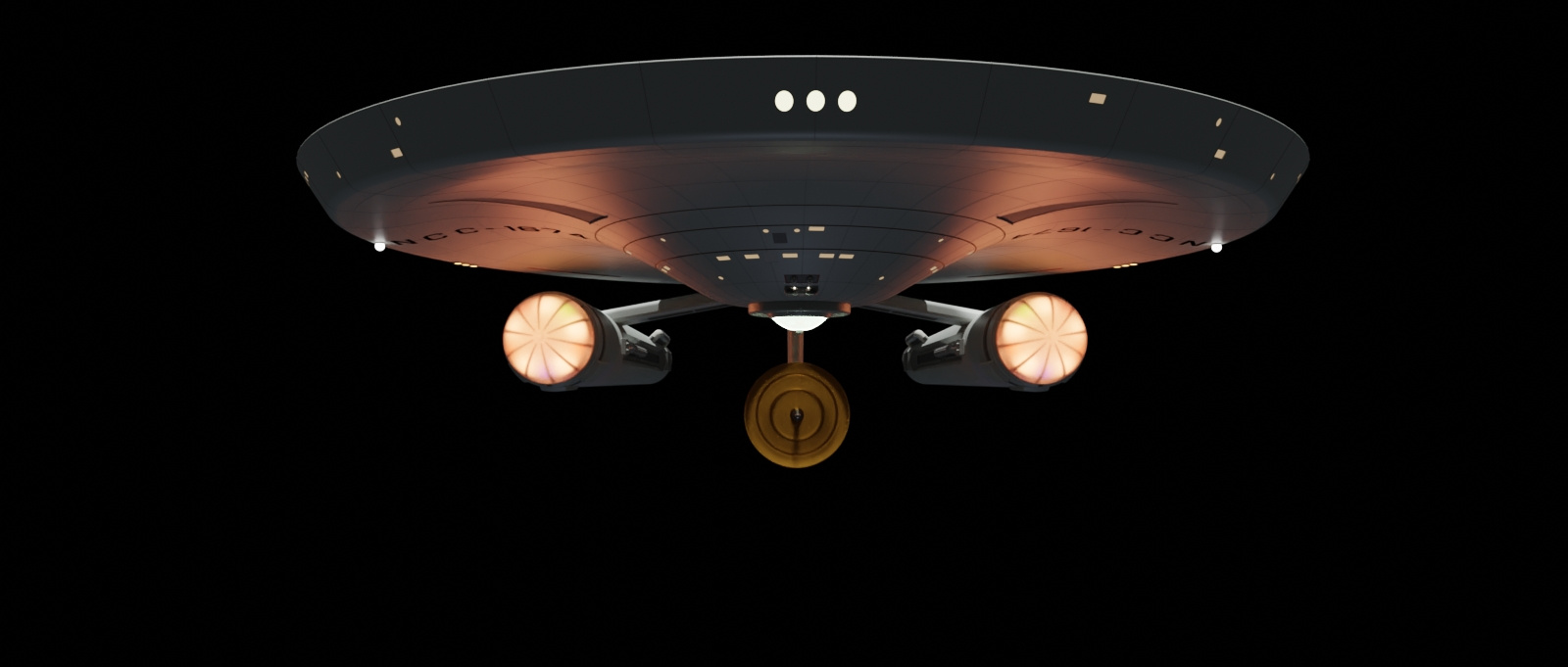
As you can see it's 80% to 90% done. Only thing left is small details like windows and hatches, and minor details I may decide to add. The gray rectangles are the maneuvering thrusters which I decided were going to follow the simplicity of the impulse engines. I wanted the warp glows to have a darker, buried appearance as if the energy is coming from the center of the nacelle as opposed to right there at the grill. I'm thinking about going back and making the nacelle caps truer to the studio model with double domes to soften the look of the vanes, which research says were tape, but mine are modeled solids, as I suppose everyone's are.
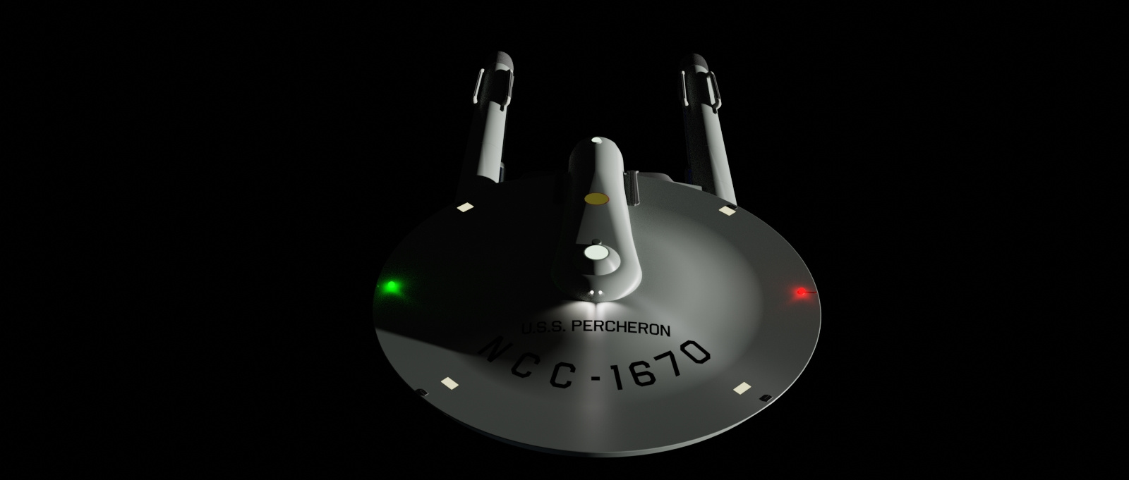
No textures are used anywhere on this model. Not the impulse and warp glows. And not the lettering. The lettering are Blender's text objects with a shrinkwrap modifier and shadows disabled, because they are slightly above the surface as text objects they are not subdivided very well. And I don't want to convert them to meshes because I can still edit them to change name and number. I'm using airborne2 as a font, and anyone who has made a TOS saucer knows center alignment doesn't match. At least the Sinclair b/p don't match up to the font spacing. For the name, you can get close with adjusting character and/or word spacing. I would have rather the registry be one text object, but I was only able to match it as close as possible to the prints by splitting it into the prefix and number because it requires different spacing on either side of the centered hyphen. Oh, the pains we go through. Plus being able to conform the text to a curve is a tremendous help. I tried a texture at first but it was a lot more work to get it close, and they are permanent unless you want to spend a lot of time making and swapping out textures. I don't. I like hitting that edit button, making the change, and going back to object mode. So much easier. But, hey, they were painting letters on a curved surface, and they did a helluva job.
The yellow hatch is also a shrinkwrapped face without shadows.
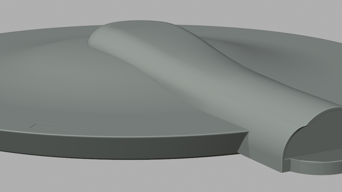
I had an idea the shuttlebay doors would open by one set sliding over the next. These give the appearance that that may be the case, but in reality their pivot point doesn't allow that to happen. If I want them to work as real doors, I would have to redesign them and they may not have the same curvature. They were cut from sphere that matched the outline of the prints, so. . . .
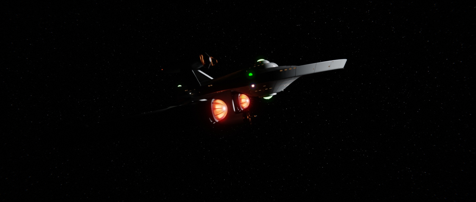
The warp glow is achieved by a number of emitting faces shining through a translucent material, and then near the grill through faces with a glass material. The glass sections I borrowed from the Franz Joseph prints of the warp nacelle. It gives it a nice separation behind the grill.
That troublesome trough, I tell you. I tried a Boolean difference. I tried knife project and extrusion. I came to the conclusion that you can do things with wood working tools you can't do in Blender. A Boolean difference will not make that front curve a half circle. I took a shower, and my relaxed brain said, "You idiot, you knife project for the edge of the trough, and delete that shit. And then you build the back wall, and from there, create faces. Slide those verts in the front to scallop it, without proportional editing because that will move too many at once, just one curve section at a time scaled in Y. It came out better. The aft clamshell shape is not perfectly flat because the outer edge is curves of course. But with sharpen edges it's unnoticeable.
I also wanted the pylons to connect to the nacelle in the same region they do on the Constitution class because it's the same engine, and I imagine that specific segment of the interior has the components to mate with plasma conduits. Other sections have other stuff that is there because that is where they need to be.
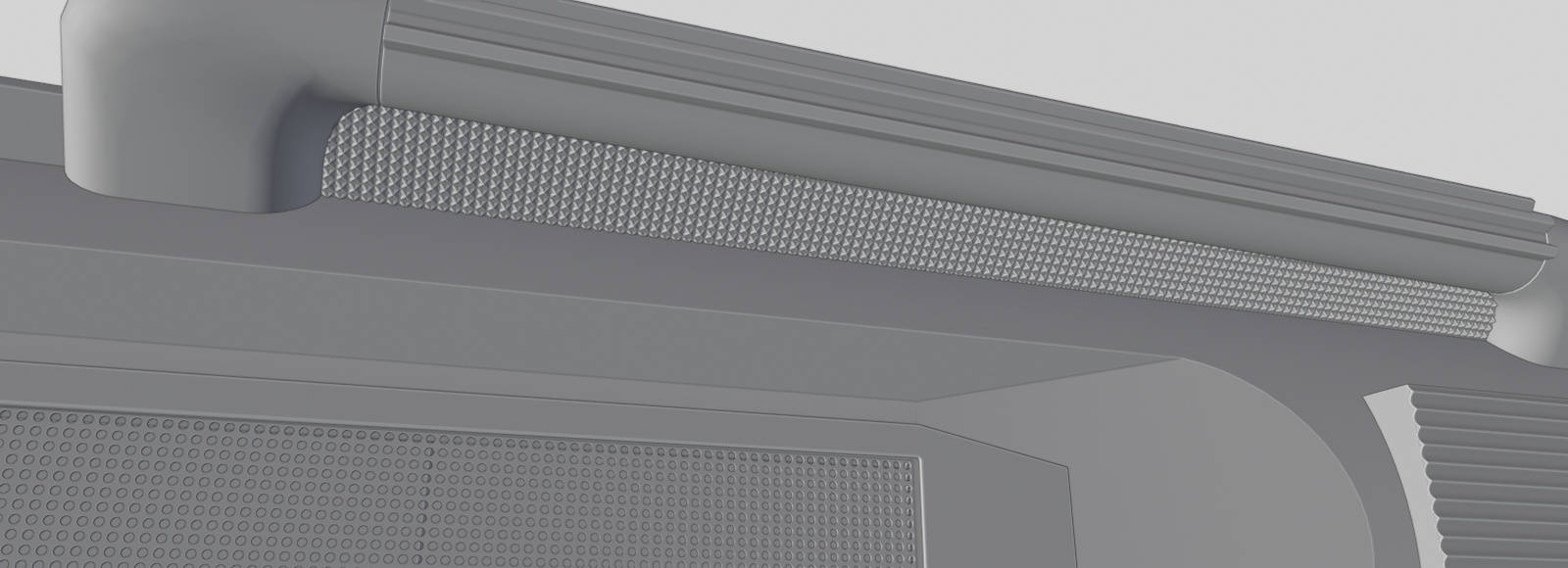
And credit were credit is due, though its a trick Eric (scifieric) learned, I learned it from him, and grids so easy from a small face with a hole in it, or a funky star pattern, just pops. Yay for arrays!
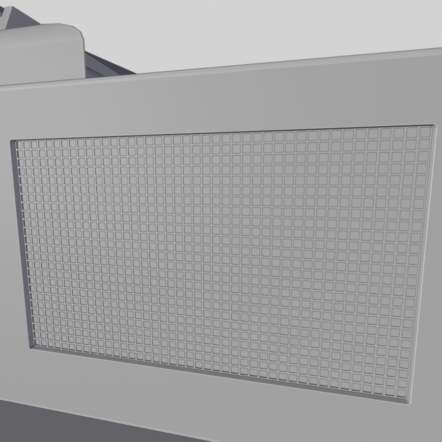
Carried the technique over to the impulse grills because I hate the way the wireframe modifier looks with its angled surfaces. I did not replace the RCS grids because they are joined meshes which would be too much work (for me), and too small to notice anyway. Gotta love super easy techniques.
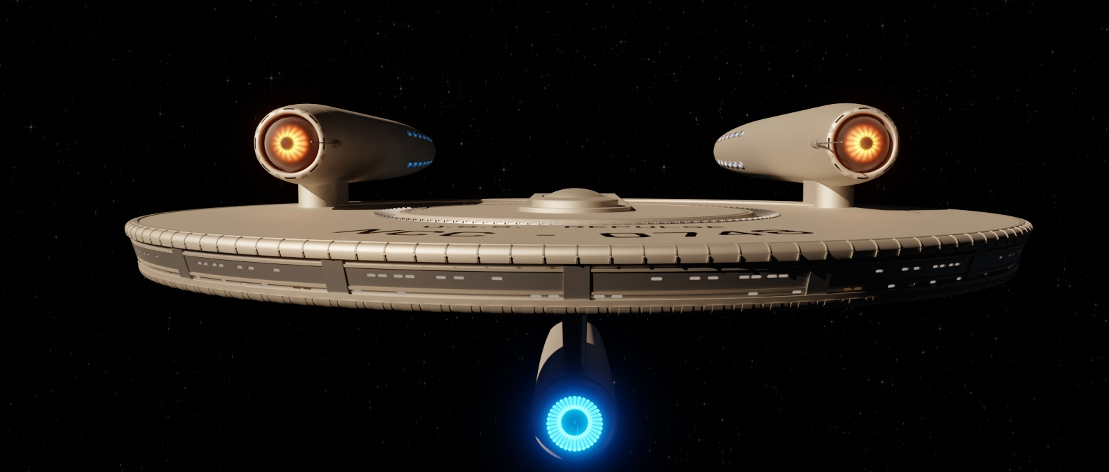
No texture impulse engines. One of the things I have always wanted to achieve was a good impulse glow with falloff at the edges that did not rely on textures or complex node systems. I thought, (not in the shower that time) what if I take a face that is to be the glowie, and add a loop cut as a fold edge, and then rotate that face back?

Here is the arrayed geometry with the negative space shaped like the grills on later drives.
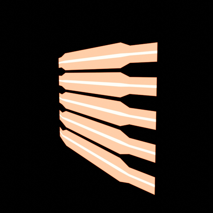
Two emission shaders with blackbody color imputs. I wanted a hotter center.
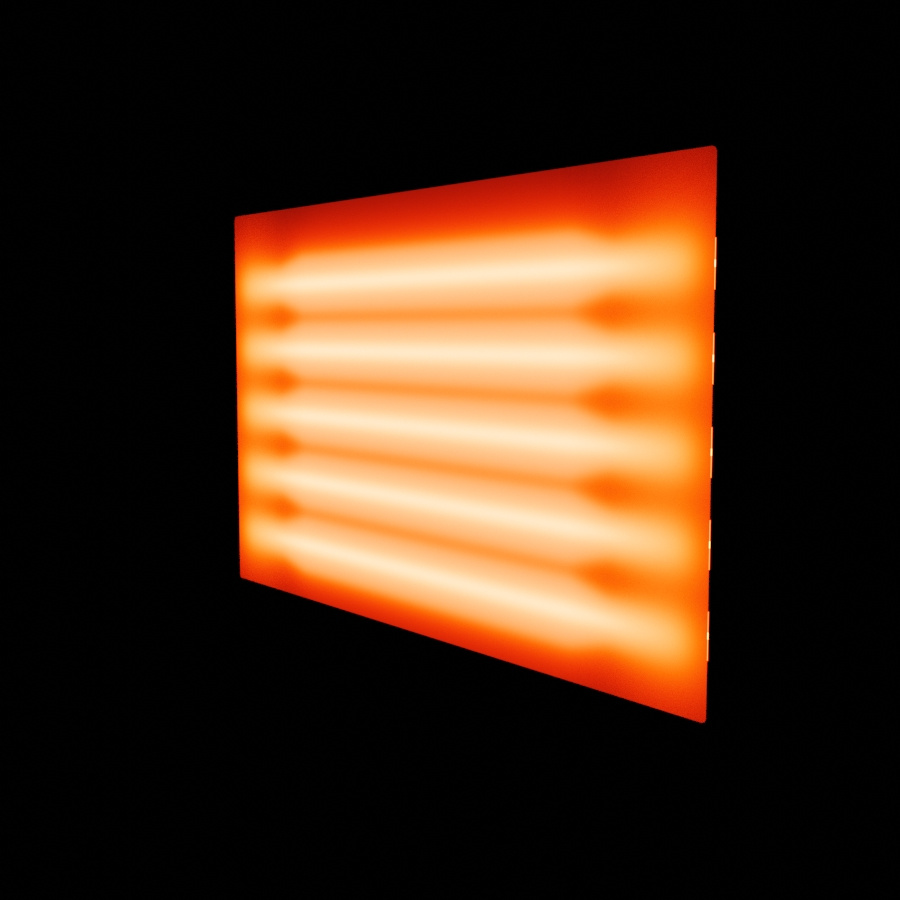
Glowing through a translucent shader. The different colors blend nicely.
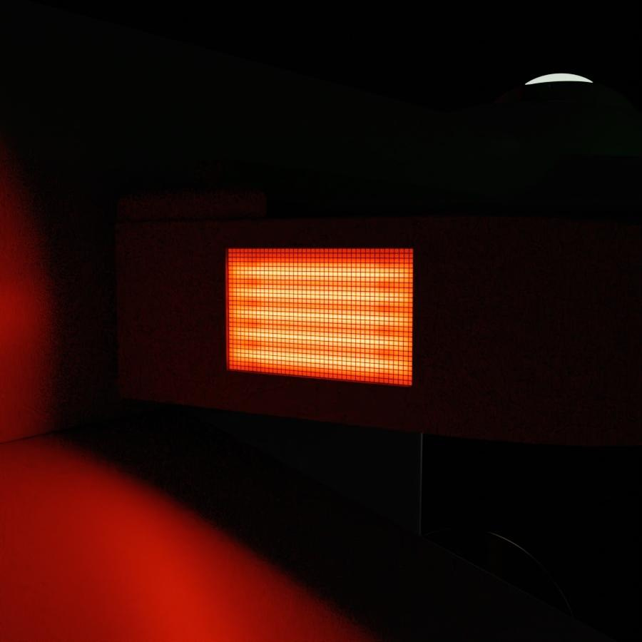
Finished product. I say it works well.
Good thing about this technique is that if you have enough space in front of it, you can change the brightness by how close you are to the translucent surface, which means you can animate the brightness with motion, either with shapekeys or changing position as opposed to lamp settings. The warp glowies are also angled faces.
Okay, so the Percheron class is a light cruiser, that most likely carries out the same missions and tasks as a Miranda class, but I don't intend it to be the class that was refit into the Miranda. I know artists have done TOS Mirandas, and that's fine, but I think the Miranda doesn't necessarily need be a refit of something else. The Percheron is a workhorse, and they are thus named after horse breeds (I have a list). The registry was going to start at 1680, but with around 22 ships that would hit the 1700 wall. I went with the 1600s thinking that when this design style was developed, ships smaller than the Constitution would be completed first. Though they could be subsequent to contracted Constitution classes. I'm not trying to find a place in fanfic registries were it could fit. Because it won't. Almost every number has been used. I do know it is close to the Axanar USS Ares' 1650, but I'm also not trying to fit into that fanfic branch of the Trek Universe.
The design has gone through some changes. First I had a proper BC deck, but there was this ugly intersection line between it and the extended engineering/shuttlebay fuselage. Rebuilt it to merge as one superstructure. There was also a half pill shaped engineering hull up against the bottom of the aft saucer to complete the shuttlebay because I needed somewhere reasonable for the pylons to extend from, but it looked like a dorky first pass of a very bad Ares class, and I did not want that. I got renders and will show them upon request. It did not look good behind the conical structure under the saucer, especially intersecting those three channels. In that version, the pylons were extremely raked back. I really didn't know what to do with the pylons when I killed the lower engineering hull, so I shot them up under the shuttlebay and connected them, but how are the plasma conduit going to work? Well, extrude that forward under the sensor pod fin, and shape to something sexy. I played around with deflector dishes on the pylons as I had done in the past, but it wasn't appealing. So just put it on a pod and hang it from the bottom. I tried it up top, but it didn't look good.


-
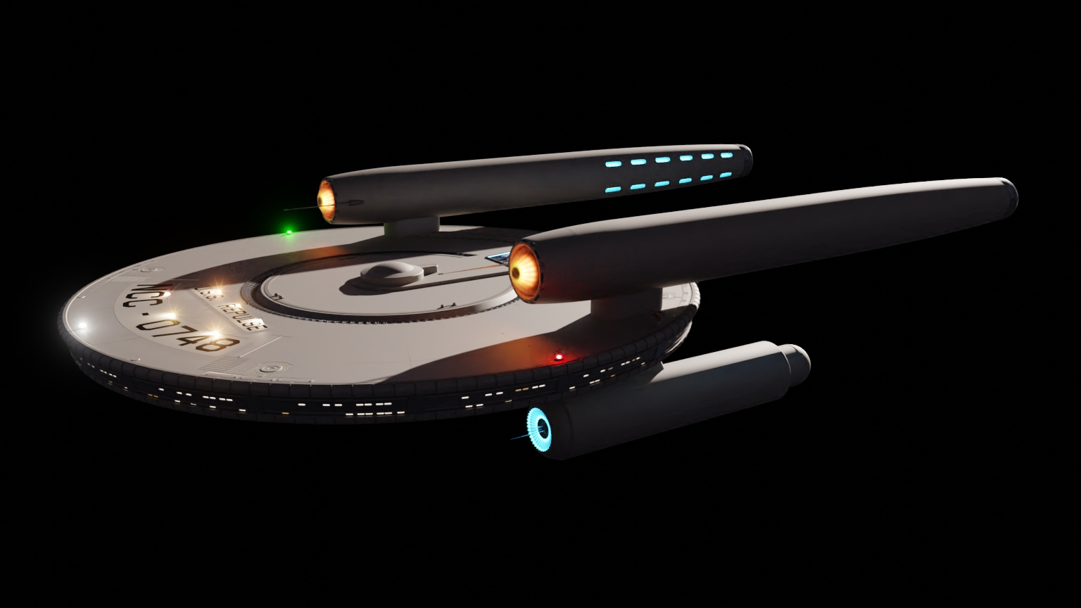
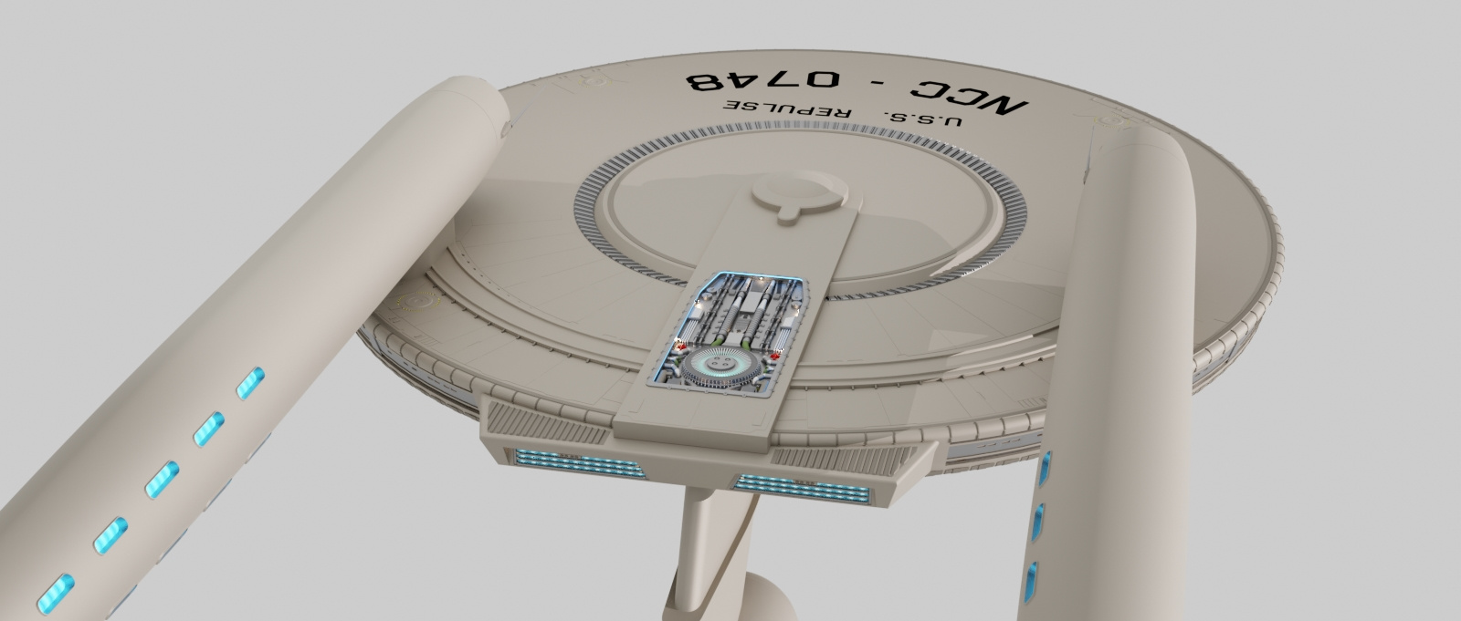
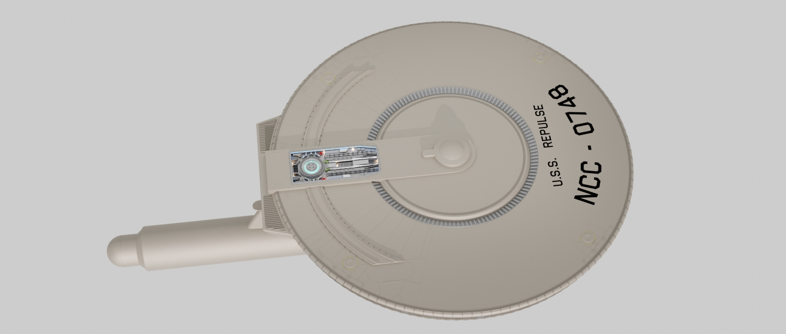
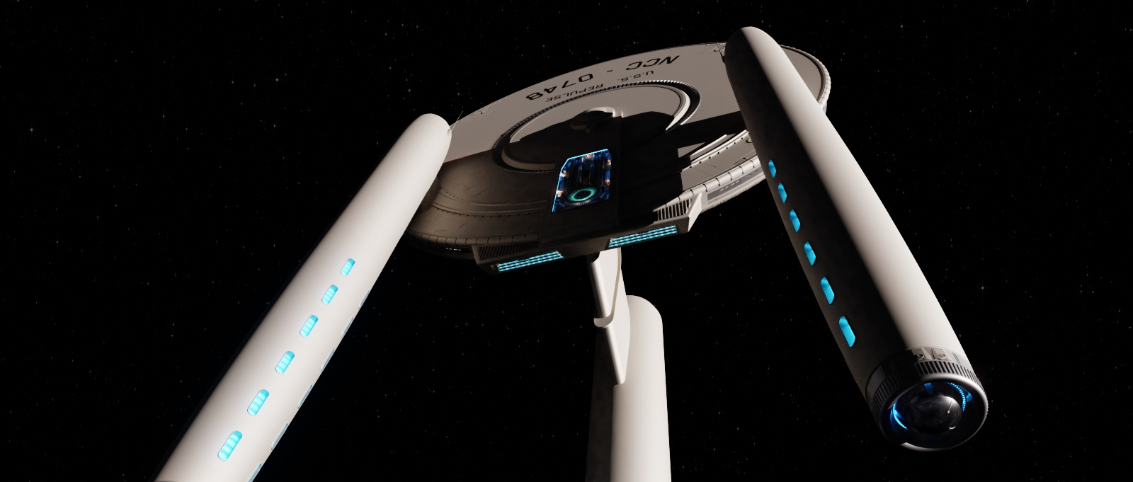
STAR TREK Repulse
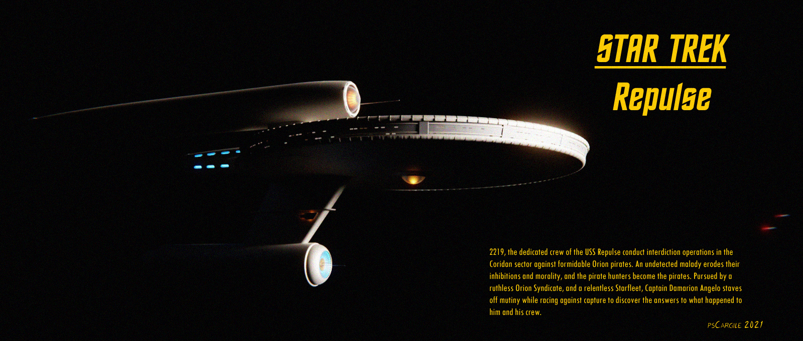
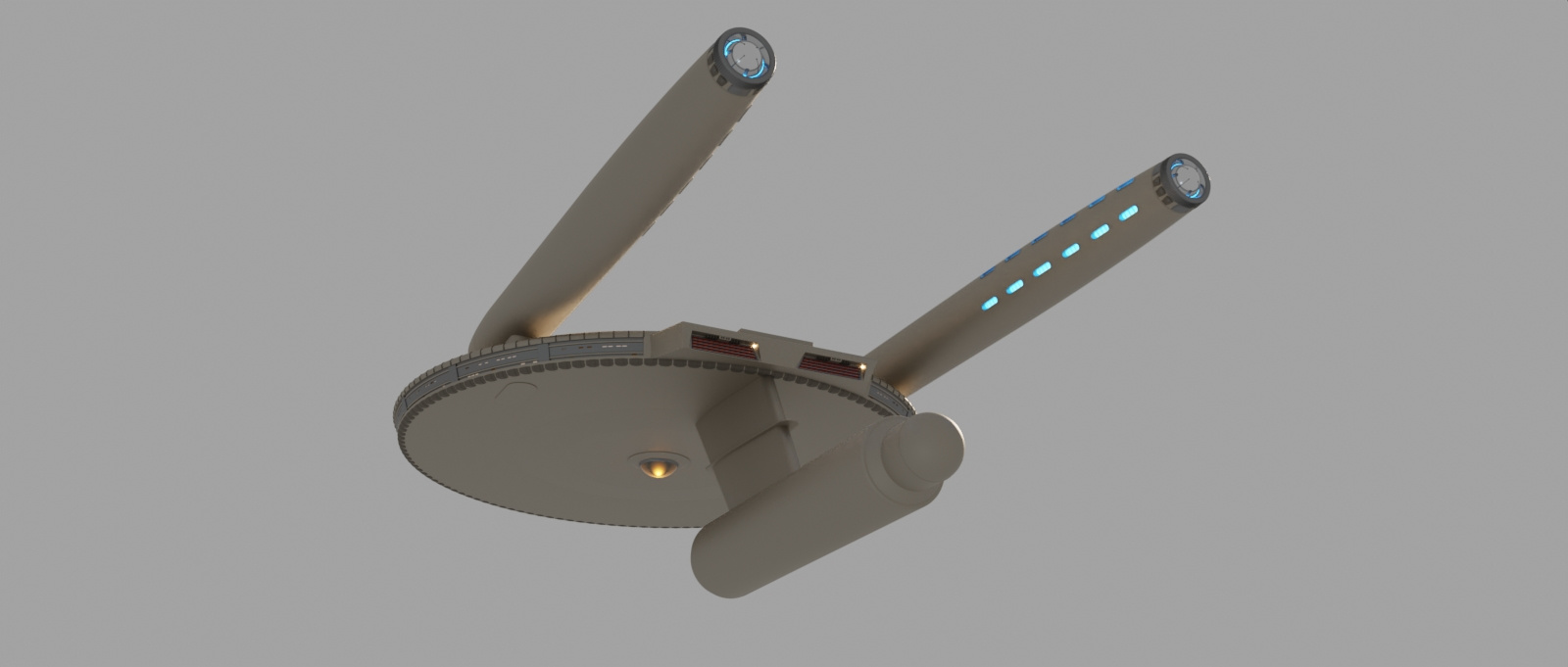
Yep. Yet another ship based on a Jefferies sketch. When I was looking at the sketch, I thought it had a more Kelvin look to it than TOS, so I am taking visual cues and detailing from the Kelvin and Franklin in a sort of alternate Trek timeline, just for creative license.
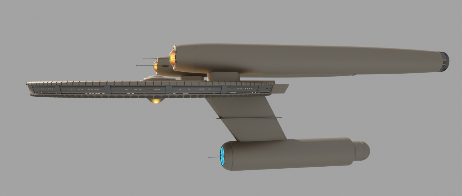
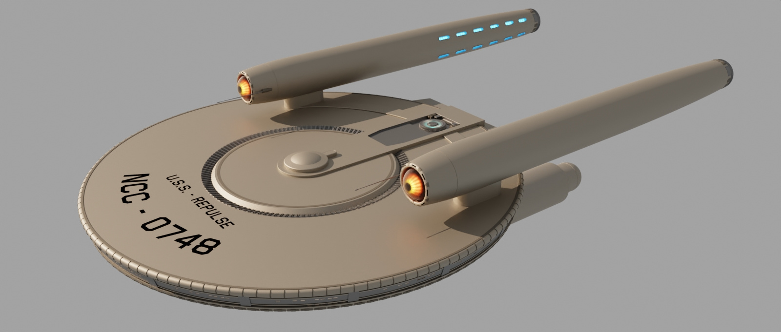
The saucer is 600 feet across, but relatively flat. Probably going to be sliding side doors on the secondary for the shuttle bay.
That's about the gist of it. Piddling around with details as I go.
But wait, there's more.
Star Trek: Repulse teaser script.
My first idea of this being an alternate Trek design was that the hull number wouldn't have NCC prefix, and the name would have either S.S. or nothing as a prefix, and as I keep looking at it the ship, I thought about pirates. But how would pirates get such a ship? Like Khan got the Reliant? Well, that has been done. What about a crew going renegade? Not too bad, but why would that happen? Then it dawned on me. You know how in old Trek there was usually some anomaly or event that happened and the crew had to figure out what it was and how to fix it, and the show reset at the end? What if they did not know something had happened to them, and they slowly changed? No reset at the end of the episode. I wondered that if this was a show, how would I do it?
Keep it short. Three seasons. Maybe do 6 episodes a season. 2 episodes for a 3 act format. Season one: After a skirmish with Orions, an undetected malady effects the crew as they pursue and defeat the major antagonist. Season two: They are full on pirates, now trying to avoid Starfleet and the Orion Syndicate, while beginning to suspect their motivations. Season three: tensions on the Repulse flare as the captain tries to avoid capture of his vessel and captain's chair, while trying to uncover how this malady started and what will cure them.


-
STAR TREK Repulse
I still work on this once in a while. I'm 53, so it gets attention when it gets attention.
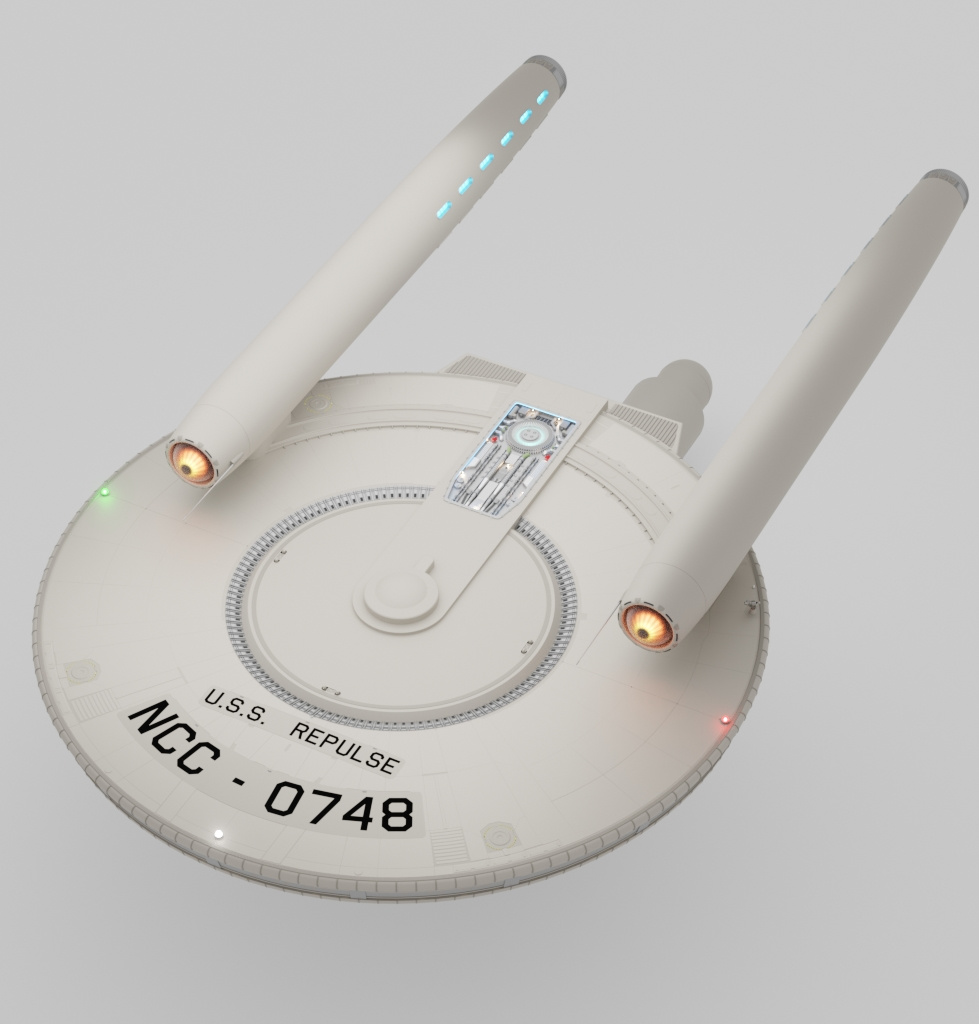
I'm more or less filling in details, starting with the upper saucer, and working my way down. -
Percheron class (tos era)
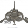
Roll bar pods.
First up is a long range search and targeting pod for reconnaissance and scouting.
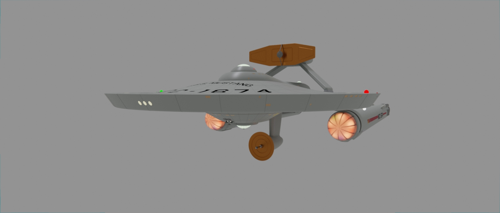
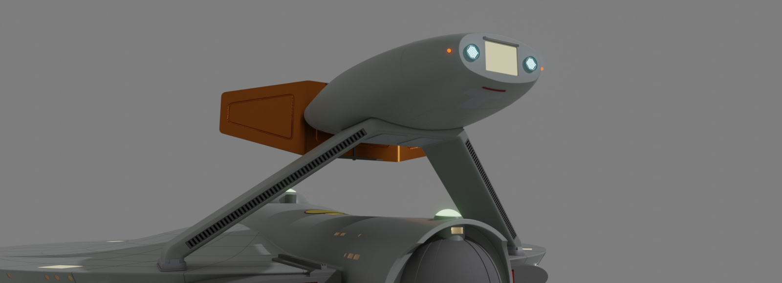
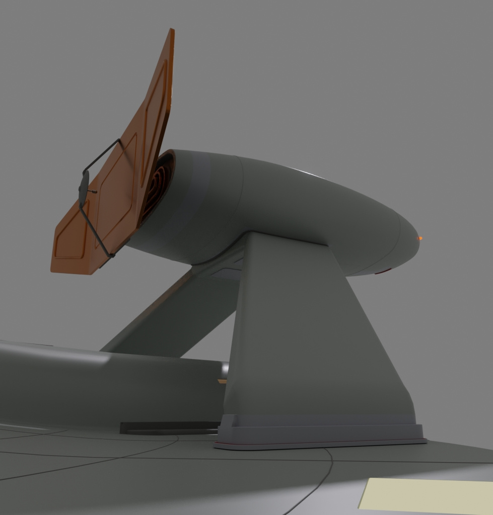
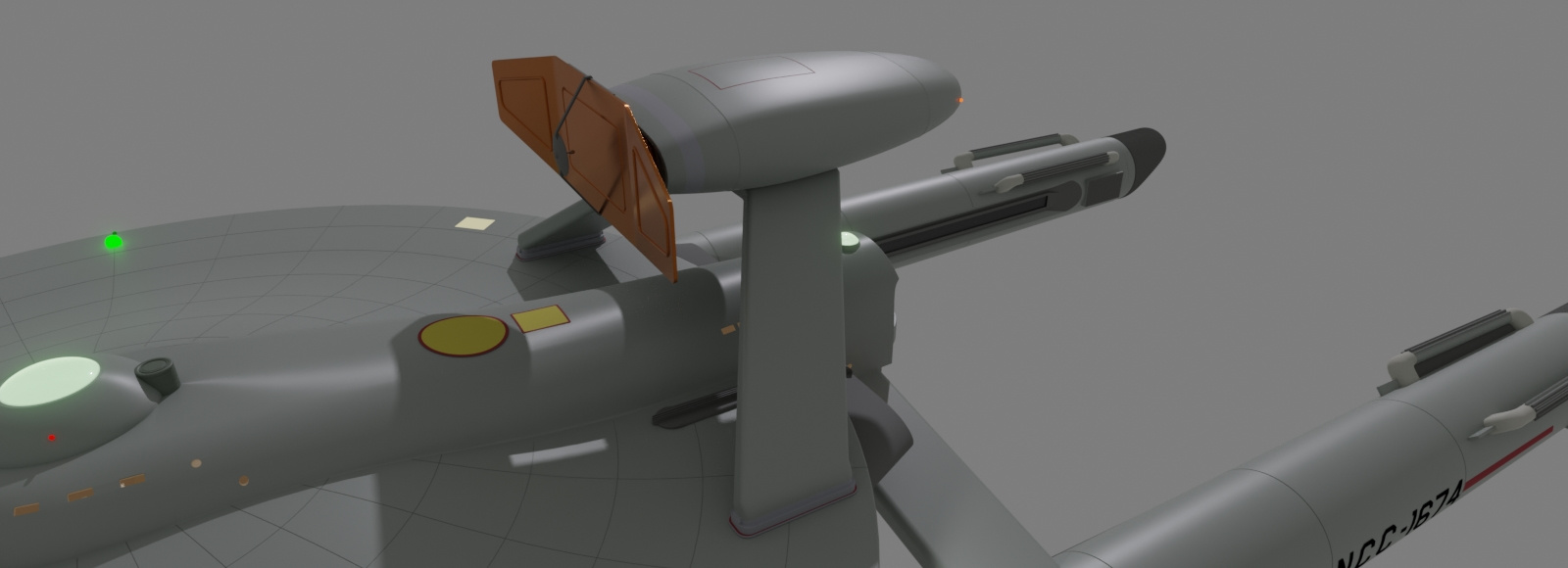
I would rather it not sit so far back so the roll bar isn't angled like it needs a third leg, but I wanted more to keep a clear path for the reactor and antimatter pods ejection ports.

-
Percheron class (tos era)
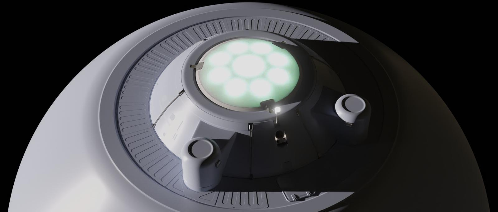
Some work these last few days.

Have all the windows I want, next step would be to add simple rooms behind them for realistic lighting. Maybe add some additional details to some of the empty spaces here and there. Was also thinking about mission packages like a pod rollbar, and extended range fuel sponsons.

-
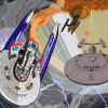
Alt Trek Spherical hulls
Back to pretty pictures.
Adding Solidify solved my problem. Sensor dome looks like what I had in mind. I also have a node set-up to keep the backface of those emission discs from shining so I only get the normal face light source. I also have a noise node added to the material. Added 70% anisotropic to the hull material and played around with the roughness texture sample, which I duplicated on the opposite side.
1024 samples and D-NOISE add-on applied.
1024 samples with standard denoiser at default parameters.

2048 samples with standard denoiser at default.
Light path settings: 256 max bounces, Dif: 64, Gls: 128, Trsp: 256: Trsm: 256, Vol: 32.
Clamping: Direct: 3, Indirect: 9, Filter Glossy 1. Caustics both checked.
Color Management: Filmic, medium high contrast, Gamma set a little high at 1.382.


-
STAR TREK Repulse
Progress update.

-
Centauri Express
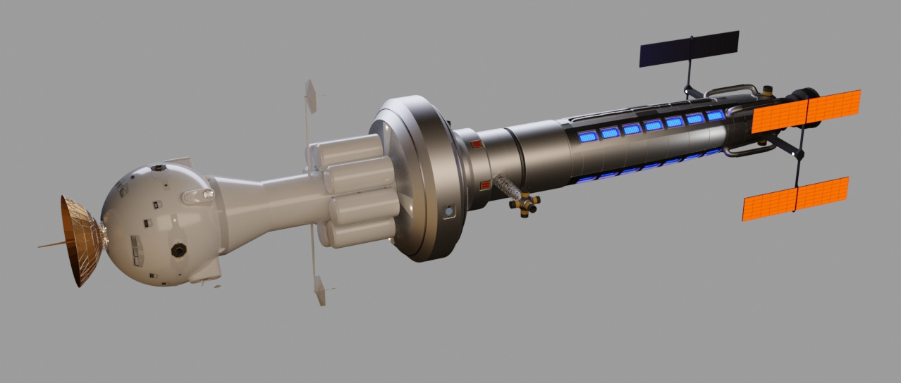
I find I like playing in Trek's past. This work in progress ship is a colony support/supply craft making warp 2 runs to, as the name implies, Alpha Centauri in the late 21st and early 22nd centuries. The only place it is designed to go is Alpha Centauri and back to Earth, refueling at each system. Thought I break Gene's Rules with a beefy single warp engine that provides a cruising speed close to warp 2 for the duration of its flight. I figure, like most significant inventions, research on different types of warp engines would be conducted until the twin nacelle design won out. Not to worry, this engine creates paraxial warp fields which are well suited to the cylindrical planform of the fuselage, yet are not very efficient for other designs such as Y or J class freighters. That's my theory, and I'm sticking to it.
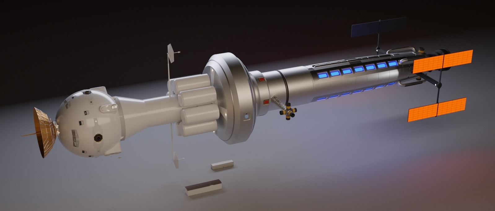
The ship is divided into two main sections, each manufactured by two separate corporations working in partnership. The forward habitat and cargo modules are produced by Daedalus Flight Systems, a company that grew out of European and Russian aerospace companies after WW3, while the navigation deflector, reactor and warp engine is built by Global Atomics-Propulsion Division, whose roots are with General Atomics (I figured since they develop nuclear reactors, their successors would move on to antiproton reactors). The two companies united to form the Daedalus Global Partnership. Once the production contracts were met and expired, and the partnership resolved, DFS took ownership of the remaining DGP-120s and refitted them with typical twin nacelles from Yoyodyne Propulsion Systems.
In this image is a mobile home I started using for scale reference, and there is a 12m cargo container just to make sure my cargo pods could hold one. They can hold two with room on the sides.
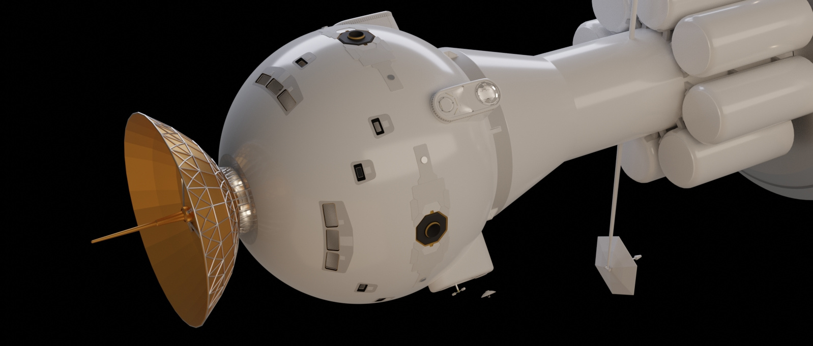
As this is a ship from the 2090s, I decided use some current space station design cues for the EVA airlock, and the mating assembly. To balance the design I'm currently working on the communication modules before adding more windows and panels. My first try on cutting in the windows was a Boolean disaster that moving things around in the modifier stack did not help. The easy fix that would also work in the fictional production design was to do Boolean slices for a window segment, and give the slice mesh the difference operation. Then just array it all into place. I plan to add windows in the aft of the "golfball", and I forgot to mention that this is a sleeper ship, because even a 6 month voyage will be very boring for a craft that is not a pleasure cruiser. Hey, you're fedexed as a popsicle for your sanity and economy. The large windows are the flight deck up near the ceiling. Yes, the decks are building style. There are 8 decks in the "golfball" and about 8 or10 in the "golf-tee."
The "golf-tee" is the services and cargo module, with plenty of room inside for internal storage. The pods can be un-berthed and fitted in orbit for de-orbiting and planetary landing.
Oh yeah, and the big hexagonal dishes are the subspace radio antennas. They may be moved to a new location later.
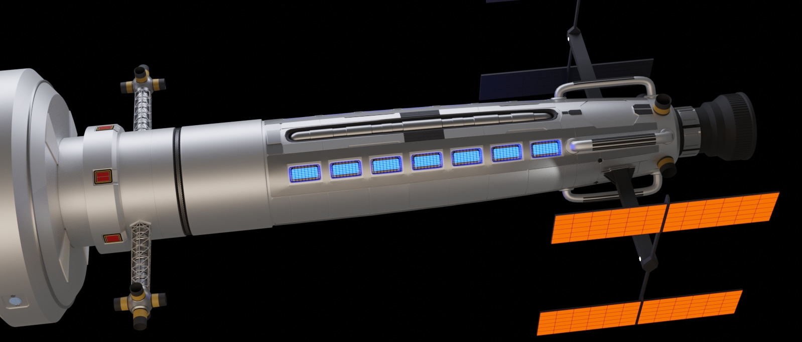
If you are going to have plasma running through the middle of your warp engine, why not use it for impulse engine too?
Originally the deuterium tanks were going to be exposed in a truss, but I didn't feel like taxing my non-existent engineering skills to design a framework that would support the tanks for all the flight forces they would endure, so cover them up. Then I had refueling ports for each tank, until I realized it would have a fuel transfer system inside, I knocked them down to two. Silly me. Yeah, the red things are the antiproton pods.
Still a lot more details to add (all over), and dammit I love my paneling method.
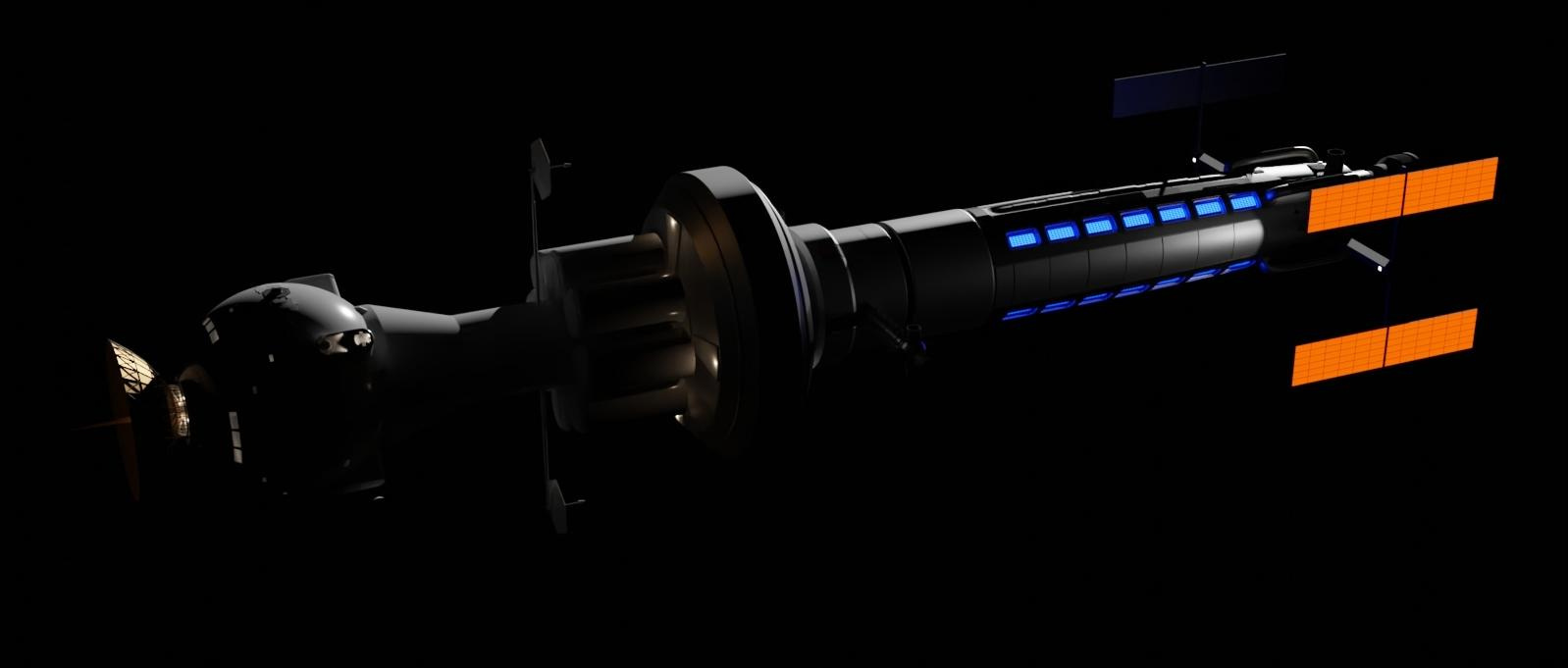
Using naked spot lights for the general idea. They will be replaced by physical lamps. I just don't like phantom light sources.

-
Percheron class (tos era)
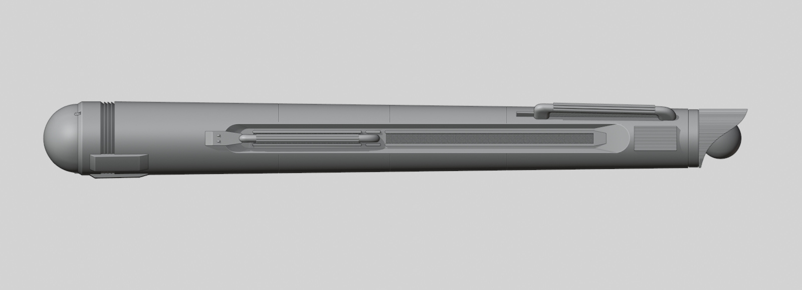
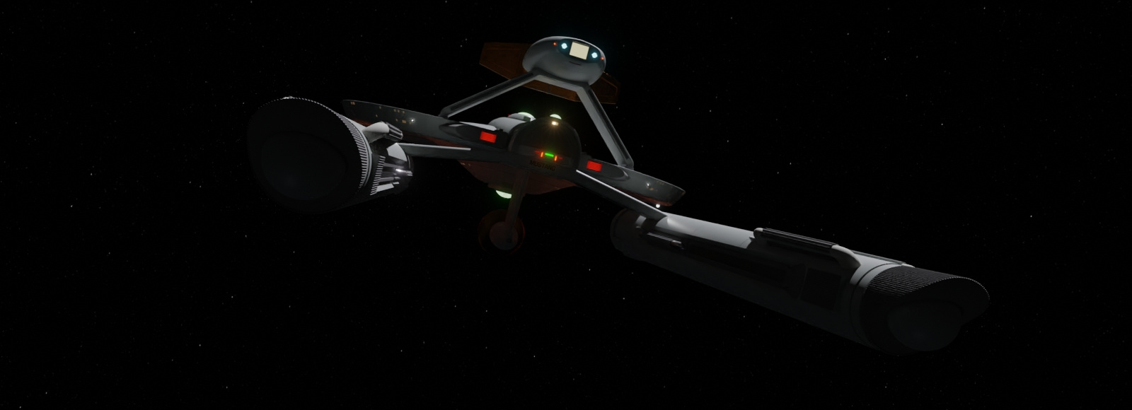
I rebuilt some of the sensor pod to smooth it out. I should have redone the whole thing with a higher radial vertices count, but I kept all the brass parts. I'm avoiding subsurface modifiers. I ended up melding it to the primary hull anyway. The pylons and impulse engines remain separate objects from the primary hull, which should be called just the hull, as there isn't a secondary. IKR?
Tractor beam emitter.
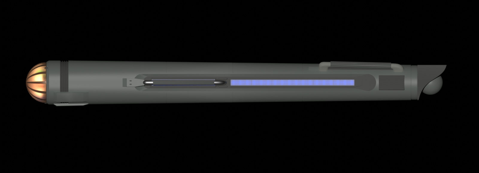
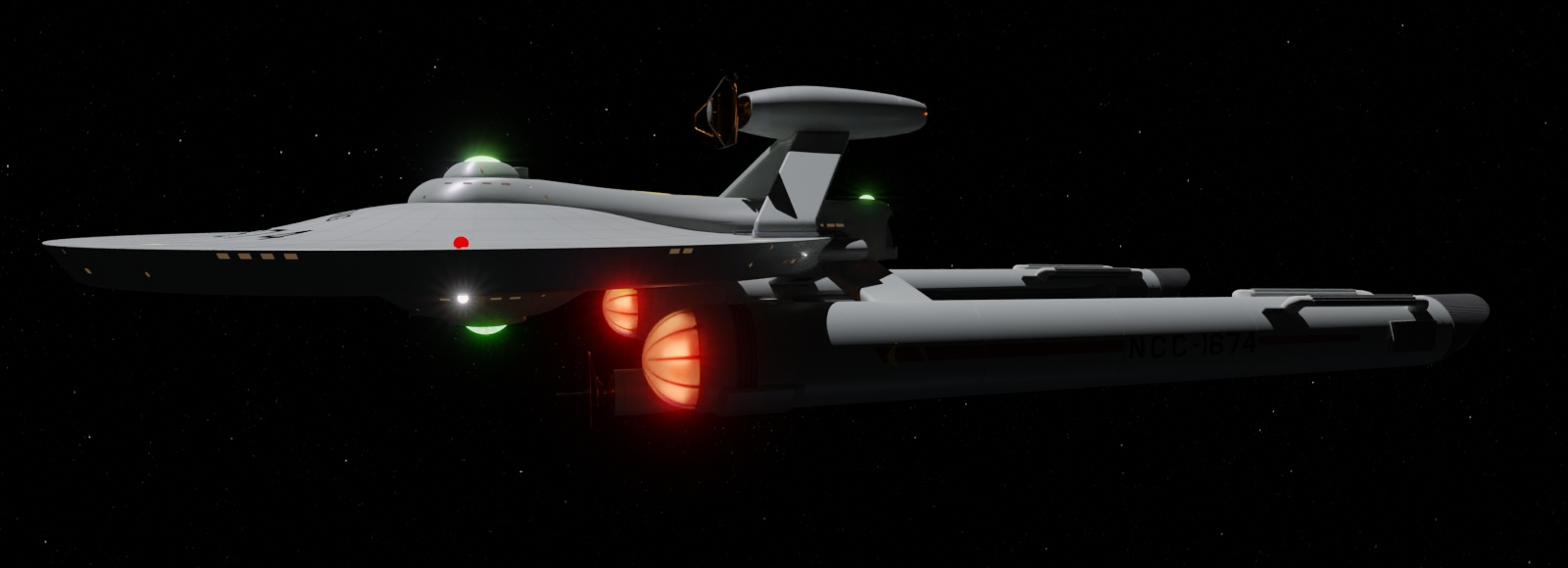
Days ago I decided to make it so I can render it more or less TOS complaint. No lighted registration number and name, no RCS thrusters, no glowing warp engines. I kept the phasers and torpedo launcher because I have altered geometry around the phasers. Of course I can hide the phasers, torpedo, and the Boolean operations, but that geometry remains and would require excising faces and rebuilding. Not a difficult task, but something to consider later on.
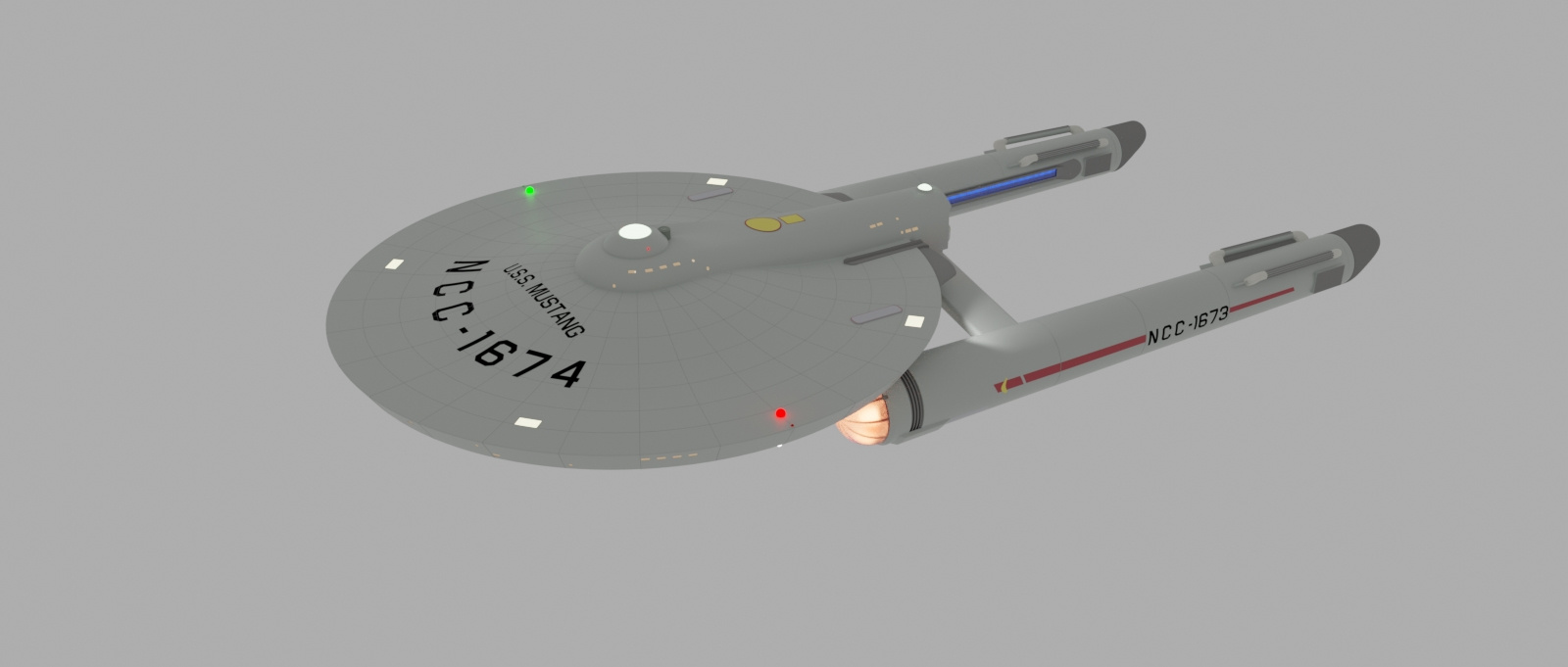
It was this point in rendering that I noticed I forgot to change the number on the nacelles.
And I forgot to hide the engine glow.
I suppose I should hide the impulse glows too. . . .
![[Irishman]](https://forums.scifi-meshes.com/uploads/userpics/customavatars/navatar499.gif)
-
Percheron class (tos era)
^And. . . that sounds like something someone else can do.") It would be an interesting take, though.
It would be an interesting take, though.
The stardates? I just came up with something that seemed reasonable.
I used Blender's Workbench renderer with material colors and the orthographic setting on a camera to keep the scale for views. The rest done in Manga Studio 5. When I do my specifications, I strictly avoid nautical and biological terms, such as "draft" and "dorsal." It's not a boat, and it's not a fish.
And the Boolean unions have begun. On duplicates, of course.
Ah, the joy of sliding verts and dissolving edges. I fix one side and symmetrize, and in this case I had to separate the lower hull faces because of the asymmetric details. I discovered this process after I thought I could get away with selecting only the verts I wanted to effect, but that deleted faces. Next I'll union the nav deflector boom to the pylon sled, and then that whole piece to the saucer. Then reevaluate my deck layout, move windows if needed, then apply those booleans and get to fixing faces. I'm not going to union the nacelles to the pylon, because, one, one is a mirrored instance collection, and two, they should be able to be jettisoned. I'll make it look like the pylon is inserted into the nacelle.
I am being mindful of quads, but if I can't avoid ngons, I'm leaving them as long as it looks good.

Additional credits
- Icons from Font-Awesome
- Additional icons by Mickael Bonfill
- Banner background from Toptal Subtle Patterns
© Scifi-Meshes.com 2001-2024