Greetings!
Welcome to Scifi-Meshes.com! Click one of these buttons to join in on the fun.
Quick Links
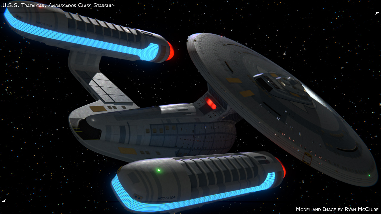
3DU.S.S. Trafalgar, Ambassador Class Starship


 373
Posts: 704Member
373
Posts: 704Member


Finally, after a year and a half, I'm calling her done. :runs:


Addendum, 2014-02-13 (details here):

WIP thread here.


Addendum, 2014-02-13 (details here):

WIP thread here.
Post edited by McC on
WIP: [ SDF-1 Macross ] Done: [ Coronado | Ambassador (original) | T'Varo ]
Books: [ Ashes of Alour-Tan | Embers of Alour-Tan ] | Blender Tutorials | Blog
Books: [ Ashes of Alour-Tan | Embers of Alour-Tan ] | Blender Tutorials | Blog

Tagged:
Additional credits
- Icons from Font-Awesome
- Additional icons by Mickael Bonfill
- Banner background from Toptal Subtle Patterns
© Scifi-Meshes.com 2001-2024
Posts
She does and she doesn't to me. On the one hand, I 100% understand why you feel that way, but having spent a loooooong time staring at every little bit of her (
Books: [ Ashes of Alour-Tan | Embers of Alour-Tan ] | Blender Tutorials | Blog
Revised the lighting so that all scene light is coming from a single unidirectional sun lamp ("distant" or "infinite" light in other programs) and the ship itself. Then futzed around with the compositing network a ton in order to try to smooth out the remaining "fireflies" in each of the direct and indirect channel passes. Added some more bloom and glare stuff. Tone mapped the whole render. Compare with the second render in the original post.
Books: [ Ashes of Alour-Tan | Embers of Alour-Tan ] | Blender Tutorials | Blog