Greetings!
Welcome to Scifi-Meshes.com! Click one of these buttons to join in on the fun.
Quick Links
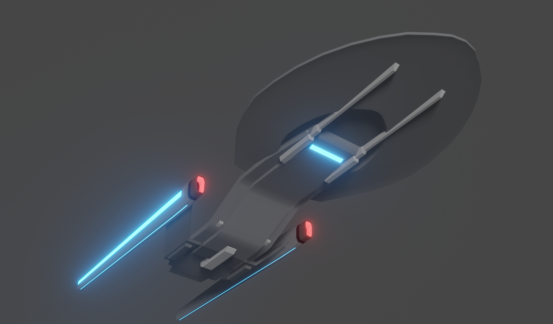
3DHello, i'm new here and this is my current WIP.
 Deantendo172
Posts: 68Member
Deantendo172
Posts: 68Member


So, i've recently got back into blender after about 12 years away, and naturally i'm making spaceships again. This particular model isn't my first, as you can see here, but my latest. Just a rough blockout for now.
I'm still very much getting familiar and learning things, and it's a hobby for me. If anyone is interested in the concept for the ship i'm happy to post what i currently have in mind,
I'm still very much getting familiar and learning things, and it's a hobby for me. If anyone is interested in the concept for the ship i'm happy to post what i currently have in mind,
Post edited by Guerrilla on


Tagged:
Additional credits
- Icons from Font-Awesome
- Additional icons by Mickael Bonfill
- Banner background from Toptal Subtle Patterns
© Scifi-Meshes.com 2001-2024
Posts
Currently reworking the nacelles (also DBZ!)
Indeed! I'm kinda merging the Inquiry class and Odyssey class.
A way to avoid that would be to inset the face slightly so that it's away from the vert going across, then delete the verts connecting the inset face to the corners and then do the rest of the operation as you did before. Since it's not connected to the vert going across or the corner you won't have the spider web of faces to clean up.
That's what it is. I knew I'd seen a similar design in the past, but I couldn't remember where.
Got a little nitpick for ya: the registry font clashes with the design, in my opinion. The Airborne font goes best with TOS era designs and your ship looks more 25th century. Here's the font they used for the registry markings from TMP onwards
https://www.azfonts.net/fonts/starfleet-bdex-bt/bold-extended-249278
Which I think would go with your design better.
Also, check out some tutorials on wrapping text around curves.
Here's my method (from memory, so I'll try to come back and correct myself)
Add a text object and give it the font and text you want.
Go to object >convert to mesh
In edit mode extrude the text a bit
Add a remesh modifier and I think the options you want are sharp, untick remove disconnected, and increase octree depth until it looks right. And apply the modifier.
Back in edit mode, delete all verts except the top faces.
Add a curve circle and scale it to follow the curve of the hull you want the text on.
Add a subdivision modifier to the curve so it's nice and smooth.
Go back to your text object and add a curve modifier and select your curve.
The text will be in an odd place along the curve, so move and scale until it looks right. Apply the modifier.
Add a shrinkwrap modifier to the text and choose your hull mesh, use project, and play with the axes settings until it looks right and set it above the surface so it doesn't clip. For me usually 0.001-0.005
Go to object properties and untick glossy and shadow in ray visibility. So it doesn't cast a shadow or reflection on the hull below.
Add whatever material you like!
I like the nacelles!
That's an interesting take on text, i like it. I'm still undecided on the font. Never much a fan of close outlines on a font, and the one i'm using leans more toward Naval styles, but then; I've always been a fan of large bold text.
The nacelles are coming along. Probably would be faster if i wasn't designing as i go, but here we are
This is the Probert design if your interested:
https://forums.scifi-meshes.com/discussion/79150/3dandy-proberts-enterprise-ncc-1701-f/p1
Well, i can see where folks were coming from with the similarity. Haven't seen that one before, but man i do not like it...
Good suggestion! I shall do that.
Thanks, and; YEAH. Unsurprising that 12 of development would improve it! Still impressed.
Current Projects:
Ambassador Class
How so? Forgive my noobish ignorance.