Greetings!
Welcome to Scifi-Meshes.com! Click one of these buttons to join in on the fun.
Quick Links
3DRetooling of the Galaxy class
 mishasiegfried


 149
Posts: 65Member
149
Posts: 65Member


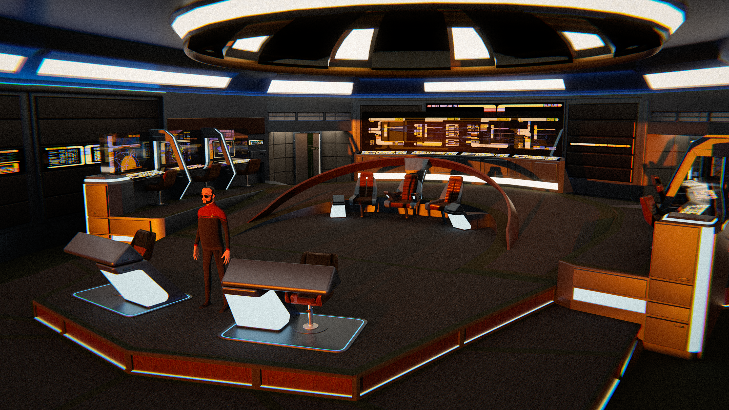
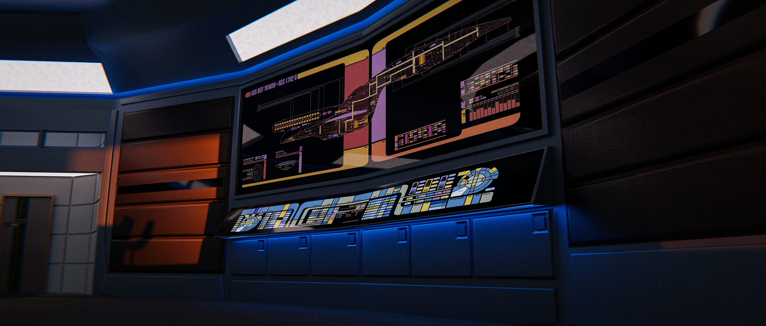
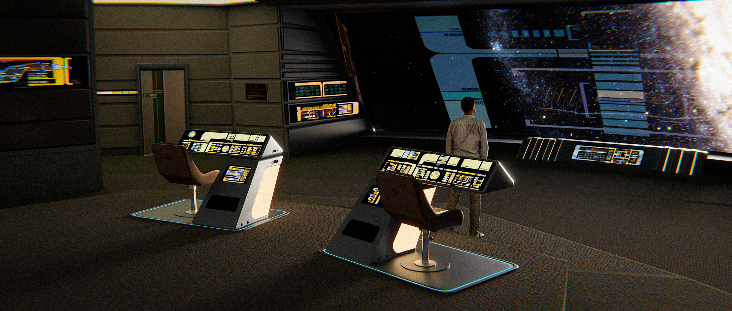
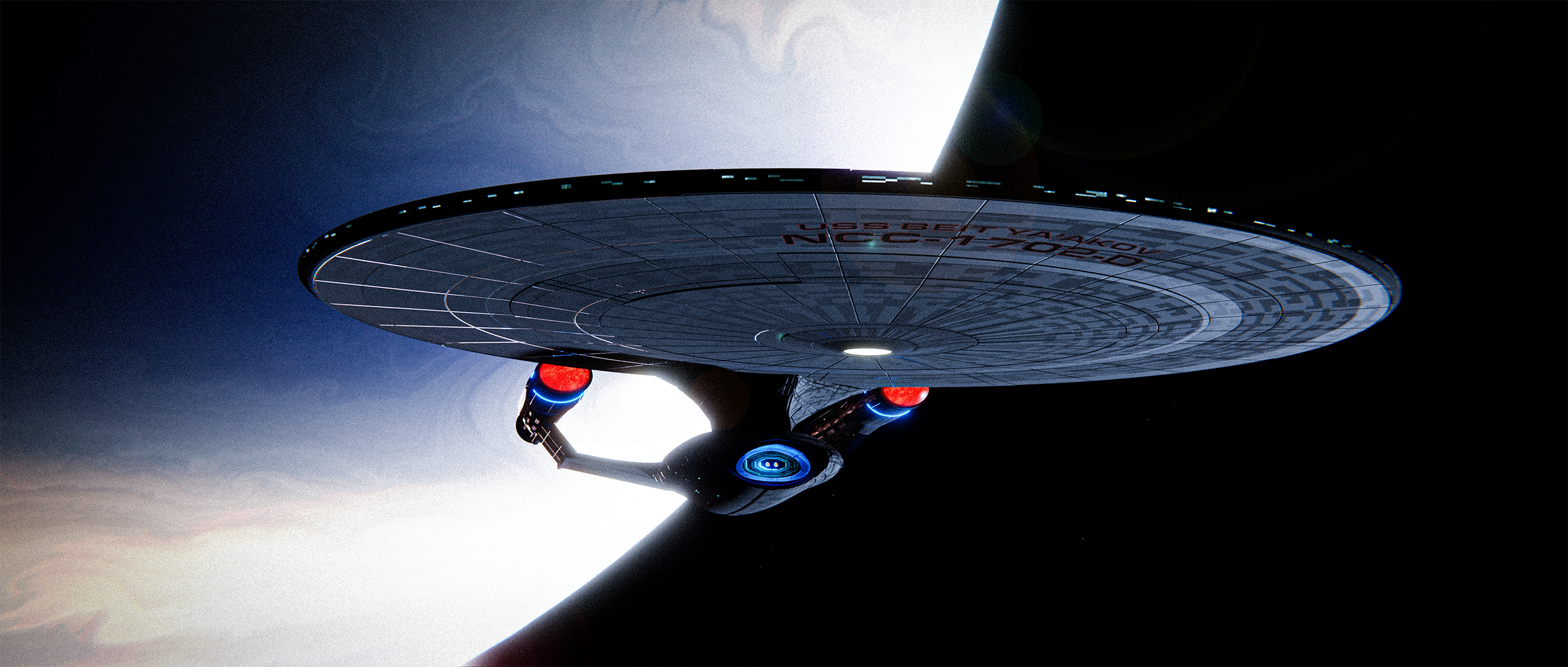
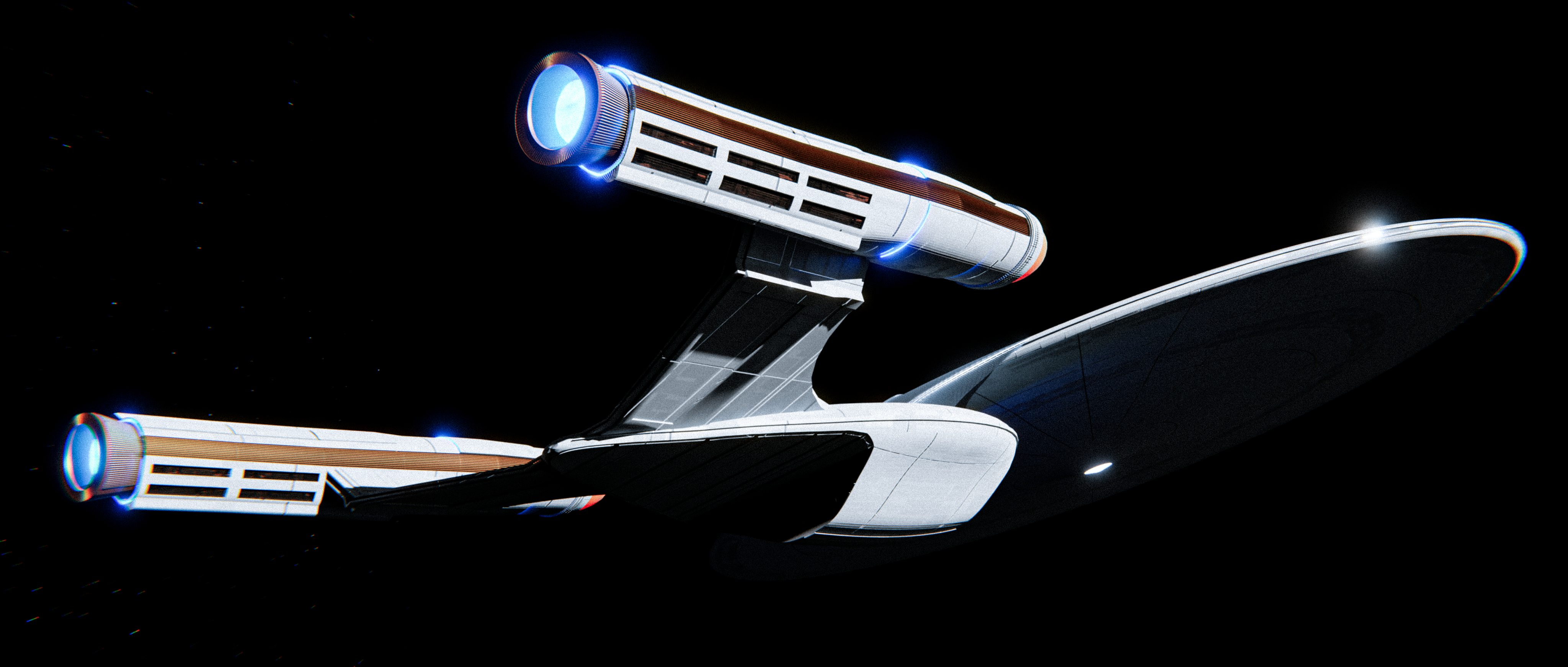
Been working on these the last few weeks. Both are still very much in process, but I feel like they're at least finally at a place I feel comfortable sharing them here. Wanted to try doing an modernized version on the TNG design era. The chairs on the bridge were downloads from CGTrader, as well as the Conn and Ops consoles in front. LCARS panels were all screen grabs from around the web. The two major changes I brought to the bridge design was the expansion of the physical space itself to include a wraparound out area (similar to the Discoprise bridge, conceptually) as well as the notion of changing the aft stations (as well as the somewhat Generations-era port and starboard support stations) to be free standing transparent glass monitors instead of the standard backlit/TV monitor style of the originals. Other aesthtetic changes are basically to suit my own personal tastes. I started with the ENT-D color scheme for the bridge, but opted to go with my own palette for individuality sake.
Also, fun fact: I posted a while ago about how to model the horseshoe tactical station. Lots of really great suggestions on how to tackle it, but I found that a slice of a fairly high vertices count UV sphere works damn near perfectly for the job. Just solidify it and extrude out the base. Pretty neat and clean solution, I found.
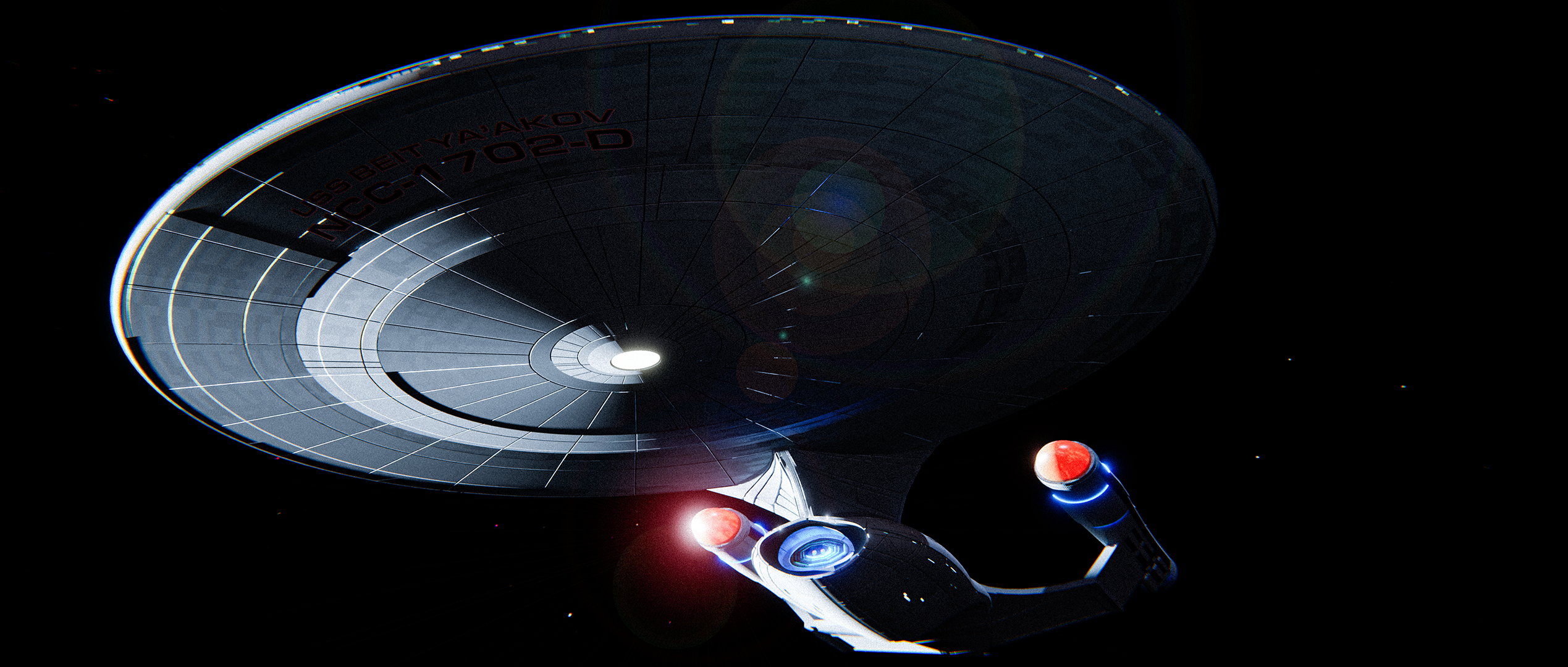
The model of the ship is still VERY MUCH a WIP. The basic silouette is near identical, but I enlarged the saucer a bit and redesigned the nacelle pylons and the nacelles themselves. Not super into the nacelles right now, but it's a good starting point. The rest of the ship is really just an attempt to update and modernize the design without losing the look and spirit of the original design. As I continue work on these, I will be sure to post more pics!
Also, fun fact: I posted a while ago about how to model the horseshoe tactical station. Lots of really great suggestions on how to tackle it, but I found that a slice of a fairly high vertices count UV sphere works damn near perfectly for the job. Just solidify it and extrude out the base. Pretty neat and clean solution, I found.
The model of the ship is still VERY MUCH a WIP. The basic silouette is near identical, but I enlarged the saucer a bit and redesigned the nacelle pylons and the nacelles themselves. Not super into the nacelles right now, but it's a good starting point. The rest of the ship is really just an attempt to update and modernize the design without losing the look and spirit of the original design. As I continue work on these, I will be sure to post more pics!


Additional credits
- Icons from Font-Awesome
- Additional icons by Mickael Bonfill
- Banner background from Toptal Subtle Patterns
© Scifi-Meshes.com 2001-2024
Posts
Thanks for the feedback! It's all still very much in progress, but I feel like it's coming together nicely. The one thing I will say is that the STD viewscreen/windshield thing has really grown on me. I also really like the idea of HUD on there because i feel like it makes far more sense, given our current technological capabilities over the older-styled "massive TV screen". The one of the biggest benefits, at least in my mind, is that the windshield approach offers the ability to introduce more natural lighting into a scene. One of my favorite things about Generations was the subdued lighting and the extensive use of "sunset" exterior lighting" on the Ent-D. I feel like it added a really nice moody vibe to the sets. My biggest beef with TNG era design as a whole is that it was always a bit generic, in the sense that it embraced the sort of 90s pastel-and-organic shapes thing a little too much. But all production design is fundimentally a product of it's time. Disco's design department has made ships and sets that are VERY 2020s (...to a fault, in my opinion, but that's another thread...)
I'll keep posting stuff as I'm working on it and hoping to hone in more on it!
The interior looks okay so far, although not a huge fan of the transparent displays along the sides. As others have said, this does give off a DSC/PIC reimagined vibe, which I suppose is what it would likely look like if they do show something similar in Picard. The hud/windscreen/viewscreen thing is okay, other than that the HUD is actually a step back from what they had in TNG. The original viewscreen on the Enterprise-D was 3D, capable of projecting images at different perspectives depending on your position from the screen. Also, the viewscreens shown on both the Enterprise-E (in First Contact) and Voyager (Year of Hell) shows they use hologrid-technology.
As for the floorplan, my one suggestion is to bring back the sloped flooring from the upper level (where Worf would typically be) to the lower level (where the command seats and helm/ops are). Adding the single step down to the ready room and turbolifts is sufficient I think. Hard to tell from this angle, but appears you've lowered the doors in the back as well (which I think actually looks rather nice), as well as a MSD on the bridge. Something the original didn't have until the Enterprise-E (as well as Defiant and Voyager).
Overall I think this would look a bit cleaner with either TNG or Enterprise-E color palette for the bridge. Displays I'd keep exactly as-is.
The Refit wore braces and Ent-D looked to be gumming it.
The only…and I mean the only thing…that makes me scratch my head about Atolm’s designs is that he moves the saucer pylon so far forward on some designs that the lower sensor dome is put on the bottom of the secondary hull.
Now I don’t mind a second sensor dome there, or 360• turret, but when you move the neck forward and lose the saucer dome? It makes the primary hull look like it is being choked…or like Best Jeanist from MY HERO ACADEMIA.