Greetings!
Welcome to Scifi-Meshes.com! Click one of these buttons to join in on the fun.
Quick Links
2DRemodel of a John Eaves Ship
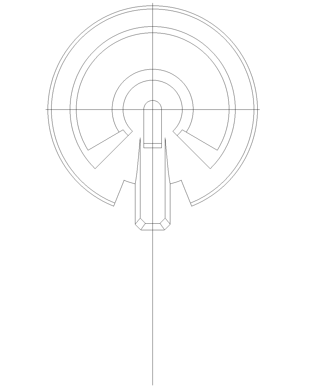
Another ship that has been knocking around in my brain has been one that I seen on John Eaves blog, I believe it was meant to be a Star Trek Online ship, though I don't know if it is.
I don't have any spec's for it, except that at the bottom of the image it says "Science Vessel."
I'll I've been able to get is a small blurb from the blog itself that doesn't help much.
Height: TBD
Width: 210 M
Length: 384M
Decks: TBD
Deck Heights: 4M
Crew:TBD
I will be augmenting the design as I'm not entirely fond of the original design, and will be keeping it as primarily a science vessel.
I hope to have more updates soon!
Edit: I forgot to post the new Starfleet logo / Comm badge.


I don't have any spec's for it, except that at the bottom of the image it says "Science Vessel."
I'll I've been able to get is a small blurb from the blog itself that doesn't help much.
Here is a science vessel from the Perpetual files. this was the first of the donut ships and looking at it again I have to cry at the bad painting in Photoshop,,, OHHH those early PS learning days were rough!!!! this one was fun to work on because it was loosely based on a big fav of mine the USS Grissom. At this point in the game deadlines were getting tighter and the execution of the renderings were getting rougher as to what was turned in. New modelers were being brought on and the load of things to be built was on the rise. As always I would have liked a little more time to work this one out a little more. The underside details were a later addition requested to add thickness to the ships profile. ItA’s a frumpy addition that doesnA’t really add much to the functionality of the vessel..
Height: TBD
Width: 210 M
Length: 384M
Decks: TBD
Deck Heights: 4M
Crew:TBD
I will be augmenting the design as I'm not entirely fond of the original design, and will be keeping it as primarily a science vessel.
I hope to have more updates soon!
Edit: I forgot to post the new Starfleet logo / Comm badge.


Post edited by Damocles on
Tagged:
Additional credits
- Icons from Font-Awesome
- Additional icons by Mickael Bonfill
- Banner background from Toptal Subtle Patterns
© Scifi-Meshes.com 2001-2024
Posts
I'm curious about the Model. Good luck
My functional concerns aside, it is a good looking ship; I look forward to seeing your interpretation.
This is from the original attempt to make Star Trek Online, by Perpetual Studios. Perpetual went under while making the game and Cryptic took over. When they did, they started over from scratch, so all of the design work done by John Eaves and other talented designers went to waste.
Edit: Also, wish John would update his site, it's been like 2 years now since a new post! He must be very busy.
I don't plan to use the bottom that was added at all, and will be editing the aft section a bit more to my liking. Haha.
I also intend to elongate the ship, make it a little bigger, and more... sciencey...? I want it to pretty much be a mobile lab.
sciencevessel_eaves.jpg
I remade the saucer and modified the aft end... It was ridiculously complicated the way it was drawn so I am now attempting to streamline it a bit.
As always, comments and crit always welcome.
I knew I was taking on a challenge when I started this, but this ship has so many awkward lines in the original that it makes the ship hard to hammer out... then again I probably made it worse by making the ship bigger than it was originally supposed to be.
That being said, I did call this a Remodel... so I took some time tonight to create to alternatives.
The first draws more inspiration from the Excelsior Class, with a long, flat-topped engineering section, but attached to the saucer more like the Eave's design, just rounded out a bit. No nacelle's on this side yet, but I like the balance it gives the ship, even if it does fall closer to the "standard" Starfleet ship design.
The second is a modification of what I have been working on already. The issue with this layout is that it makes the ship seem more off-balance and forward-heavy. A possible solution to this would be to once again extend the engineering section to the left and right to make it bulkier and then add slightly larger nacelle's to the sides, but I'm not sure.
If anyone has any suggestions, I'd be happy to hear them!
Seems this will actually turn into two separate vessels, since, with some minor adjustments to the saucer (Thank you, Jenny), I actually like both styles now.
In the Excelsior-style pic, I put a small image of what the saucer looks like from the side view. I added the tapered edge on the inside to thicken up the saucer a little more, and give the front of the ship more "weight" so to speak. The edge exists in the Eaves-style as well, I just didn't put in a reference for it.
Thinking about what Jenny said, I decided to try moving just the bridge module forward a bit to see if that helped (instead of the whole core - if the bridge didn't work out, I would have tried the core next). I actually think it works rather well overall, and made minor adjustments to the side "slope" areas - which now go up and wrap around the bridge instead of just ending.
Also, for shame on all of you for getting the Vengeance stuck in my head... now I have a "prime universe" version kicking around my head!
Forgot to reply to this...
True, and as a science vessel I can see them having storage for a lot of specimens, cargo space for food / rations (I'm thinking this would be a deep-space vessel on a years-long survey mission), and yeah, hanger-decks, etc.
This is where the Exselcior-syle works best because it has more volume to it that the Eaves-style. However, the Eaves-style one (in my mind) has more fuel space to allow for longer missions...
Thankfully I can play around with both and see what comes of it.
There's also the fact that I had an idea for yet another ship, and I worked on that for a few days.
If anyone is interested, I uploaded the new ship and an MSD mock-up to my deviantart account, you can view it by clicking the link in my signature.
As for THIS ship; worked mostly on the side view of it, erased the deck lines I was using as a guide, got the nacell's in place and the pylons.
I also added in the impulse engines to the saucer section.
As usual, nothing is set in stone right now, but I wanted to get this stuff in place just to tinker around a bit.
As a side note, I'd like to mention that I am trying to keep in a fair amount of John Eave's syle as I can, which is why I have the pylons attached as they are - it was the way they were attached in his updated version of this ship.
Only a minor update to this as well, but I wanted to make sure everyone knew I hadn't forgotten about this project!
Started adding in the shield grid lines and some windows. I'm hoping to tackle more later.
Else it looks fairly nice.
Worked on the bottom view (quite a bit actually), and got a lot of that fleshed out, though I didn't intend my deflector to resemble Voyager's as much as it does... what do you think? Keep it, or change it?
Also re-did the Nacelle's, and their views look MUCH better in the top and bottom views now... added some phaser array's to the saucer, more windows (which were a pain), the sensor dome was put in, and the shield grid on the bottom saucer.
Overall she's coming together rather nicely!
What do you think of the hull color? Too light? Too dark?
Less mass, more windows, greater security for the bridge.
For Donut Option 1 I sloped the conference room deeper into the back of the saucer, giving it a little more protection from the sides, and finished the coloring of the RCS Thrusters. I also thickened the lower saucer phaser array's on the side view. I still intend to add some windows to the engineering section, but have yet to start that. Once I make those changes, Option 1 will be considered complete.
As a side note, with all the escape pods tallied, there are enough pods for a total of 348 people. I think thats definitely enough!
Edit:
Donut 1
Decks: 20
Height: 80m
Width: 320m
Length: 640m
^ All estimates
Crew: 500 - 550
Mission: Deep Space Exploration
Side Note: Because this ship is designed for Deep-Space, most of the engineering section would be dedicated to fuel tanks, coolant and storage / cargo - hence why it has a lower crew count than the E-E.
__________________________________________________________________
As for Option 2 - I spent a lot of time tonight working on the aft section and finally managed to get it to look a little more like the original John Eaves designs. I will be making some more modifications to the saucer section in this version and I think it's going to end up being more of a war-ship than what I originally planned. Something like border protection in the post-dominion-war. I also modified the bridge area in this option the same way I did for option 1.