Greetings!
Welcome to Scifi-Meshes.com! Click one of these buttons to join in on the fun.
Quick Links
3DBlender Trek Thread
 psCargile417
Posts: 620Member
psCargile417
Posts: 620Member


Since I'm getting the hang of Blender, I decided to model my popular Trek concepts from over the last 16 years.
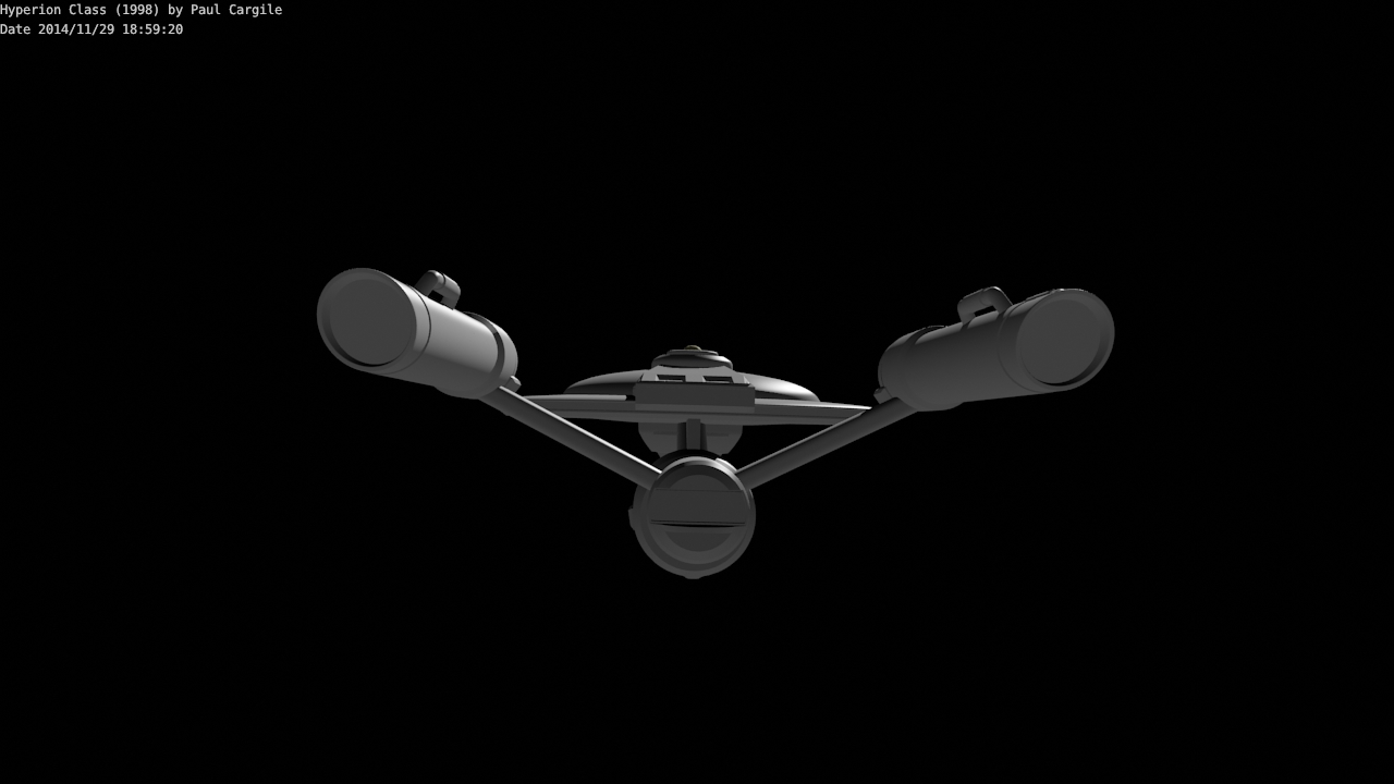
The Hyperion Class is one the oldest, and while it's been modeled before, I've never given a crack at it with Rhino. I'll start with it as it is easiest.

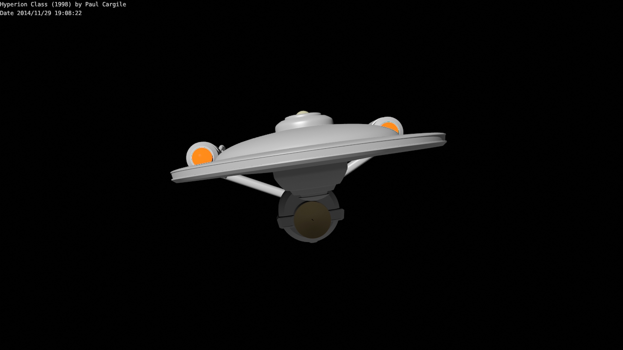
I'm making minor aesthetic changes along the way, fixing problems were 3D doesn't match 2D. I scaled it so that the saucer edge is only one deck, making it a total of 206.6 meters long, with a saucer diameter of 108.4 meters.
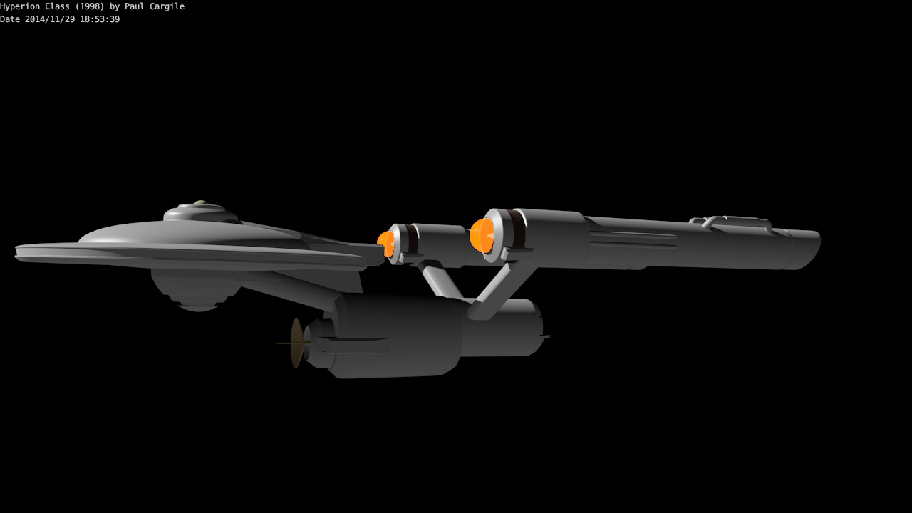
The Hyperion Class is one the oldest, and while it's been modeled before, I've never given a crack at it with Rhino. I'll start with it as it is easiest.
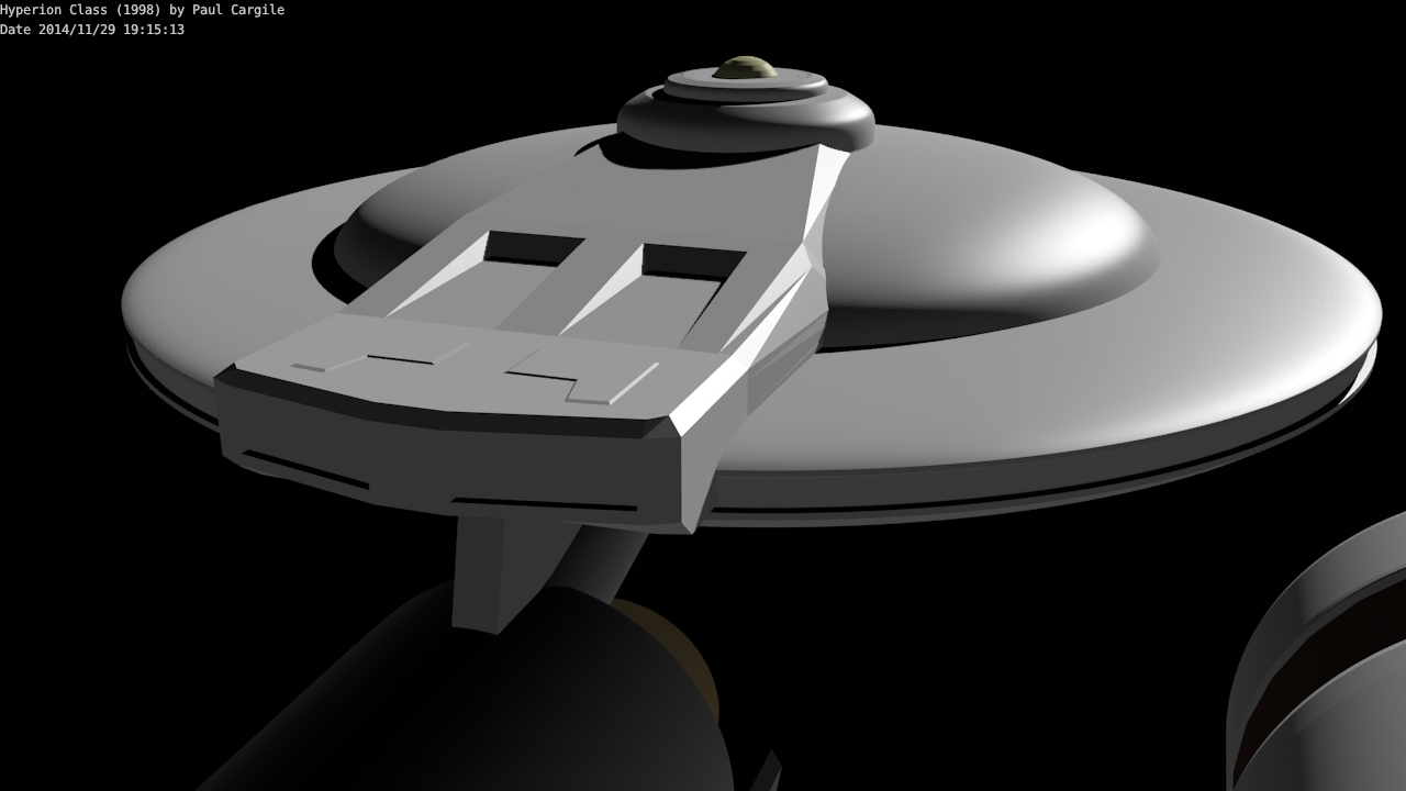
Need to fix that impulse deck geometry!
I'm making minor aesthetic changes along the way, fixing problems were 3D doesn't match 2D. I scaled it so that the saucer edge is only one deck, making it a total of 206.6 meters long, with a saucer diameter of 108.4 meters.
Post edited by psCargile on
Additional credits
- Icons from Font-Awesome
- Additional icons by Mickael Bonfill
- Banner background from Toptal Subtle Patterns
© Scifi-Meshes.com 2001-2024
Posts
Geometry fix, and engines added.
Canted the engines so the exhaust meets the screen at 90 degrees. I don't know what they do in Trek lore, but I use the plasma permeable screens to vector thrust.
I made some icospheres and selected Blender's Halo material to create a engine glow, and then tried some compositing for glare, but I didn't like the results. Eventually I'll probably replace those with closed circles and create a particle system for a thrust effect.
John Eaves said something similar on his blog once, that he loved seeing what people did when they interpreted his designs and maybe did things a bit differently than how he drew it.
The changes I'm making are becoming so noticeable, it might as well be a refit. As well as continuously tinkering with the impulse deck, I've made the neck an oval and added width and angle to the spine. I wanted the Warp Plasma Conduits to and into the nacelles to be be straight paths, so I moved the nacelles forward so they would not interesect the square units Franz Joseph labeled the FLux Constrictors. I also raised them a little higher so they would not appear to rest on the saucer from the front view. I lengthened the main engineering hull so that the pylons would extend from the engineering room, and not from the cargo/shuttle bay. I also pulled back the geometry along the edge of the saucer to allow navigation lights to be affixed to a flat surface.
Shrunk the width of the "flush vents" atop the impulse deck, and squared it up.
Navigation lights are such a pain in the ass to make bright without washing the hull in their light. I loath having to do test render after test render.
Belly shot. We don't see a lot of those do we?
It's funny you should mention that. I was going through a fan film a while back trying to get references on a model, but they wouldn't give me a bell shot. I so wanted one, but it wasn't there.
Test texturing.
I downloaded the Jefferies font, but the letters for the registry looks too crowded, and I don't like the arc distortion of the letters/numbers. May have to do them individually for better spacing and rotations.
Didn't like how the name curved across the acute curvature of the hull, so I moved it back.
I moved everything up the hull. I don't like that either. Maybe the first one was better.
Still tinkering with the impulse deck. Made the top details more in line with the original Enterprise's.
Yeah, I was going to comment on that. I find that none of those fonts have the correct spacing, so I always have to do each letter individually and move and/or rotate them accordingly. It's a pain, but the results are worth it.
I have always had to manually tweak the fonts as well. The ARCH modifier ruins the text.
Playing around with lighting. I like to make physical light fixtures for spots, but I'm thinking recessed lamps might look better.
Would have to increase the texture to 4096 for better clarity, but these are just test textures. The acute curvature of the hull requires more than one spot, unless I put a single spot up on a boom. Then there is the question of running a deflector grid line through a light fixture.
Photon spill vents are just a test to see how things will look. I will probably move the nacelle to the other side so the glowing parts are on the inside.
I drew the design before ST:Ent aired, so now their ideas are a source of inspiration.
As of these time, I want to model the Ranger class, the Rapier class destroyer, the Banzai fighter, redo the Lambo shuttle/runabout, and some future stuff I have kicking around in my head.
For text, I like to rotate every single letter/number into place, as opposed to using arcs. That doesn't create distortion issues.
I've often wondered if the work you all did on those designs predated Enterprise or if it was the other way around. That answers that.
Playing with Blender's multimaterial feature to assign different materials/textures to the mesh. Only the outer edge of the saucer has a texture unwrapped from the top view. Added some space in the relevant letters in Font Creator, arched it in Photoshop, added individual letters, and finished it off in Manga Studio. (Is there software that does everything?)
I do my lettering and base textures entirely in Inkscape, though any vector graphics drawing program would work. Though, to add weathering and other stuff, I do have to move it over to GIMP.
I was looking at NX-01 images yesterday and just noticed its saucer edge detail is the inverse of mine. Parallel development. I was looking at the texturing, which I think is done more realistically than most. As a person that has removed and installed panels, I've never understood the Aztec pattern.
Yeah, pretty much. I've never found one program that does everything I want for making textures. It would be nice, but I just don't think it exists. Inkscape is good for laying out the markings and doing base colors, different color sections, etc. However, I haven't found anything I like as far as adding weathering using it. For Aztec or other types of paneling, I usually find myself using Lightwave for at least part of it. I don't like having to draw the panels and then "fit" them to the model, so I just skip that step and do it right on the model and then render it with an orthographic camera. Then I take the rendered image into Inkscape, Gimp, etc. to do whatever else with it.
A little more engine work.
A couple of hours of work, and I'm glad I didn't save it during the process. I like the straight pylons better.
The attachments were done in Manga Studio 5, mostly with vector lines.
Anywho, I really like that "Star Trek Alternative" design. You're going for completely different than what we're used to on Trek, and that's not a bad thing. And, of course, I like the detail bits on the Hyperion.
The "Star Trek Alternative" was something I was going to post back in the spring or summer but I never got around to it. The "not playing it safe" addresses what I've noticed in a lot of science fiction where we envision a type of future tech and put it, say, 500 years in the future, when in reality it probably comes to be in about a hundred years or so, a lot sooner than we would otherwise think. Trek tech was the inspiration for flip-phones, and that has been surpassed. It's easier to think of technology advancing linearly, and not exponentially as it does. I see a lot of concept artists (paid and hobbyist) replaying the same tropes over and over again, playing off the themes of Star Wars and Star Trek and only putting imagination into the details for their original designs. Look at the technology and ships designs in "Barbarella"--it's bizarre. (Watch "Zardoz" for even more craziness.) Seems the idea was "We aren't going to understand future tech or physics, so we'll design it all like art." I love Barbarella's ship, shag carpeting everywhere.
My idea was that if Trek hadn't been done in the 60's, and was done today while ignoring the contemporary scifi tropes, what would it look like?
They miscalculated the moon landing, but you can't predict a man like JFK would be elected and move the country in that direction. Afterwards, our expectations got ahead of us when we thought that space travel would advance at the same rate, with 2001, and Space 1999, and others. We couldn't send people to Mars in 2010, let alone Jupiter. But then again we are using a skyhook method to put the heaviest rover to date on Mars and landing a probe on a comet. Both achievements were more difficult than landing men on the moon, and got less publicity while they happened. I did watch Curiosity land. Even having a thin atmosphere to contend with ratchets up the difficulty.
And next year. . .Pluto. I can't wait.
For getting ahead of ourselves, don't forget Star Trek: The Original Series. WW3/The Eugenics Wars was supposed to be sometime in the 1990s, and Khan's ship supposedly left Earth in 1996. Given that the episode was written in 1966 or so, that would have meant genetic engineering was going on at that time, unless Khan and his group rapidly aged. Plus, that would have given us 30 years to invent cryogenic freezing, as well as advanced spacecraft capable of rudimentary interstellar travel. That was a bit lofty. It was also surprisingly bad writing, given that Gene Roddenberry preferred to not give specific years/dates for when stuff happened. (hence, the stardate system)
Some pylon work.