Greetings!
Welcome to Scifi-Meshes.com! Click one of these buttons to join in on the fun.
Quick Links
AnimationBattlestar Apocalypse: The Battle Begins V4.0
:=: FYEO:=:
Updated Video. The Video is my storyboard. Also, I need to upload to see how it looks also.
For some reason, my previews in C4d, then in Sony Vegas, are not what comes out.
But when uploaded, the differences are more apparent.
Have re-rendered almost every clip, added some things,removing the blue, etc.
Am thinking of jumping in 2 more Basestars and maybe using TOS
Baseship-Attackstar also. Also a possibility is adding 1 or 2 more Battlestars.
thinking of some more dialogue also. The Video is my Storyboard.
still arming the Basestar. Need a lil time off from this. And a lot more time to make it.
I have seen this so much, I could use others perspectives.
Video will be available shortly.
[video=vimeo;95407900]
Tips,Suggestions,Corrections, sound off like you got a pair!
-- after seeing it, I do not believe I need to re render some more, the lighting seems to have
altered with out permission.
"Cylons are not what you thought they were"
Regards,
Randal R.
Post edited by RandalR on
Tagged:
Additional credits
- Icons from Font-Awesome
- Additional icons by Mickael Bonfill
- Banner background from Toptal Subtle Patterns
© Scifi-Meshes.com 2001-2024
Posts
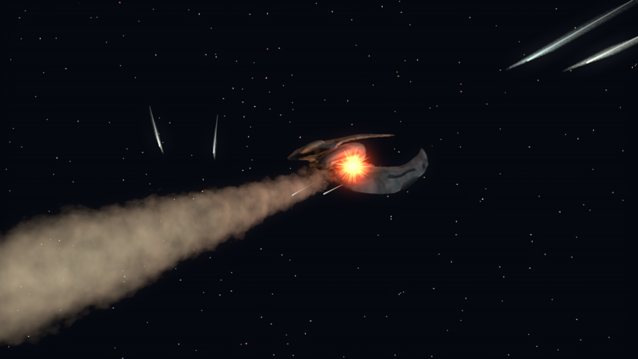
01:36, really nice blobs of flame effect. the great camera motion at 02:23 is now vastly better, good to see the stuttering motion gone. i also notice you say one of your clips is being reconstructed, is this to improve the hull textures in it? noticed the hull being lit up by flashes from offscreen explosions in the clip around 03:20, good use of lighting to imply what cannot be seen directly in the shot. would be good to have some extra battlestars and basestars, although they will mean you need to either really alter this video or bring them in later, but i would suggest keeping away from the TOS designs. another tip is try having more shots where you have a part of the battlestar in shot whilst the main action is further away, like the clip behind some of the credits, it's a rather effective composition. noticed you had credited me, you needn't have but thanks anyway.
-The Apocalypse roll in the beginning was cheesy. (That's a word that should come out of the shadows or bathed in fire.)
-The Story boarding was well planned. The camera effects competent and original. The ship choreography wasn't repetitive or boring.
-Lighting may have been a bit too hot
-Viper movements were convincing.
-Base Star Model didn't look right
-Details on Vipers and Battlestar extremely accurate
-Music overture was competent and seamless.
-Voice Selections was equally seamless and convincing rather than awkward and amateur.
-Weapons fire was not the right color.
-Probably could use some in-cockpit shots to jazz up the action.
8/10
All in all Pretty Good.
It may lack the wow factor that makes professional work pop but it's nothing to shake a stick at. You've clearly mastered the fundamentals and have good taste in models (or you amazing 3D work yourself). I really would like to see this finished.
I have just discovered how to get Motion Blur AND Depth of Field to work together.
or at least it happend by accident ...lol
Before it always canceled each other out. In one pass.
So, am going to try and redo some more of the clips to better DOF on them.
Also Am testing shots on the Base star firing, and Lighting is proving to be a bear.
The base ship does not respond well to lights.Already re did the Raider launchers with new material.
May have to adapt Basestar Materials.
I am also adding some Color Correction in C4d Filter. ( To which I really have no clue ) Just trial and error on this.
May help some. I cannot really tell a difference, but IT looks like it affects the upload more so. Will stick with
+4% Saturation
+3% Brightness
+4% contrast
Taking out all atmosphere also.
I have also learned of TFD and X-Particles for C4d. I wished I had them now. And knew how to use em
Will add a new update when I get a lot of this I got on the Table now to do.
Thanks for those replies, Very Helpful.
Regards,
Randal R.
How exactly did you convert it to Cinema 4D? Could you post a screen grab of the texture window, I might be able to figure out what's going on.
I'll try.
When Imported into C4d, I re-assign the material/image. I go thru each material that is assigned, and manually
re-load every image or texture in all of the used channels.
So, each of the materials that has a Diffuse, I load up the Diffuse image. On this example, it shows the Diffuse
is on, material on, and brightness 100%. And each are like this. Would it be the Image then that is the problem?
It looks ok to me as long as it kept a distance. IF you have suggestiions on improvement, am all ears
I thought of Actually adding some hull like textures to it or at least some Bump with them.
And I have already done a Revamp of Intro Text with Flames, looks pretty good.
Thnx,
EDIT:
I tried a new scene and turned down the diffuse tp 20 % and it made an improvement I believe.
Will begin Rendering a clip.
No new scenes really, still working on Re render settings.
Aw, The New Intro Flaming Text is in! Feedback.
There is a longer clip of flaming text in credits.
https://www.youtube.com/watch?v=iH6Gxeh8wIY&feature=youtu.be
Yeah, you'll definitely need more than just the diffuse texture to get it to look right. I don't recall exactly how I originally set up the textures, but the hull was a bit dark with very dramatic specular highlights. It was lit by a large number of very bright lights, with very short falloffs that lit up certain areas near the main hull.
I can double check all of this, but not before this weekend.