Greetings!
Welcome to Scifi-Meshes.com! Click one of these buttons to join in on the fun.
Quick Links
3DIntepid Class Prototype
 calamity_si361
Posts: 369Member
calamity_si361
Posts: 369Member


Hi everyone,
VoyagerCncpt2.jpg
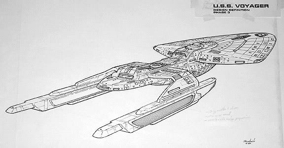
Rick Sternbach designed this as a primary concept idea for the USS Voyager. He was later told to 'smooth' the design over and make it look a bit more like a Lexus, which he did.
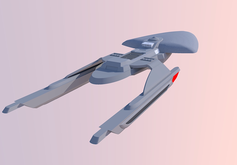
This design, although clunky, is a particular favourite of mine and has been ever since I first saw it when I was about 15 years old in the 'Art of Star Trek' book. Sternbach did other angled views of this concept, but changed the details whenever he did so, meaning that this picture is the ONLY existing image of this particular design. It was quite a challenge to build my Sketchup model to match, especially as I had never seen the navigational deflector array before, so essentially, I got to add my own flair to the design. Here's the back quarter view to match the original sketch. It's obviously not finished, so there's much more to follow! :thumb:
USS Sternbach.jpg
VoyagerCncpt2.jpg
Rick Sternbach designed this as a primary concept idea for the USS Voyager. He was later told to 'smooth' the design over and make it look a bit more like a Lexus, which he did.
This design, although clunky, is a particular favourite of mine and has been ever since I first saw it when I was about 15 years old in the 'Art of Star Trek' book. Sternbach did other angled views of this concept, but changed the details whenever he did so, meaning that this picture is the ONLY existing image of this particular design. It was quite a challenge to build my Sketchup model to match, especially as I had never seen the navigational deflector array before, so essentially, I got to add my own flair to the design. Here's the back quarter view to match the original sketch. It's obviously not finished, so there's much more to follow! :thumb:
USS Sternbach.jpg
Post edited by calamity_si on
Tagged:
Additional credits
- Icons from Font-Awesome
- Additional icons by Mickael Bonfill
- Banner background from Toptal Subtle Patterns
© Scifi-Meshes.com 2001-2024
Posts
(been meaning to ask you) The next time you build a sketckup model such as this can you make a video of the techniques you used.
Your mesh looks dammed close to the original sketch, which is one of my favs too. :thumb:
Guys, feel free to check out the 'Finished Work' section to see what I've been up to or just check out my Deviantart gallery here: http://calamitysi.deviantart.com/gallery/
USS Sternbach2.jpg
(you could try asking him. he responds to posts on trekbbs.com like in this thread for example)
Cool! I'll contact him and see what he thinks. With regards to the 'primitive' intersecting, I've been working off the original blueprints. I'll post some more views of what I've done but I think think my version looks sleeker and more advanced than what was originally proposed, but have a look and tell me what you think.
voyagerangbp3.jpg
voyagerangbp4.JPG
voyagerangbp5.JPG
Voyager-schematics.JPG
Bear in mind, I know that since Voyager came about, we've seen ships like the Prometheus and the Sovereign class which are all 'super sleek'. This is meant to be reminiscent of Voyager (and I guess, even more primitive than that).
Yeah I've seen plenty of these shots and for the life of me, I've searched for an underside view but can't find it. I have seen a picture of that angle before but if it's on the internet, I don't know where it is. I do remember it was a very straight cut slice-off of the secondary hull though. Not actually that pretty to look at.
I've got a free day on Sunday so I'm going to barricade myself in my room and get as much done on this as I can. My biggest concern is all the detailing like the windows etc. Unlike most Starfleet designs, this one has quite a few greeblies...can't wait! :-)
Contacting Probert can be a good option. He is usually very receptive.
15/04 - Ouch... I was thinking about Rick... I wrote the wrong name!
Not sure Andy can help you with that model, but Rick most likely could. As was already said, he sometimes posts at Trek BBS and is also regularly posting on Facebook.
USS Sternbach3.jpg
USS Sternbach4.jpg
When I see this ship I see a study model idea that was a superb jump point but needed a great deal of refinement. I remeber seeing this design in the TV Guide as a teaser but saw the images of the MSD in the background with Tuvok Janeway and Chakotay. I knew it would be how this ship turned out.
Most of my personal disatisfaction with the design is in it's form and not it's function. It wasn't continugous or as modular as the final. It was neither sleek nor tall as the ships of the past were. Rather it was long, abrupt and blocky and many locations. Maybe a different sculpter could have carved something different and better but the Final was in my opinion absolutely perfect. It was true reflection of the Galaxy Class but refined, slimmed, functional, sleek and extremely well developed with interesting new features that said "ADVANCED" like the variable field and sensor palettes and landing capabilities all without betraying the look of the current Fleet and still tall in it's own way....
Hi Saquist, thanks for your comment! Agreed, this was a primary 'jump-point' for Voyager and so lacked the refinements and 'sanded down' appearance of it's later incarnation. However, I actually prefer this version for that very reason.
I think this is a product of a very specific time in Starfleet design, namely about the time the starfleet runabouts and USS Defiant were developed. If you look at those designs, elements from both of them are strongly present here. I like the 'clunky' details as I think they make the ship look more detailed and I like to think that each little recess has a purpose or hidden capability. I could just imagine all sorts of wonderful extensions popping out, possibly like the weapons upgrades did on DS9...
Also, I've heard a few people mention how bad it is to have large warp nacelles as they present a major tactical disadvantage. I personally don't agree with this as the Sovereign class has MASSIVE nacelles and has never suffered any apparent problems as a result.
Had a major session on this yesterday when I tried to add details onto the saucer section. One major issue I'm having at the moment is the shield grid. I created 2d grid, which I then extrapolated and tried to intersect with the saucer section. However, the result took me a long time to do and didn’t come out as well as I had hoped because the horizontal lines of the grid are thicker than the vertical lines, so the grid looks uneven. I might abandon the ‘intersection’ method altogether and try applying a skin texture instead. I want to get a lot more done on this before I post my next update.
Sovereign had it's own tactical short comings regardless of the size of the engines.
Everyone knew they couldn't move faster than the Scimitar in Nemesis and they knew next to nothing about it. To me that means Enterprise E couldn't even best the Galaxy Class in speed. Likely Warp 9.5 or lower.
Voyager had more compact units, field enhancers around the hull and variable field geometry.
The Design Trend is leaning toward smaller for efficient and fast.
Here's an interesting article on the design process behind the USS Voyager http://ottens.co.uk/forgottentrek/designing-the-starship-voyager/ It describes the following;
"Sternbach’s early sketches had Voyager as a streamlined, dart like primary hull, with a flattened, enlongated engineering hull, sporting swept back runabout like warp pylons."
I think that pretty much nails this design on the head!
Why are you sure it's faster than the Galaxy Class?
Warp 8 is the highest speed a Sovereign-class ship was known to have traveled on-screen. According to Star Trek: Starship Spotter, the maximum warp of the Sovereign-class ship was warp factor 9.7. However, Star Trek Evolutions gives the Sovereign a maximum warp of 9.985.
Galaxy Class = "Warp 9.9 (Automatic engine shutdown after 10 minutes)
Warp 9.2 (max. cruise)
Warp 6 (initial average cruise)"
I think Sovereign may have a similar problem because Picard and Data knew the Bassen Rift was the perfect spot for a trap even before Scimitar started firing. On the one hand we can assume Sovereign is one of the fastest ships in the fleet and Scimitar is even faster than that. Or we can assume that Scimitar is powered by 3 Singularity cores and it's one of the few Imperial ships (Klingon and Romulan) that can match Federations ship typically fast top speed.
I prefer the latter. I think Sovereign top speed is warp 8 until you dump power for weapons.
I look at Nemesis and I see the ship regenerated it's shields 2x taking more hits than the first time they failed. That tells me their was a lack of available power for all systems to function at once. This is the only the second time a 24th century ship has shown that weakness. Galaxy and Intrepid's systems never maxed out total power generation unless something unusual was being attempted.
USS Sternbach5.jpg
Banned from working?
About the shield grids, they needs to be subtle. The actual form makes tha gap between the plates large than it would be.
I agree about the grids look, tho. They're too thick.