Greetings!
Welcome to Scifi-Meshes.com! Click one of these buttons to join in on the fun.
Quick Links
3DStar Trek: Phase II - inspired artwork


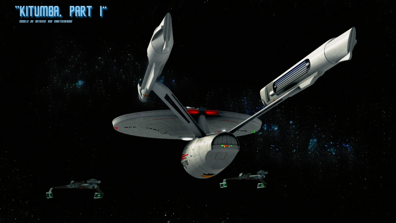
Well, since I've modelled the Phase II constitution class I decided to make some artwork with her. Here's my first image, based upon the two-part episode "Kitumba":
Post edited by NBTrekie on
Tagged:
Additional credits
- Icons from Font-Awesome
- Additional icons by Mickael Bonfill
- Banner background from Toptal Subtle Patterns
© Scifi-Meshes.com 2001-2024
Posts
I always thought the Phase II Ent, looks weird being a hybrid of the TOS enterprise and what would become the TMP Ent
Could put a bit of an angle on the Enterprise too?
So, on popular demand, some more views:
Small nipitick: arenAât the red running lights to much intense?
That station looks awesome.
@Road Warrior: Yes, there will be definatly more pictures, it's only a question of time and inspiration. Right now I'm working on a D7, after that I think I'll rework my first version of the Phase II drydock and space office complex.
@Starship: Hm, I didn't noticed that...The red ones are as intense as the green ones, which aren't realy seen in the picture...Maybe we shouldn't forget that this is the ENTERPRISE, maybe she needs that much attention
Just a niptick: ItAâs to much retangular. I donAât know if itAâs just with me, but she makes me remember a bed, from hospital. Excuse me...
Maybe a chamfer over the top edges could break this feeling.
Just one small nitpick on the first image though: The klingon sprirtual leader is Kahless, not Kitumbra