Greetings!

Welcome to Scifi-Meshes.com! Click one of these buttons to join in on the fun.

First Blood

OzylotOzylot332 Posts: 0Member
FirstBloodHiRes.jpg
USS Monarch returning fire...

Modelled in Bryce 5, Background and compositing in PSP7. Enjoy...
JES
Tagged:

Posts

  • Dr-TimelordDr-Timelord0 Posts: 0Member
    Why the big Starfleet logo in on the side? kinda stands out a bit much from the rest of the picture
  • OzylotOzylot332 Posts: 0Member
    They were placed there at the request of the ships designer.
  • kuckuk333kuckuk333178 Posts: 209Member
    i find this pic a bit confusing. the Monarch fires to starboard, i.e. it has weapons directing there. u may ask now, what is so confusing about that? Confusing is, that the Monarch seems to be more advanced then the later commissioned Constitution-Class, cause the Connie had only 2 Phaserbanks directing foreward.


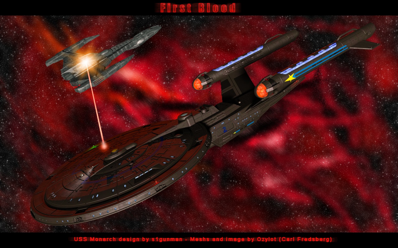
    nonetheless the pic looks quite good
  • [Deleted User][Deleted User]11 Posts: 4,002Member
    Actually, kuckuk333, what Ozylot did there was actually what Starfleet would have gone.


    You see, the NX Class could fire each side, right? Because of the Phase Cannons. Right there, those could be FIXED Phase Cannons, so they can't move. So that ship could have one phase cannons on each side, and two forward. The NX Class would have been stronger than the Constitution if the Pre-Federation Developed phaser banks, because she had more torp launchers than the Constitution. But, they only developed Phase Cannons, much weaker than Phaser Banks...think of it as Type I or Type II phasers, while the Constitution has type IV or type V. So you see the difference, the Constitution is still stronger. No mistake in that photo, I LOVE IT. Only wish I could create something like that, I got no program to do it...HP image zone...not something to create...Microsoft Photo Editor...yeah right...eh.
  • OzylotOzylot332 Posts: 0Member
    Thanx guys!


    Most of the tech that is used here is consistant with the NX-01 enterprise era ships. IMO
  • [Deleted User][Deleted User]11 Posts: 4,002Member
    Ozylot great job.
  • captainkirkcaptainkirk171 Posts: 0Member
    I always liked the Monarch and it looks great, but as Dr-Timelord said, the logo stands out too much, it looks like a sheriff star. Another problem is that the beam looks like it is coming from nowhere. But other than that, it looks great.
Sign In or Register to comment.