Greetings!
Welcome to Scifi-Meshes.com! Click one of these buttons to join in on the fun.
Quick Links
3DCome on then, point out all my mistakes!
 Deantendo172
Posts: 68Member
Deantendo172
Posts: 68Member


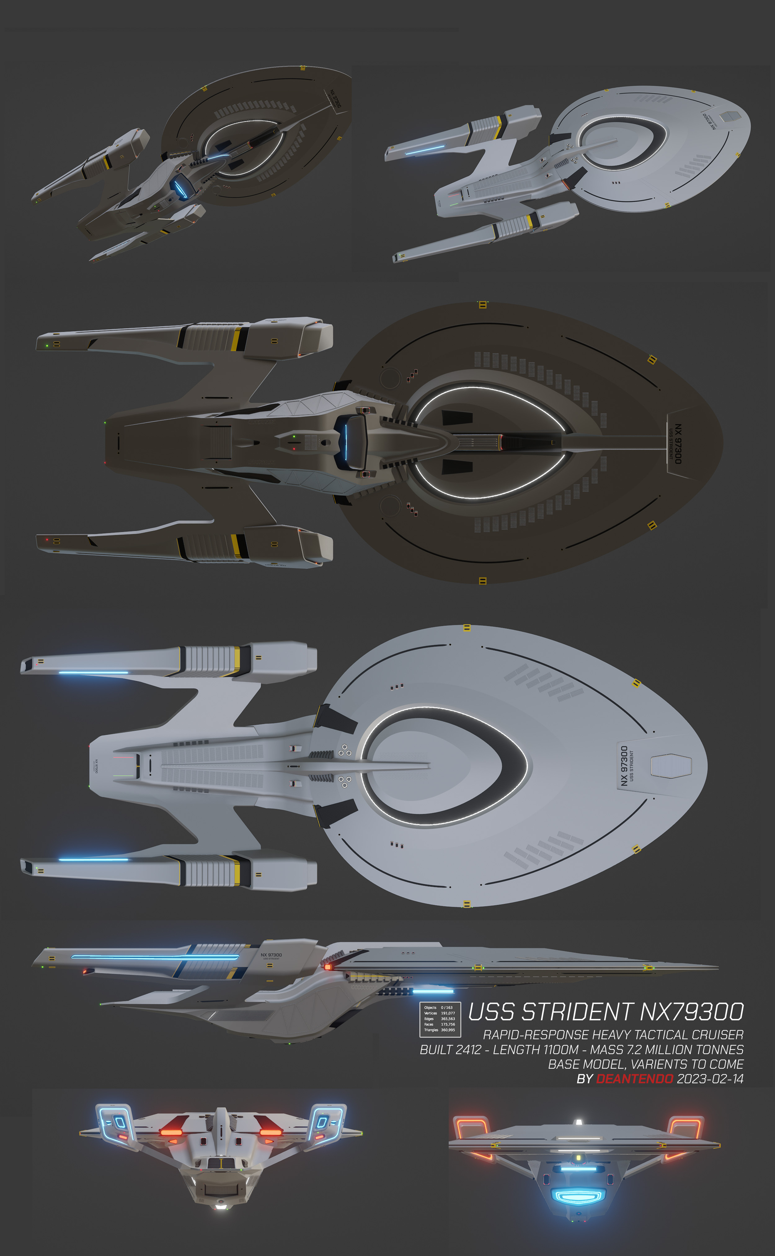
I feel like i'm largely done with this. And i already know there are quite a few errors, but i want you folks to pick it apart from a modelling standpoint - Cant' fix things if i don't know they're broken!


Tagged:
Additional credits
- Icons from Font-Awesome
- Additional icons by Mickael Bonfill
- Banner background from Toptal Subtle Patterns
© Scifi-Meshes.com 2001-2024
Posts
That's the biggest one I could think of. Also, you used the wrong font for the hull lettering. You used the 22nd to mid 23rd century lettering, as opposed to the later 23rd to whenever lettering.
For anything else, I'd need to know what your overall goals were, beyond learning Blender. Aside from the engineering hull that you already acknowledged, the modeling looks pretty clean.
You said point out mistakes. I was merely pointing out that your design doesn't fit with established ships. If you're fine with that, then that's cool. However, I've actually encountered people in the past who didn't know that font wasn't the one they used on later ships.
I think the first and most important thing for me to say is that i was joking around.
Just looking at it at a glance , it would guess the ship to be maybe 400-450 meters, and not the stated 1100.
The secondary hull and pylons could use some straightening here and there, and may some extra subdivisions.
I don't know what those grey rectangles on the bottom of the saucer are, but they might look better when they are following the curvature of the hull.